Reviewing snapshots from the past helps us understand where evolution is taking us, especially when future decisions are on the line. So Renault had an excellent idea for the preview of the Scénic Vision in Paris last May, when it stood its historic 1991 Scénic Concept at the entrance. A revolutionary project that we are delighted to have another look at – is it really more than thirty years ago? – in those features where it was ahead of its time, such as that special focus on passengers that made it a symbol of Renault’s ‘voiture à vivre’.
Three basic pillars for future projects
We enter the studio and find ourselves in another time dimension, back to the near future. The Scénic Vision presented to us by Laurens van den Acker, the Renault Group’s head of Design, is an expression of the three pillars on which the company led by CEO Luca De Meo plans to base all its projects: sustainability, safety and inclusion. And design is certainly no exception.
An iconic name
Van den Acker explains: “We chose an iconic name from our history because the car’s ambition is to change the lives of the people on board for the better. The context has changed completely, however. Our vehicles are becoming more and more technological, and we want the design of this environmentally-friendly vehicle for today’s family to show this”.
The Sensual Tech formal language
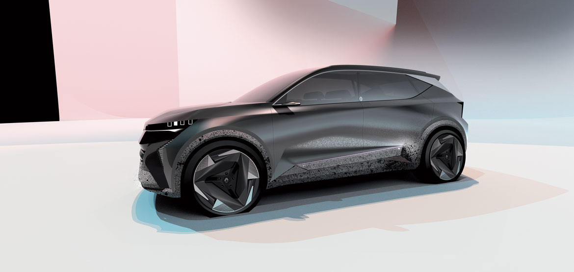
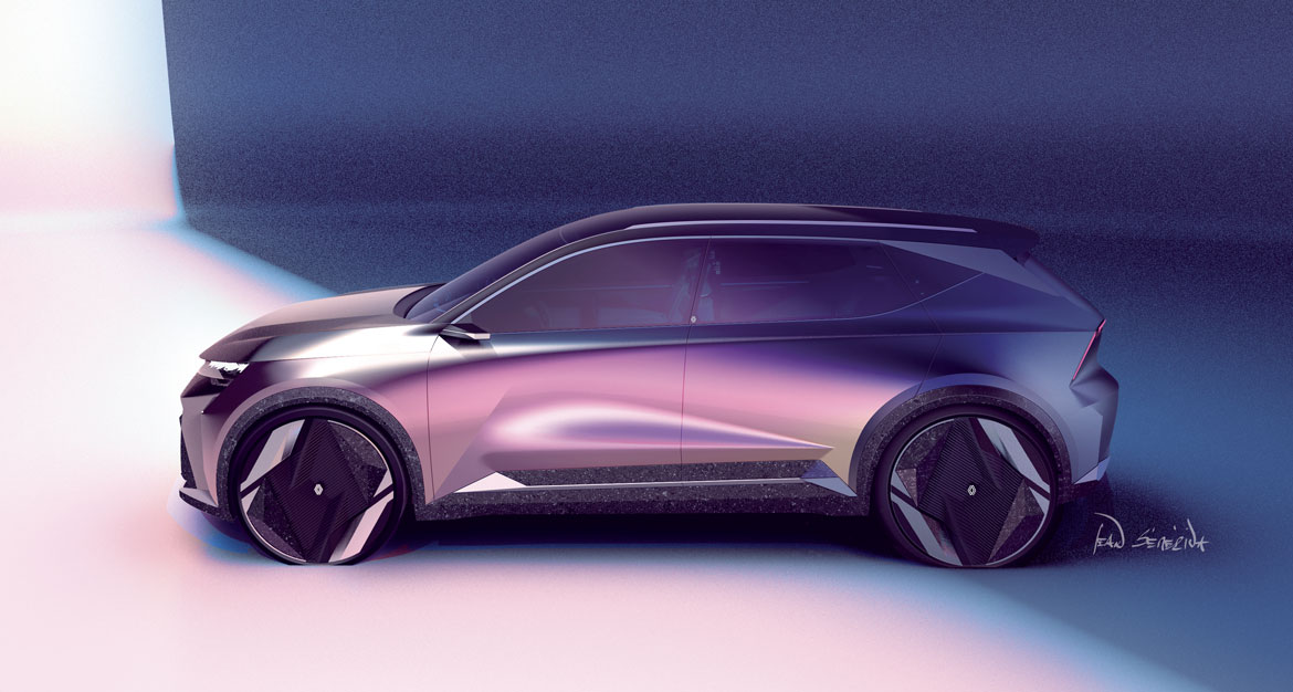
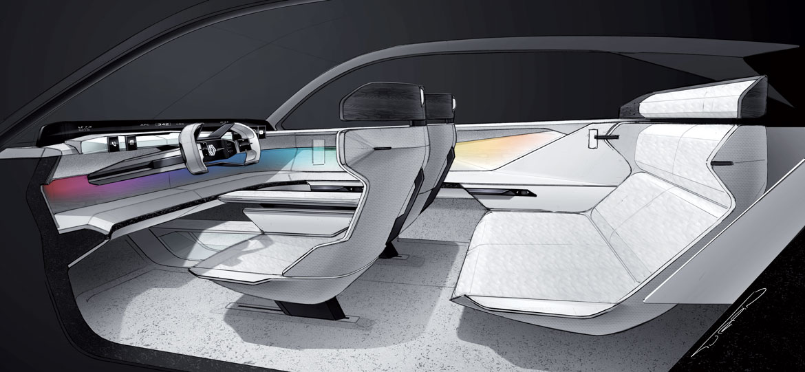
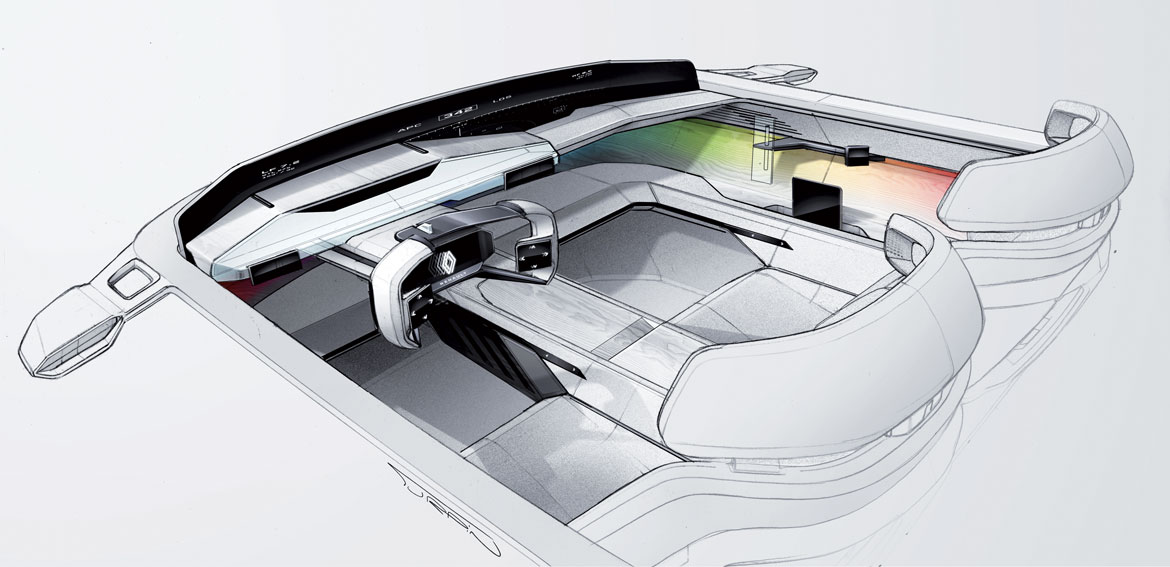
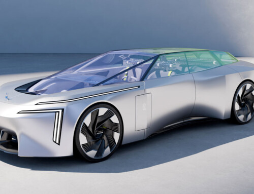
The Scénic Vision’s dual soul is built on the dichotomy between exterior and interior. The muscular body heralds the features of an all-electric model that will come to market in 2024 and is an expression of Sensual Tech, the formal language defined by the Renault brand’s new design chief Gilles Vidal and his team. “The interior, on the other hand, looks even further ahead. It is a research laboratory not only in terms of styling, but in terms of materials and how we intend to interact with the vehicle”, adds Van den Acker.
The choice of materials first
The proportions are typical of an electric car, with a long wheelbase and very short overhangs, ideal for achieving a light, airy interior volume. The black and white colours, in sharp contrast, are the result of sustainable rather than stylistic choices, explains Stéphane Maiore, chief interior designer: “We followed an opposite approach to the usual. Instead of designing the interior and then looking for recyclable materials, we first chose the materials and then adapted the shapes to the processes involved, accepting their appearance”.
100% recyclable
While the black of the exterior paint uses environmental particulates (mixed, for a touch of gloss, with carbon fibres recovered from industrial waste), the total white of the interior arises out of the decision not to use pigments and to adopt a mono-material for the upholstery: recycled polyester for fabrics, padding and stitching, so as not to have to disassemble the elements when the materials are recovered, given that the Scenic Vision is produced with 70% recycled materials but is itself 100% recyclable. “This project belongs to a new era of design”, observes Agneta Dahlgren, head of C-segment and electric car design. “This is Sensual tech, highly sculpted, generous shapes, but with very precise details”.
(Full article in A&D n. 255)

