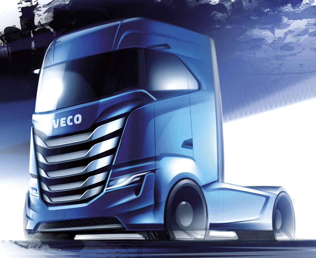
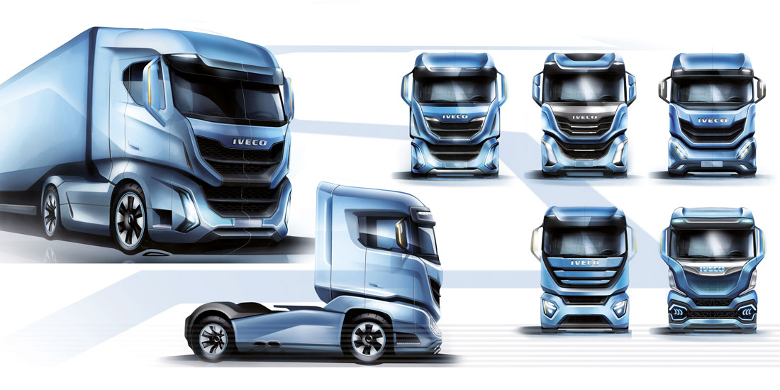
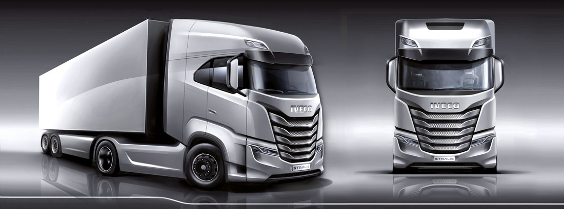
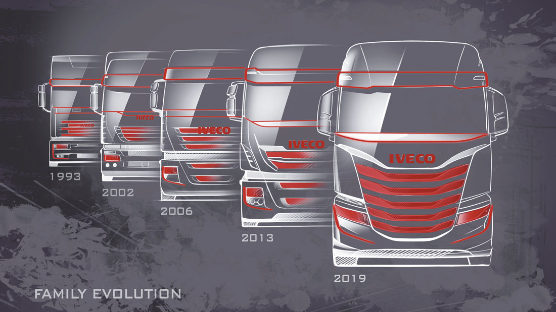
Turin. Again we’re discussing an entirely Italian concept of transport-linked style, not only one involving cars. Perhaps because of this, the ferment is palpable in the offices when those slides appear on which the first sketches of the Iveco S-Way emerge like giants. This is the new big, heavy vehicle of CNH Industrial.
“It took two years to develop the project, it involved a completely new vehicle, which required an unprecedented approach and a truly thorough study”, begins Marco Armigliato, head of design at Iveco, with the look of someone familiar with challenges. “We have thoroughly revised even the cab’s key elements, along with, more generally, the role and image of this model in relationship to the rest of the range”, adds Giuseppe Bruno, senior designer for exteriors and interiors.
The significance of the operation, necessary for substituting the commercial pillar that was the previous Stralis, is immediately clear. It’s no coincidence that the drawings projected on the wall, though oriented to seeking different and interesting formal solutions, as is typical during the beginning stages, all appear to be aligned on the same proportions: “Already, at this stage, when we’d just picked up our pencils, so to speak, the sizing and the packaging of the platform were defined with preliminary sketches and mathematical models, which were essential for correctly balancing the structure”, explains Armigliato.
This approach constitutes one of the keystones of the creative pathway for the S-Way, since the guidelines (on the one hand, comfort for the user and payload; on the other hand, aerodynamic efficiency and reduced consumption) are linked to the conception of the structure. In fact, the alchemical complex of the success of such a vehicle is located at the intersection of these guidelines.
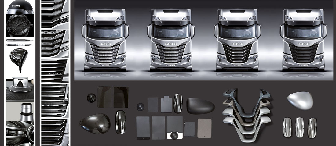
We grafted our desire to concoct an imposing front end on top of the specific dimensions already determined – a front end that was strongly vertically oriented and, therefore, free of horizontal separations or other elements that might fracture its unity. “The choice also depended on the cooling requirements, on the basis of which we needed to provide a very wide grille. In any case, it produced a large entry surface for air for which we developed an elaborate, three-dimensional look, capable of suggesting the power of the engine that it conceals”, the designers recounted.
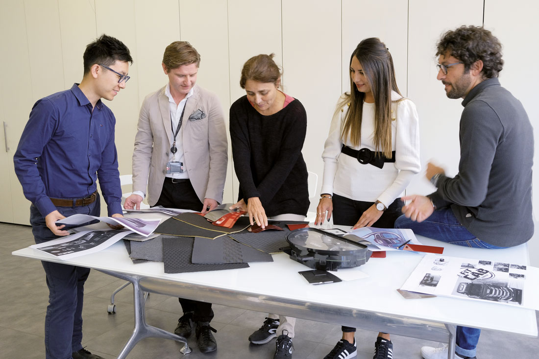
Having analysed the creative proposals, which were all rich in such incisive visual stimuli, the three most interesting ones were transformed into 1:5 scale maquettes that were created by hand. They were ready for the final decision. “At this point, however, management suddenly requested another round, a further gathering of ideas”, David Wilkie, head of CNH Industrial’s style centre, intervenes. “This did not involve redefining the general brief, but refining a few details. So, we preferred to look beyond the experience of our team, and, with a move that might perhaps surprise a few people, to request the consultancy of FCA colleagues, in particular of the team led by Klaus Busse. Their contribution led to our achieving a formal equilibrium that was very convincing”.
(Full article in A&D no. 239)

