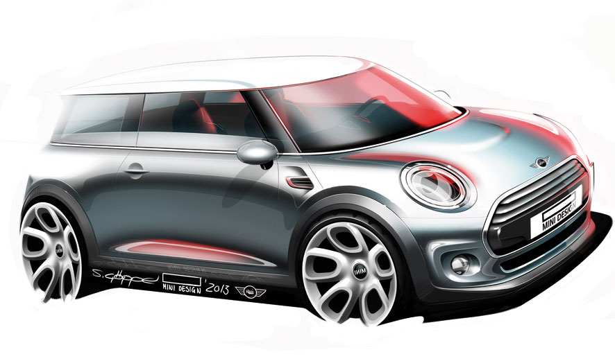
Heralded an icon of automotive design when first introduced, the diminutive four-passenger Mini remained a distinctive symbol of good design well into its subsequent rebirth under the stewardship of BMW. Now in its third generation, the modern Mini is out to gain a new generation of buyers yet again. Led by Stefan Göppel under the direction of former exterior design director Marcus Syring (and ultimately current exterior design director Christopher Weil when Syring moved to Rolls-Royce last year), the key objective was to retain the iconic elements of previous models while pushing the design forward.
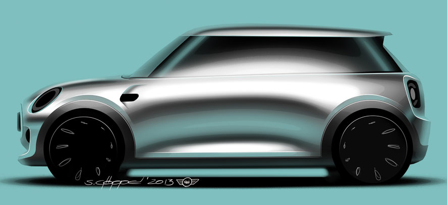
“We really started out with a clear assignment that we are doing a successor to a successful design. And we referred to it as the hero,” says head of design Anders Warming, who joined Mini shortly after the initial sketch phase in late 2010.
Taking elements from Frank Stephenson’s first design and the second generation developed under the direction of Gert Hildebrand, the design team set off “to build on the icons,” and create the next phase in Mini’s design story.
“I always refer to designing a Mini as 50 per cent, heritage and 50 per cent innovation,” says Warming. “If I were to have an over-proportion of innovation, we would probably upset a lot of diehard Mini fans. Contrary, if we did smaller steps and did mainly 60-70 per cent heritage and just a little bit innovation, then we wouldn’t be doing our job right.”
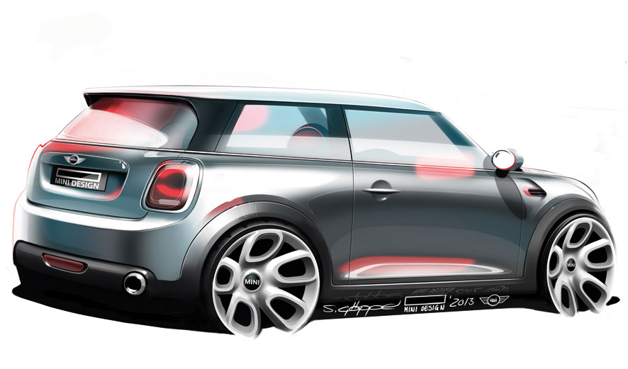
Following this premise, essential Mini-typical design elements such as the hexagonal grille and round headlamps were modernised.
As expected, the new Mini has increased in every dimension. It is 98mm longer, 44mm wider and 7mm higher than the car it replaces, yet has retained its short front and rear overhangs. With a 28mm longer wheelbase and larger front (+42mm) and rear (+34 mm) track width over its predecessor, there is more knee, head, shoulder and cargo space than ever before.
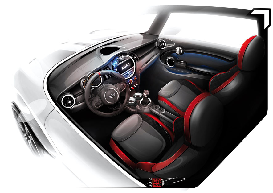
But the main focus of the new interior — by Tanja Schöller under the direction of Oliver Sieghart — was to elevate perceived quality. This was achieved through increased use of sustainable and premium materials typically found in higher segment vehicles, as well as through technology.
“With our new dashboard, you can really press your thumb into it and you really feel that it’s cushioned all the way through,” says Warming. “Usually it’s a process that’s been used for cars in the 3 Series, 5 Series segments upwards.”
Refined ergonomics were also paramount in the new design, highlights Warming: “One of the focus areas for us on the new design was to create perfect seats. We really have perceived an even lower seating position relative to the steering angle and the pedal position, and the shifter position as well.”
Circular and oval elements are a Mini characteristic, as is the main central display. And as the Mini arguably spearheaded the entire personalisation trend, customisation options are also extensive in the new car.
“I think my favourite thing is the LED ring around the display that customers can customise on-the-go, setting the colours, functions, mood lighting, whatever you want right now and in the blink of an eye,” says Warming. “You can change the function and do something different with it.”
Warming is excited about this LED ring because it previews a new level of personalisation for a customised user interface Mini is looking to implement into future products. “This is the beginning of it,” Warming says. “The Clubman concept in Geneva is the next level of it and we’re hoping to get a lot of that stuff into production…”
The article continues in Auto & Design no. 206

