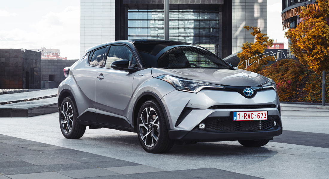
Unconventional. That’s maybe the most appropriate adjective for describing the Toyota C-HR, a compact crossover whose unique new image aims to win over European users.
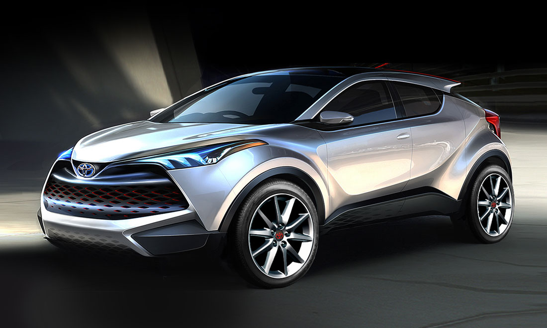
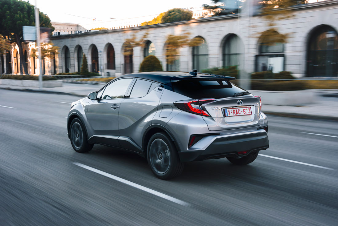
A new aesthetic departure made of unusual proportions that stand out from the more rigorous style of the other brand models and grab the watcher’s attention not just for the sculpted forms, but for the refined formal and chromatic lines too. Like the roof that slopes down to the rear with a nod to the coupé, the handle integrated in the C pillar and cleverly hidden by the dark paintwork so as not to interrupt the flow of lines, the two-colour solutions and the interiors with their pleasingly unusual combinations of materials.
The second car, after the Prius, to be developed on the new Tnga global platform, the Toyota C-HR targets a very specific customer: 35/40 year-old, a real driving fan with an eye to design and attracted by a high quality product.
The car’s look is dynamic, pointed up by the sleek silhouette, pronounced wheel arches to mark road presence and the “diamond-shaped” faceted side as Kazuhiko Isawa, project design chief that we met in Milan, loves to define it.
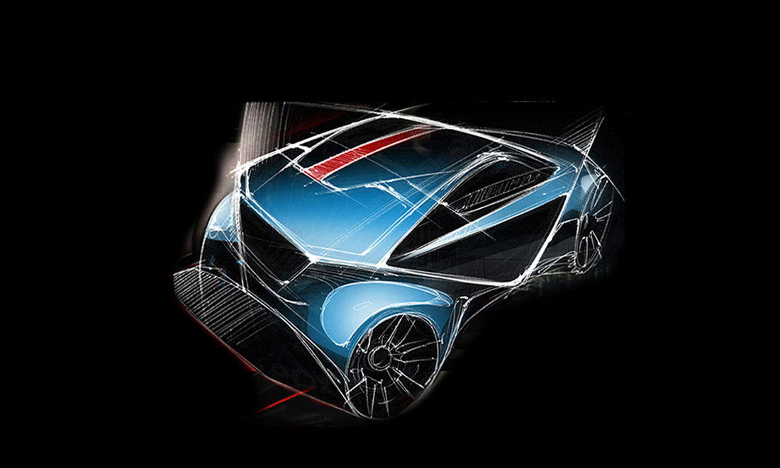
“We set no limits on our pursuit of strong styling to respond to the idea that every product should be consistent with its function, without necessarily being similar to another”, explains Isawa. “The C-HR was slated to have the appearance of the Suv and a significant road presence but without being heavy. We wanted to communicate an all-round feeling of dynamism and to obtain this result we worked hard on the plan view, eliminating pointless protrusions and giving fluidity to the shape”, he continues.
Anticipated by two concept cars of breakthrough design – one a three-door displayed at Paris in 2014, and the other a five-door unveiled at Frankfurt last year – the new C-HR does not betray their characteristics and innovative spirit, while smoothing out some of the rougher edges difficult to bring to production, especially in the design of the rear and in the lighting graphics.
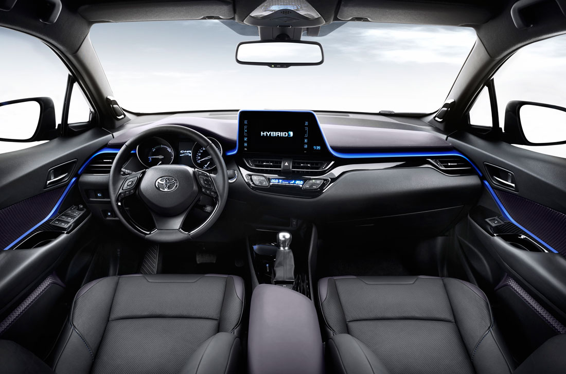
“Our intention for the interiors was to create the same feeling of movement and geometric research as in the externals”, Isawa continues. In the design, we therefore experimented with new aesthetic and functional solutions such as the metallic blue trim that crosses the asymmetric dash and frames the centre screen which, thanks to an optical expedient involving a special surface finish, is able to recreate an ambience lighting effect without being backlit. “We exploited the metallic properties of the material, a polymer looking like aluminium that emits its own light”, Isawa explains.
“For the door pannelling too we used a special plastic and a 3D pattern echoing the diamond faceting concept in harmony with the external theme, so as to confer a characteristically original tactile and chromatic appearance”, he specifies.
The result of the profound attention to perceived quality that was a feature of the vehicle’s development, made it possible to obtain a cockpit that wraps the user up in a comfortable, refined environment, making life on board highly pleasurable thanks also to the layered seats where the lower part is given over to support and lateral containment while the finer upper part of sleek design reins in the volumes and permits better exploitation of living space.

