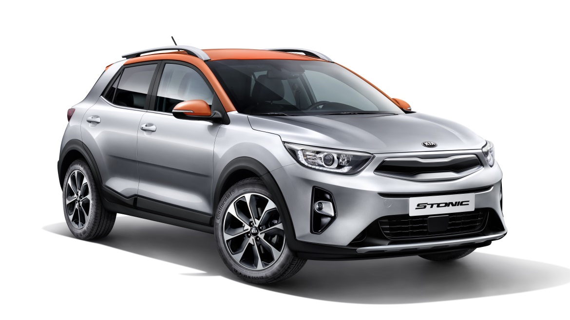
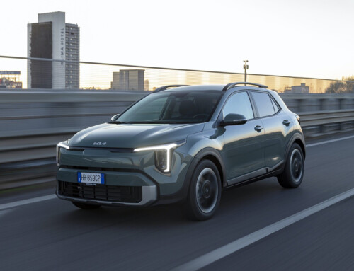
Four meters fifteen (approximately) of contemporary cues in all the right places. While some manufacturers indulge in way-out styling exercises, building bodies that grab the attention for their at times forced whimsicality, Kia prefers a dimension of marked but homogeneous modernity, at the same time adding a few harmoniously aggressive details to the mix.
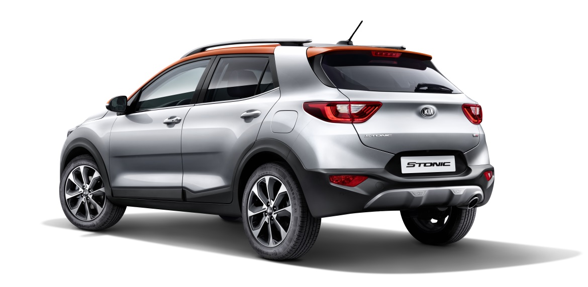
Thus, on the latest born, which joins the explosive small SUV segment, the brush strokes are linear and neat, without blurred edges. Not lacking in character, but definitely consensual. A few, strong well-chosen elements (like the two-colour paint scheme, with the roof in five shades, or the graphic pattern of the mouldings that run along the bottom of the rear doors) add spice to the balances.
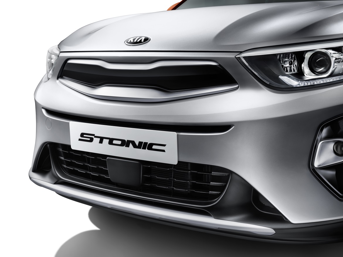
The reinterpretation of the Tiger Nose Grille (closed off incidentally because it is not needed for cooling) astonishes: it has become thicker and gains a new metal frame, not just a simple contour, but a three-dimensional component capable of creating a further design, a sharper and more elaborate visual pattern.
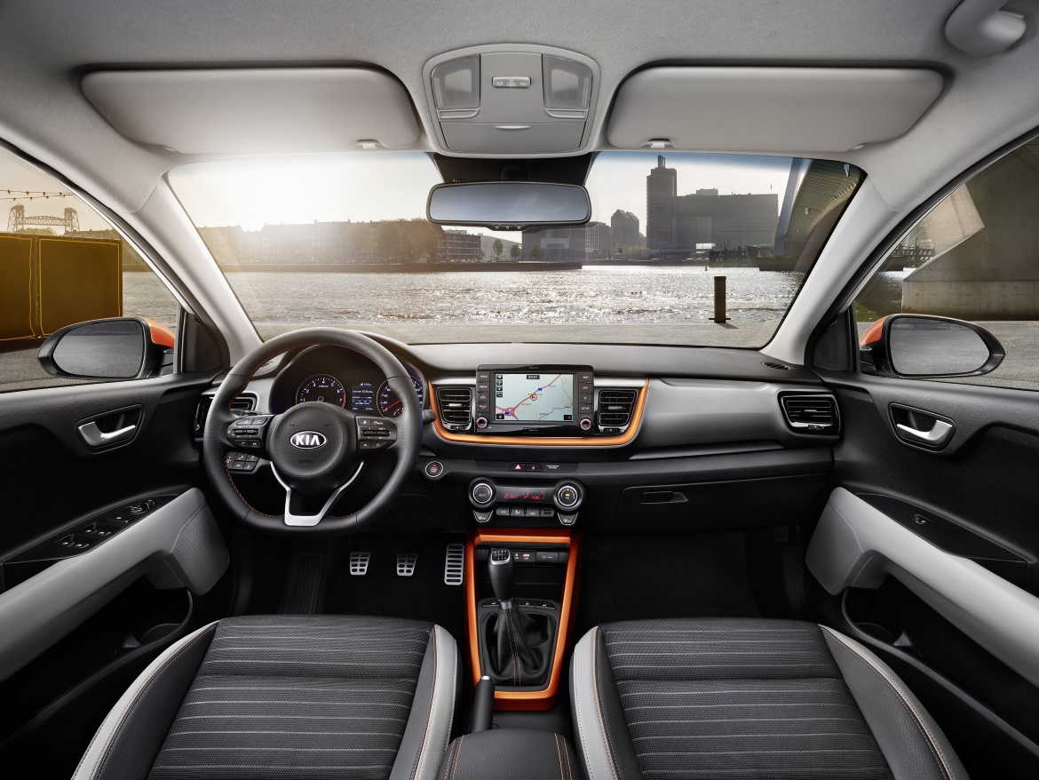
The Stonic thus adheres fully to the Korean philosophy whereby aesthetic choices must first communicate quality content, telling the customer his car is “worth while” before he has even touched it. And in this regard, the interiors appear well designed both in terms of ergonomics and materials, while not revolutionising the standards of the category. In this project, the design is unquestionably first and foremost a catalyst of quality.

