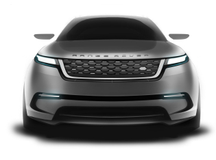
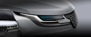
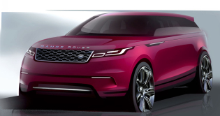
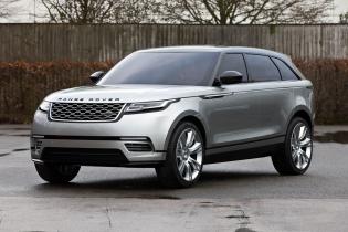
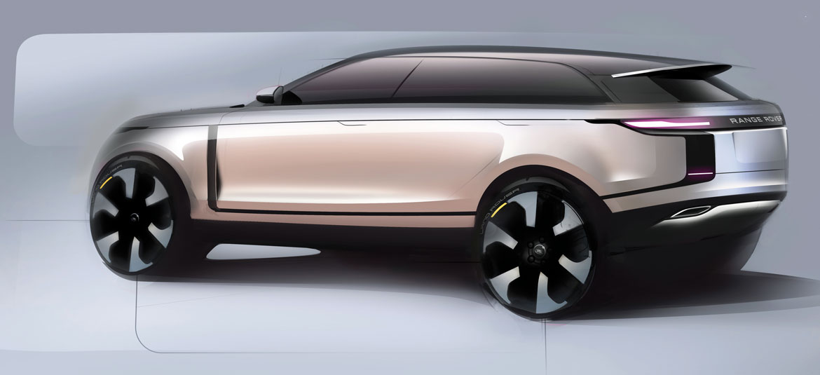
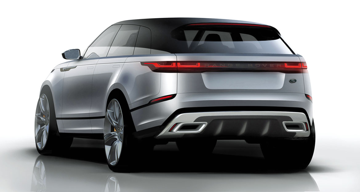
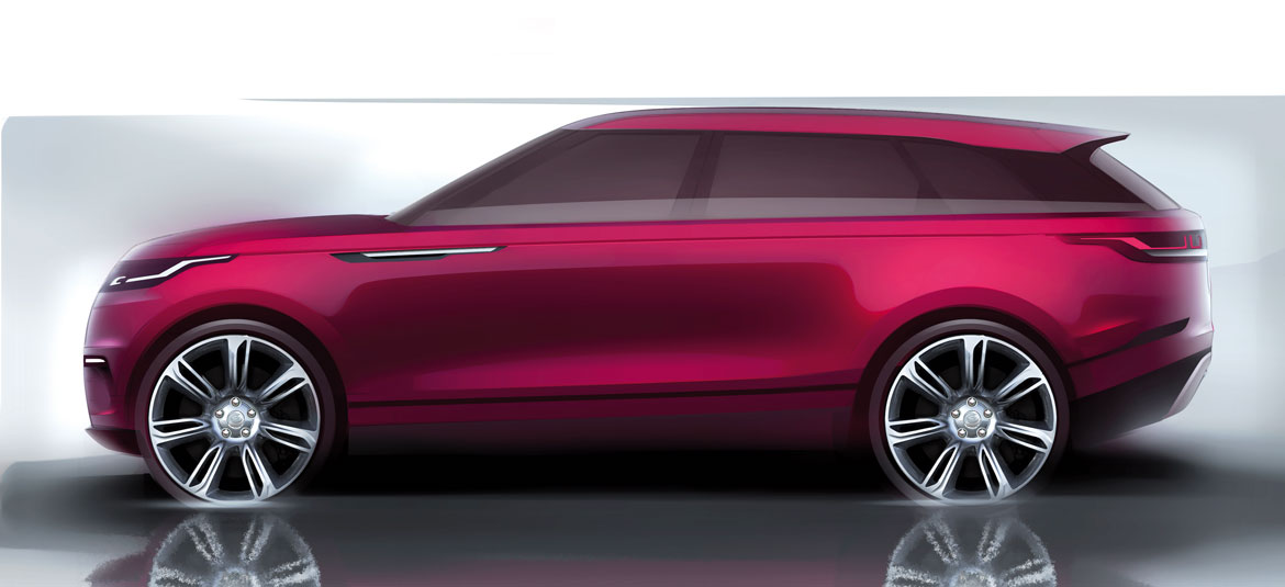
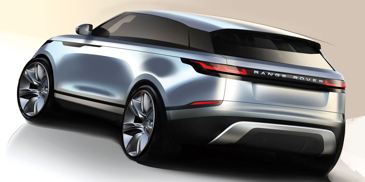
It’s the most aerodynamic Range Rover ever, with a drag coefficient of 0.32. Almost a miracle. Because, as Gerry McGovern says, “Bricks aren’t very aerodynamic”. Perhaps the explanation lies in the fact that the new Velar launched in Geneva, takes its cue not so much from a brick, namely a classic SUV, but also from crossovers and even wagons. In fact McGovern, head of Land Rover design, notes that this fourth model of the Range Rover series, which slots commercially into the “blank space” between the Evoque and the Sport, “has a unique personality, and is neither a reduced version of the Sport nor an expanded Evoque”. Then he admits, “Yes, it’s longer than the others, and this is what gives it a sense of elegance and makes it unique”. Maybe it’s because of the wheelbase, which at 2.87 metres is slightly shorter than that of the Sport, while its height is just a few millimetres higher than the Evoque. Massimo Frascella, who designed its exterior, adds, “It’s difficult to place it in a specific category.
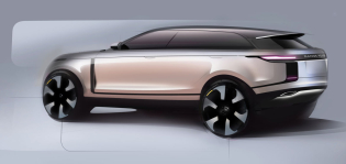
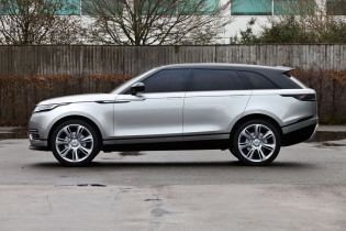
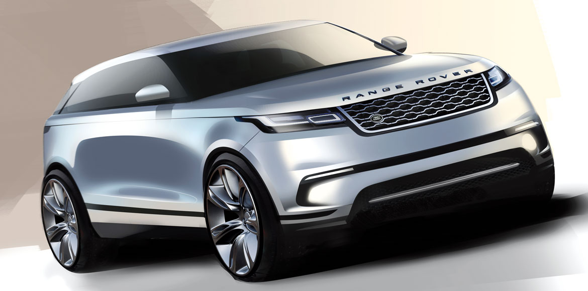
You can see elements of wagons, SUVs, and crossovers. In fact it’s the most road-going car we’ve ever made, even if its off-road credentials aren’t lacking. It’s in our DNA”. The key to understanding the Velar, McGovern explains, “is in its volumes and proportions, a constant in the design philosophy of the Range Rover.” He then adds, “Just take a look at its side profile: the wheels are just the right size (between 18 and 22 inches; author’s note), the very short front overhang, the cleanness of its sides achieved by the taut surfaces, the eye-catching silhouette, the clamshell bonnet, the position of the passenger compartment in relationship to the rest of the car, the floating roof; everything gives a minimalist sense which is also reflected in the spacious interior design”. McGovern argues that the boundaries between SUV’s, SUV coupés, crossovers and wagons are becoming increasingly blurred and also reflect the ebb and flow of fashion. And he admits that “sure, the Velar is more of a motor car, although many expected it to be a coupé version of the Sport, but it still retains its thoroughbred off-roader features”.
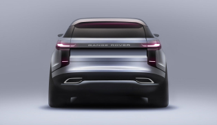
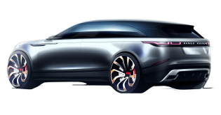
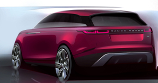
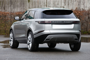
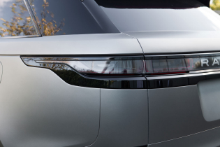
And then there’s the rear end, which is more typical of a small boat than that of an SUV. “There is a closure both in plan and elevation views,” notes Frascella. “The roof curves downward while the lower part of the rear curves upwards, so everything is connected almost to a vanishing point. Even from the wheel arches there is a sort of tapering. And all this gives you a strong sense of elegance, while at the same time a car that’s really down to earth. If you take the rear three-quarter view you can almost see the edge of the wheel on the other side, precisely because in plan view the vehicle is so closed”.
Launched three and a half years ago, the project had a “very natural and consequential” gestation period, according to Frascella. So much so that, starting from a series of sketches among which the one done by James Watkins was the most outstanding, it only took a couple of scale models before we moved to the 1:1 in clay and the final development stages. Parallel to the exterior, there have been some developments regarding the theme for the interior under the guidance of Mark Butler, while Amy Frascella was responsible for colours and materials. “The interior”, explains McGovern, “must be intuitive, with a touch of relaxation, almost an extension of one’s own home.”
What his concept of home is, is soon said. In fact, he claims to be “a lover of modernism”: “I am not a collector of cars but of furniture, modern antiques, Italian crystal, mirrors. Gio Ponti and Fontana are the artists that come to mind. For me, the interiors of a car are as important as the exteriors and modernism goes well with technology, in an optical process that facilitates creativity. When you take your seat in a car you do not want to be intellectually involved, you want your driving position to be right, you want to feel you are in a car that needs driving but that is at the same time intuitive”.
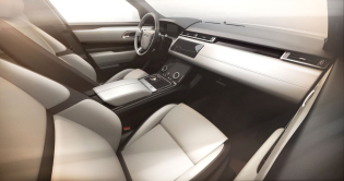
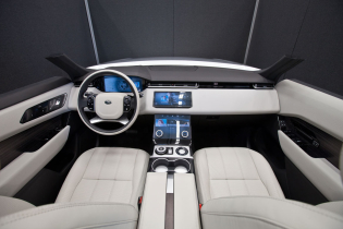
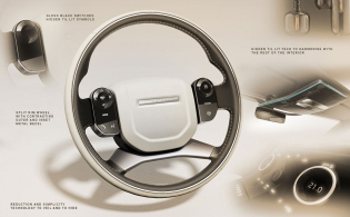
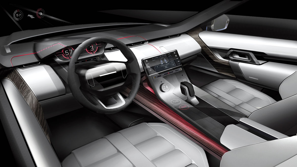
During the development of the Velar, both the interiors and exteriors were the result of the exact same approach that now makes Land Rover designers talk about “a sanctuary of calm” was used: the same minimalist language, the reduction or elimination of no longer needed components, but without reducing the overall functionality. The horizontal dashboard development, the double touch screen, the departure from the use of many knobs, and the choice of the noblest materials represent the more immediate aspect of a unit which suggests elegant simplicity and sophisticated refinement.
Full article in Auto&Design no. 226
