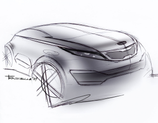
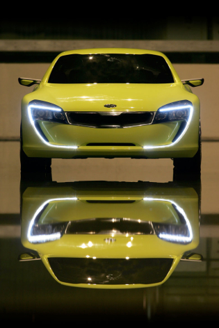
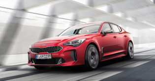
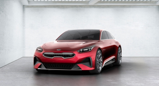
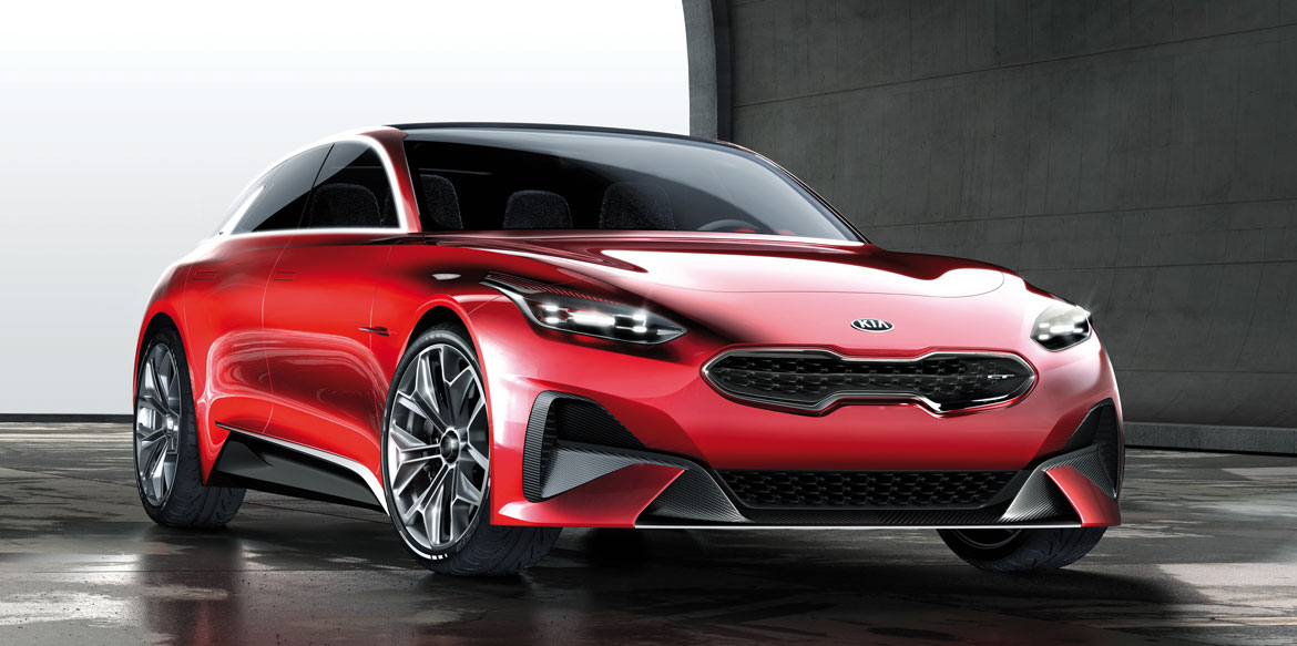
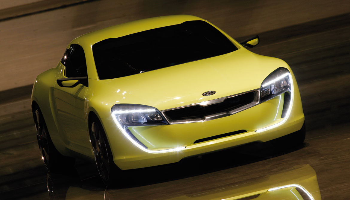
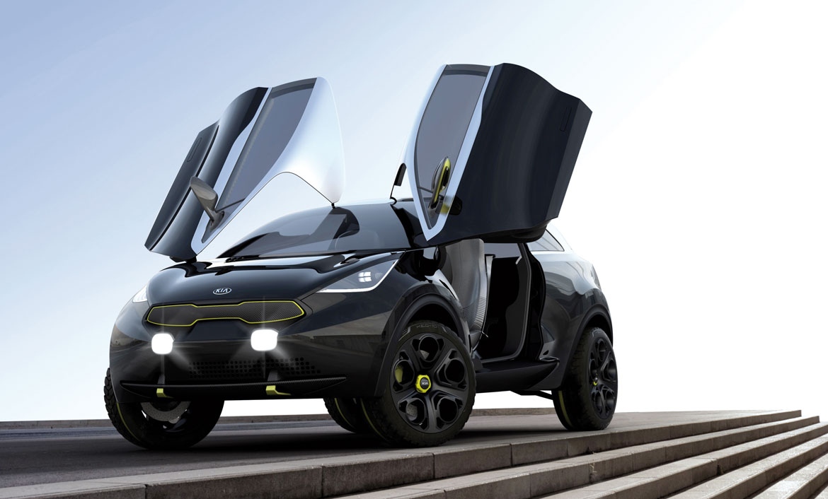
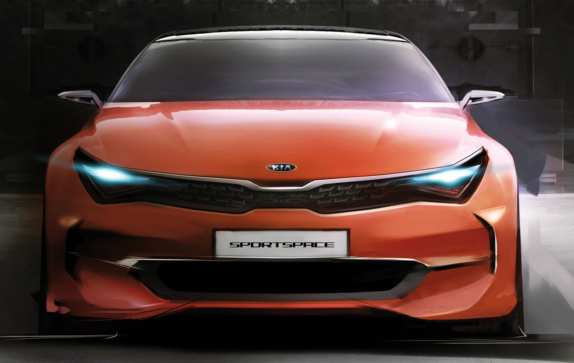
Its latest iteration the Tiger Nose comes in the form of the sharply tapered nose of the Proceed concept, spotlighted at the recent Frankfurt Motor Show: the horizontal grille which narrows in the centre, so compressing its surrounds to make them more dynamic and relevant, thus reaches, with incisive discretion, the end of its first decade. “It was in fact at the Frankfurt Show of 2007 that we presented the idea for the first time, on the prototype of a compact coupé called the Kee”, recalls Peter Schreyer, head of Kia brand design.
“We had already begun to think about the image of our cars the previous year, after I joined the group: there was no standard approach to the styling of the nose which is fundamental if you want to stand out from the competition and transmit a message of uniqueness. For this reason, work began on several alternatives, the most successful of which would debut on a show car that was in preparation. We experimented with some of them even in full scale. When we tried the Tiger Nose, we immediately realised that this was the way to go and the other solutions were shelved.
The inspiration was first and foremost the graphic design of the new element: “The shape of the chrome-plated profile might have suggested a location for the logo, but we preferred to move the logo to the bonnet, leaving a free area in the centre that immediately caught the eye”. In this way, our approach was therefore quite the contrary to that prevalent with other manufacturers, intent on maximising the size and value of their symbols, and in addition we obtained a grille that tended to suggest a plentiful fresh air intake, almost like two nostrils designed to let the engine breathe: “In reality, the name “Tiger Nose” was not born at the time of the aesthetic proposal, but only later, in a Seul studio where I met a few of the Korean managers. Perhaps in the central narrowing they saw the expression of a feline curling up its nose before opening its jaws, even if evoking the animal world was not the direct intention of my team. In any case, Kia’s identity was now clear”.
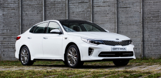
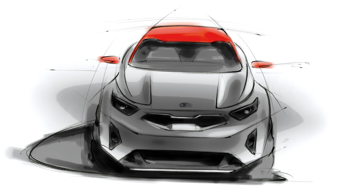
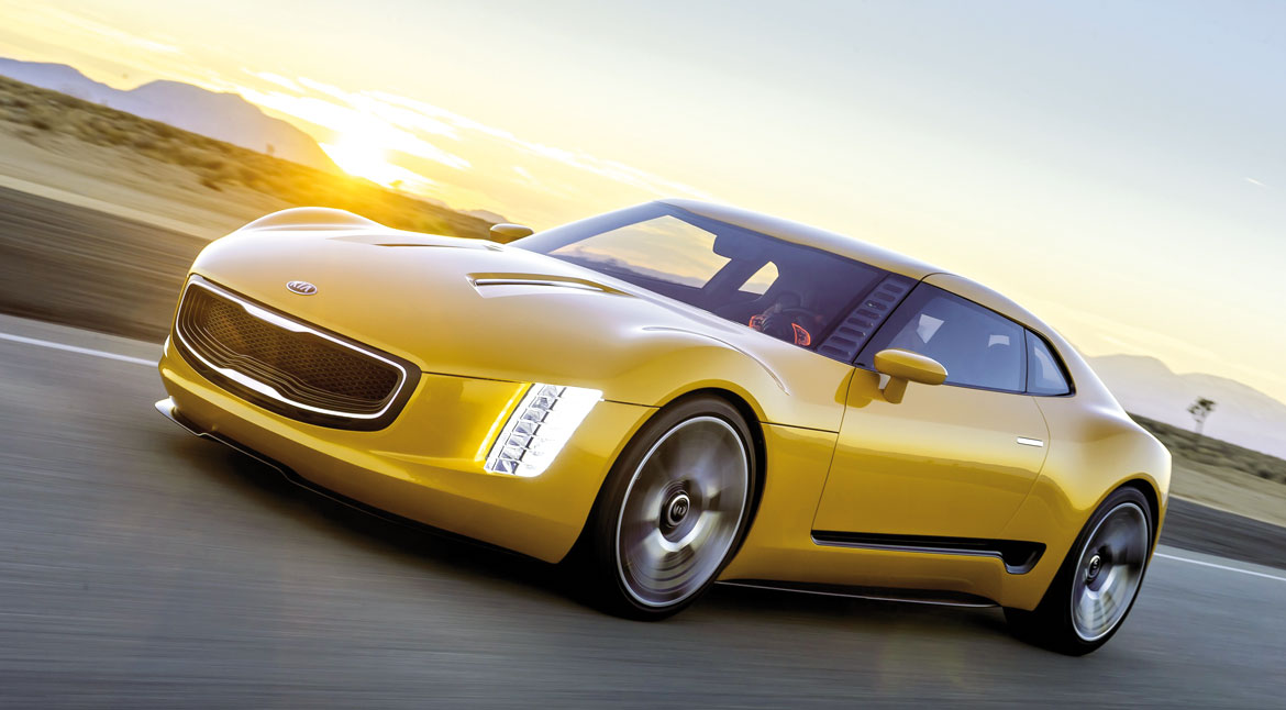
From the outset, the grille was examined in detail to make it adaptable to multiple models: “We knew we had to ensure a unique impact for all cars in the range, it was our main objective. We soon realised that focusing the design on the two small protrusions would allow us to keep the same layout regardless of the shape of the front. It was not a fixed module, to be used slavishly for each segment, but a flexible concept, easily adaptable to all types of front volume with minor modifications”. It is no coincidence that in several subsequent variants, the thick chrome moulding of the original resulted in a more sober bright strip integrated into the perimeter, the morphology of which is thus enhanced.
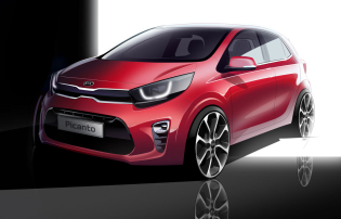
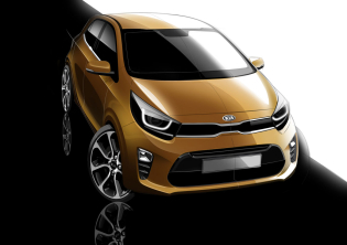
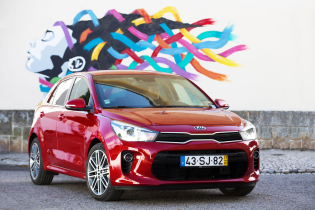
“The Tiger Nose has changed somewhat over the years”, says Schreyer. “Recently we have proposed it in a “slim” version on the Picanto and Rio, in a three-dimensional key on the Sorento, joining up the headlights on the Optima and with a negatively inclined edge on the American Cadenza saloon. In some cases, the logo has been placed, clearly visible, right in the centre, because of the brand’s growing reputation on international markets.
On the smaller cars, including the newly launched Stonic crossover, the graphic pattern comes completely free of the air inlet which is superfluous for cooling needs and is therefore replaced by a glossy black insert. The important thing, in such a varied landscape, is to preserve a recognisable imprint”.
What about the future? The designer is cryptic, but promising: “One probable evolution is linked to three-dimensionality, to a more sculpted and complex processing of the surrounds. There is no question that the Kia model offer is expanding worldwide, and this will provide us with a lot of material to work on”.
Full article in Auto&Design no. 227
