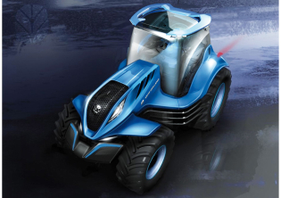
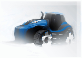
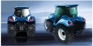
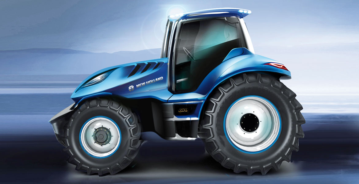
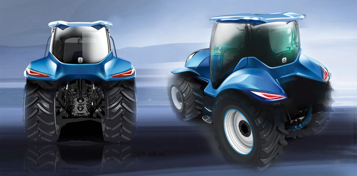
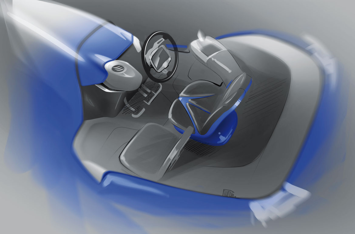
The main aim of the Methane Concept presented in the United States by New Holland Agriculture was to create a new tractor, not only stylistically but above all functionally, starting with a methane fuel, produced using sustainable farm waste as a new energy source. Given the chance to start from a blank sheet, the design focus was on the cab. The first objective was 360-degree visibility. On the outside of the tractor, on the other hand, a great job was done fully integrating all elements, taking inspiration from the world of automotive design.
David Wilkie (head of the Design Center at CNH Industrial) explains: “The project was innovative, a look into the future. In fact, the headlights and all the other parts were explored in detail to improve functionality and at the same time offer a high level of design. Our concept has already been put to the test in France”.
“This concept”, adds Wilkie, “could be easily marketed, it’s not just a futuristic teaser. It should not be forgotten that a tractor does not change model every three or four years, unlike in the car world. Its technology targets not only functionality, but also durability and a life-span of at least 20 years”.
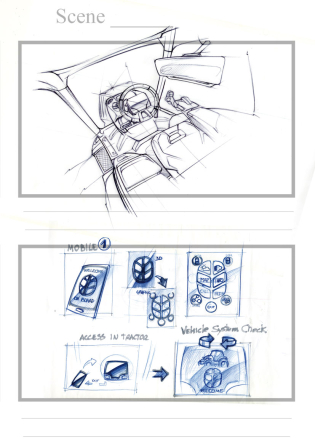
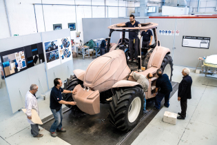
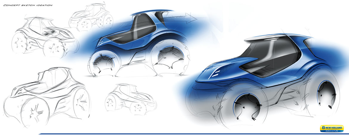
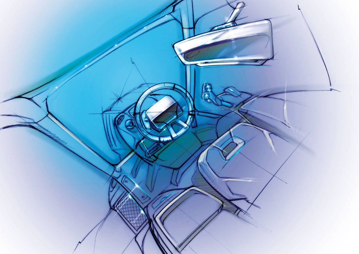
The idea was developed from a series of proposals put forward by the group’s designers in Chicago, Turin and Modena. The American studio, Wilkie recalls, proposed “a concept with a low cab integrated with the bonnet and broad fenders: eye-catching, extreme”. The Modena project rotated around the cab, with a floating roof in which the tractor’s functional lighting was integrated. Inside there was a fixed screen in the middle of the steering wheel. The Turin studio worked on the idea of total integration with the constituent elements of the tractor. Ultimately, the end result was the outcome of a full collaboration among the design centres.
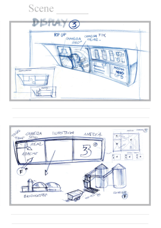
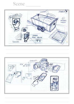
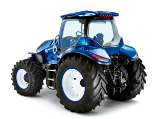
New Holland tractor cabs are traditionally function oriented. “This”, says Wilkie, “is more technological and advanced, with wraparound glass that gives 360-degree visibility”. The transparent, floating roof incorporates the lighting units, while the rear-view mirrors are replaced by videocameras: all this to give a clean, cutting-edge effect. But a designer’s life isn’t always easy: the grille and headlights are the signature parts of the New Holland brand. Intensive research therefore went into finding a new “face”.
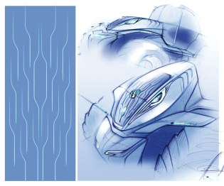
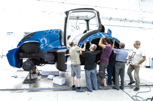
Inspiration for the headlights came from the cat’s eyes, while the bonnet air intakes are reminiscent of fish gills. The grille has been completely redesigned. The design centres also worked intensively on integration of the fenders so as to make the form more fluid, and on the side and front fairings that enclose the methane tanks.
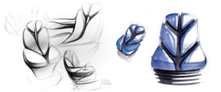
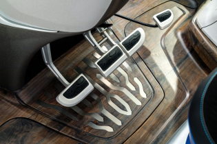
The New Holland logo is a growing leaf: here we have an ear of corn in a field. This is the pattern used for the new grille, the same as for the interior, while the stylised leaf reappears in the shape of the seat. “We have gone for bigger tyres and widened the rear fenders”, explains Wilkie, “to obtain the right proportions”. The colour is no longer New Holland’s classic blue, but a more intense, metallic blue. “In many respects”, concludes Wilkie, “we wanted to think differently than in the past, with an eye to the future”.
Full article in Auto&Design no. 227
