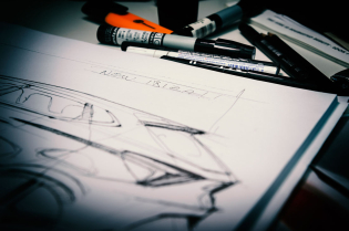
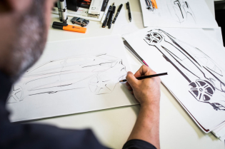
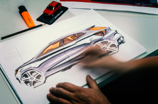
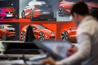
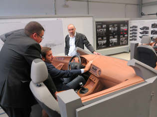
Designing the fifth generation of a car like the Seat Ibiza, a model that has been a great success for over thirty years, was obviously a huge challenge as well as a great responsibility for the whole company. This made the task demanding as it was, but for Alejandro Mesonero the project, begun at the end of 2013, also had sentimental implications. “My very first car was an Ibiza, which was white because it was the only colour available at the dealership that day and I wanted it immediately. I was 18 years old and having a car like that was a dream come true,” the Seat head of design told us.
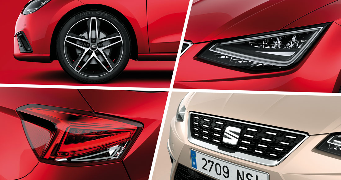
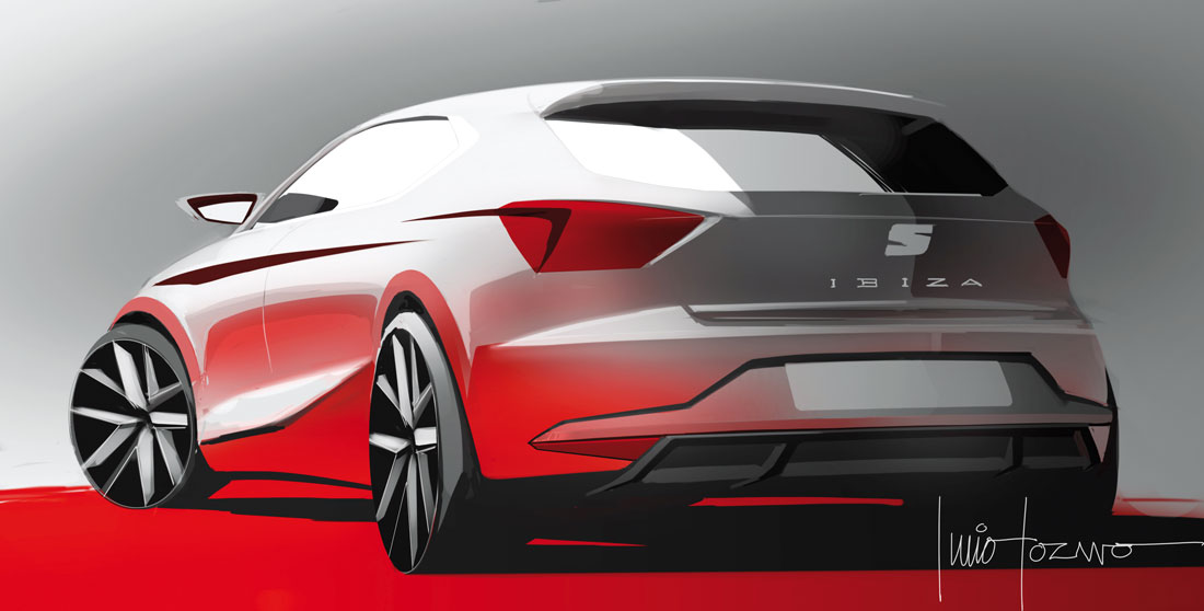
In addition to drawing on the legacy of the four previous generations, the starting point for the new design was the stylistic language of the Leon, the forerunner of the new stylistic approach of the Seat range, and the Ibiza was intended to represent a further evolution of this process. “The Leon and the Ibiza obviously have two different personalities,” Mesonero pointed out, “the former is more mature and refined, while the Ibiza aims to be disruptive; this is evident in the detail and in the larger number of lines used than in the past. But the end result is a harmonious whole, with well-balanced lines that are never in conflict with each other.”
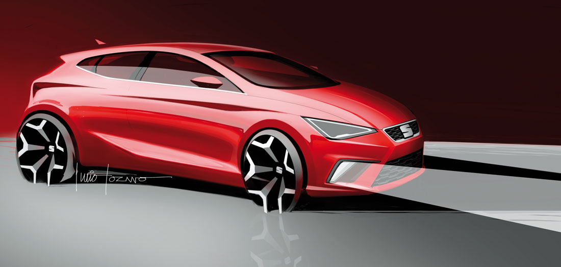
The harmony and dynamic strength are once again achieved by the proportions, an element that Mesonero considers fundamental for every good-looking car, and even more so for what he defines as “the Latin approach to design, to achieve a car with a ‘healthy’ posture and a strong road presence, which is our primary goal. We have dedicated a great deal of time to refining the balance of the side view, from the positioning of the wheels to the overhangs and the overall height.” If we observe the Ibiza from the side, we can also note that the passenger compartment has been positioned marginally further back, which is perceptible from the slightly negative angle that terminates the rear end, gaining in agility.
Even the blisters (the elements in relief that sculpt the side) were carefully redesigned. “They are a strong distinctive sign of Seat and we wanted to find a new stylistic language that could interpret them from a fresh viewpoint,” continued Mesonero. “They are now more horizontal and more strongly stated. We have extended the longer one and shortened the rear one, which links up with the rear lights, returning towards the front of the car to reinforce its image of compactness and strength.”
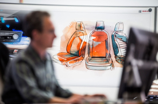
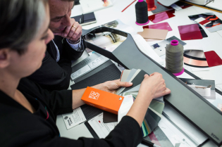
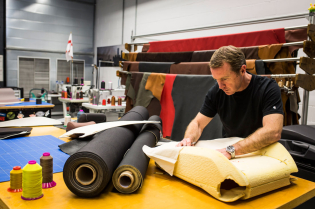
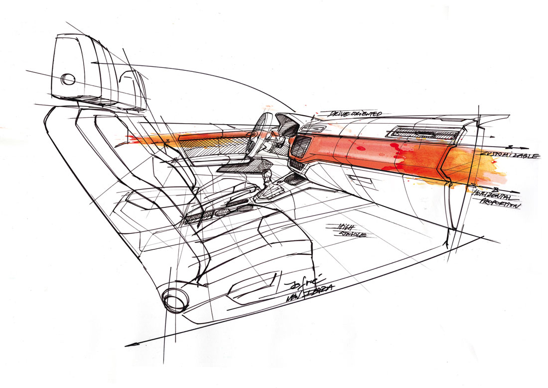
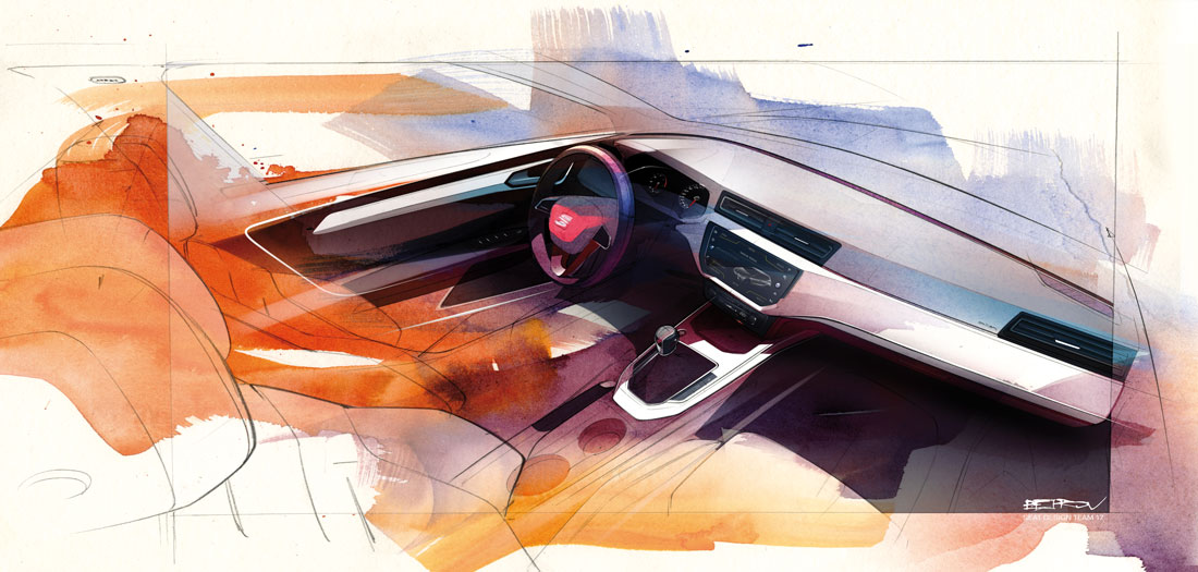
There was no doubt about the objectives to achieve in the interior. There were two in particular: the possibility of customising the colour of the car, and connectivity. The combination of the two produced the broad decorative ‘path’ or insert that crosses the whole of the facia, framing the central 8” screen. It is possible to repeat the colour of the exterior but to express it in different materials. “Dividing the facia weighed the visual impression down in spite of the larger cabin,” Mesonero explained.
The interior measurements were optimised to exploit the new dimensions – the new Ibiza is 2 mm shorter and 1 mm lower than the previous version, but 87 mm wider – and this was made possible by adopting the new MQB A0 platform, which is shared with other brands in the Volkswagen family, and makes its world debut on the Ibiza. It offers advantages in terms of flexibility and packaging efficiency: “It was like dressing a model with a perfect physique,” said Mesonero, who admits that he was very demanding with his team, expecting manic attention to detail in the definition of every inch of the surface, inside and out.
