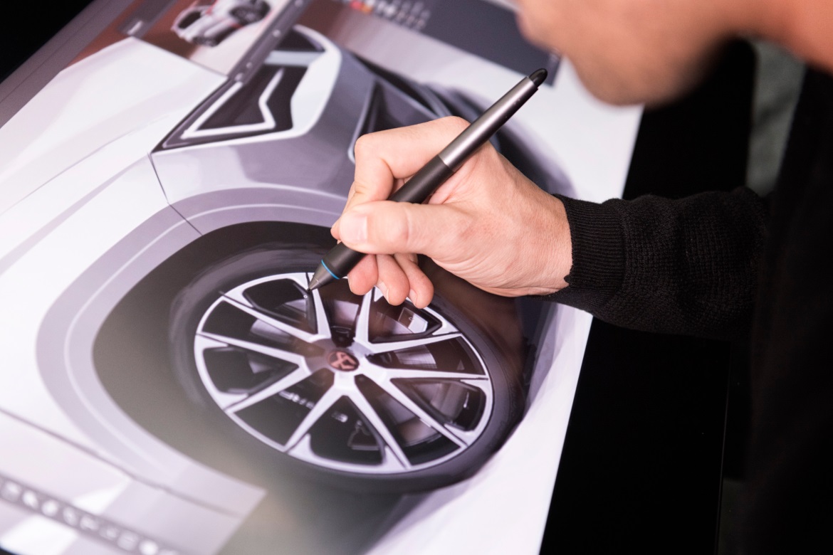
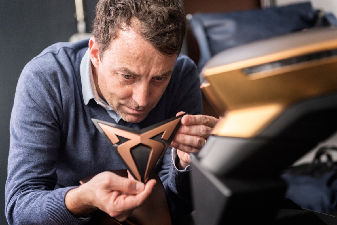
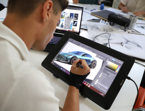
In what way can a colour, a texture or a symbol convey the personality of a new brand? Coming up with the answer falls within the scope of the work carried out by designers in the automotive industry. “The Cupra Ateca is refined, bold and stylish” says Tony Gallardo, the head of Design at Seat, when referring to the first model of the new brand. To reinforce the launch of the sporty brand, a powerful logo design was essential, two overlapping symmetrical ‘C’s. “It goes far beyond a simple logo. It’s an emblem. It symbolises the sense of belonging to a clan”, says Jordi Font, the head of Color & Trim at Seat.
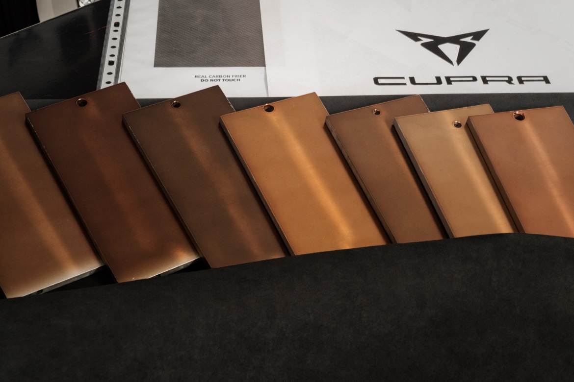
Also the colors matters. “The Cup Copper colour, a shade that perfectly matches the model’s refined character”, he adds. The other shade that defines the brand is Petrol Blue, a mixture of cyan and hints of black that emphasises its personality.
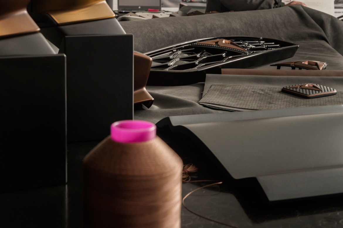
Building on the sporty brand nature, some elements have been modified to increase its level of sophistication. Changes made to the front grille and door sills, among other details, give the car a combination of style and strength. Viewed as a whole, they convey the character of the Cupra Ateca, the first model of the newly created brand: courage, passion, instinct and determination.

