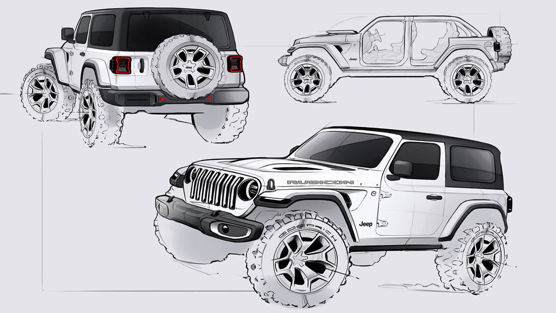
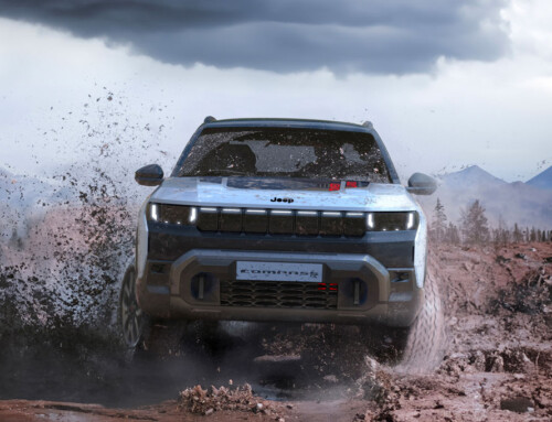
The spirit of profound, forthright renewal that pervades the latest generation of one of the most significant American icons of all time can, perhaps, be traced back to a single element, the grille: “Now it’s taller and straighter, and it ensures a much stronger visual presence for the whole front”, explains Mark Allen, head of Jeep’s global design. “It also conceals a detail that many might not have noticed, but which is an important citation for us: the two headlights, larger than in the past, make slight inroads into the perimeter of the two outermost slots, as was the case with the original CJ”. Here, the reference to the famous off-roader of the Seventies sums up much of the operational approach that characterised the project.
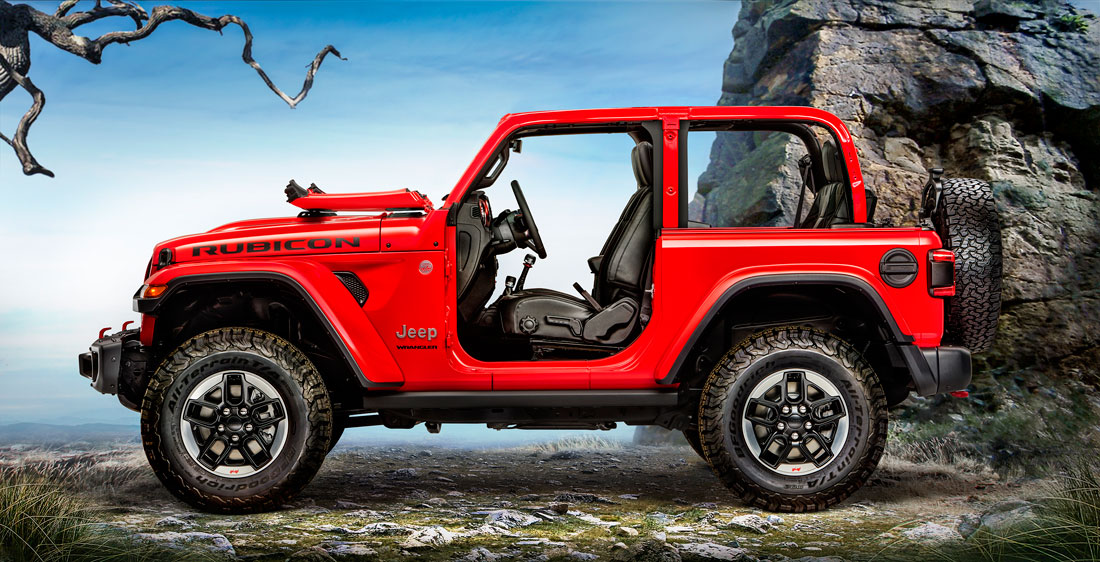
Even the new three-dimensional treatment of the surface behind the front wheel arches, completed by a small air vent, was indirectly inspired by the vehicle’s forerunner. “Fundamentally, it was a matter of giving the bonnet more volume, just as in the past”, confirms Brian Nielander, Head of Design for Performance, Passenger and Utility, who was in charge of the vehicle. “On the penultimate Wrangler the panels had become flat in some places, while the solution of the shaped slots, also made possible by the longer wheelbase, led us to give the profile of the upper part of the nose a more full-bodied look”.
Since the openings are real, they also get round some inconveniences that have occurred in recent years, related to excessive pressure in the engine compartment. “Here, every stylistic choice is always linked to vehicle functionality and simplifying use,” Allen continues. “For example, the roof panels were designed to ensure complete disassembly within seconds, while the new structure with a safety cage extending up to the A-pillars, allowed us to design a windscreen that was particularly easy to tip forward. Then we perfected all the details, the added value of this edition”.
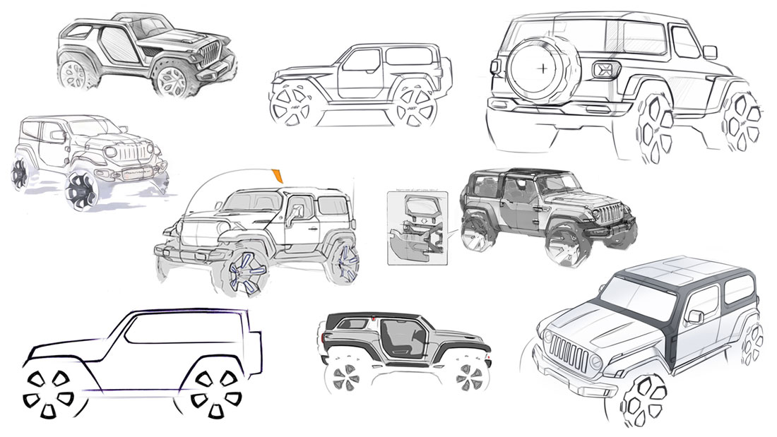
In fact, the honing of minor elements and the rationalisation of visual signs means a veritable revolution for the Jeep brand: the definitive transition towards the product approach, purified of pointless roughness and not devoid of a certain playful taste, albeit faithful to tradition. “When you are dealing with such powerful symbolism you have to be humble”, Nielander comments, “for this reason we have not altered the fundamental canons. On the other hand, this vehicle was comparable to a big toy that deserved to express its full character: at times we took an approach similar to that of developing a muscle-car, looking for power and fun together”.
Among the elements that, more than others, reflect the renewed attention to detail, the direction indicators incorporated in the mudguards stand out most: in addition to stressing their outline and width and the definition of a pleasant graphic effect, they allow the perimeter of the grille to remain more faithful to the original than would have been the case with the traditional round lights, because current laws would have meant their positioning was too external. Even the shape and position of the windshield washer nozzles are guided by a criterion of formal cleanliness, while the Jeep logo disappears from the nose. “You didn’t feel the need anymore”, smiles Nielander.”And the other micro-interventions testify to how precise the design was, without any nuances of brutality”.
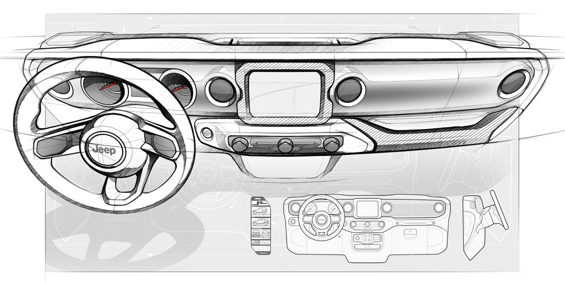
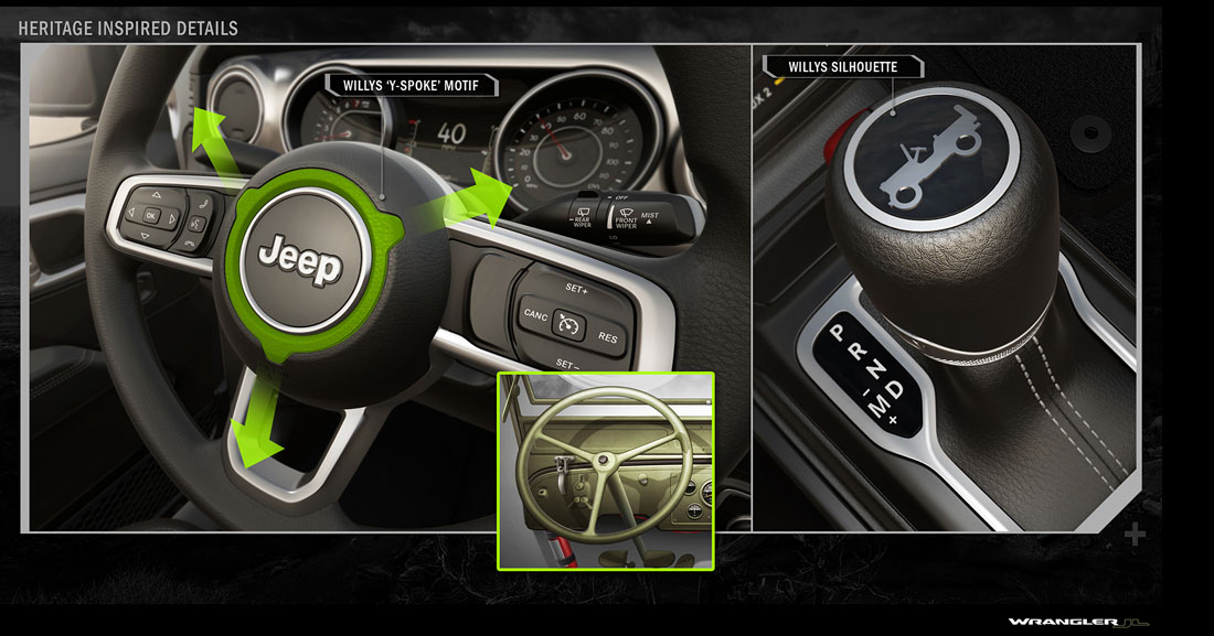
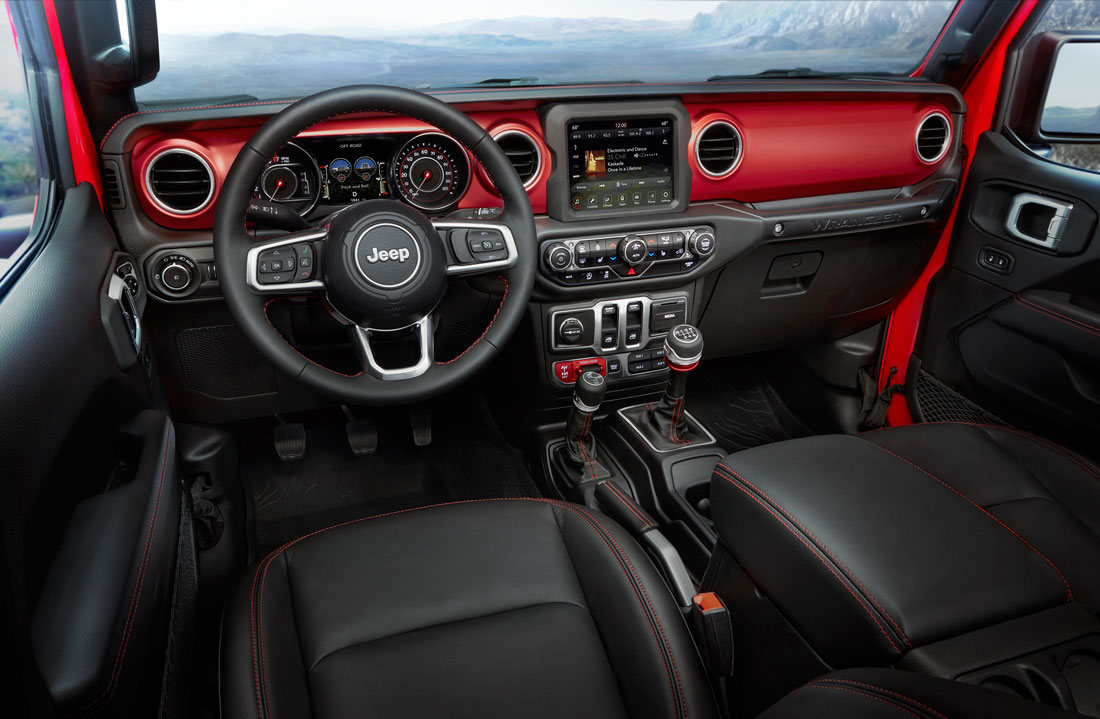
Moreover, meticulous refinement also become focal points in the passenger compartment. Ryan Patrick Joyce, who oversaw the development, says: “Every millimetre has been redesigned. But if the interior borrows suggestions from the past, both in a luxury key and in a more practical and essential sense, some of the processes hark back to a sophistication that is permitted only by the most up-to-date production and assembly techniques, as in the case of the gear lever knob”. Improvements in ergonomics, materials and construction quality thus become the crucial technical framework of a styling register pleasantly suspended between the contemporary and the nostalgic, the technological and the Spartan. “Overall, the new Wrangler required a uniquely attentive approach to customer feedback”, concludes Mark Allen. “It was important to open up to the new Suv user generation without disappointing the “pure hard-liners”. And by inviting them to play again, we would add.
(More contents in the Jeep Design Supplement to Auto&Design no. 232)

