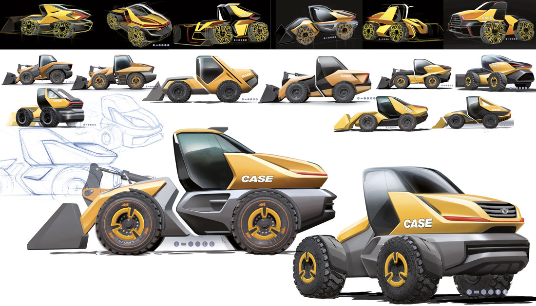
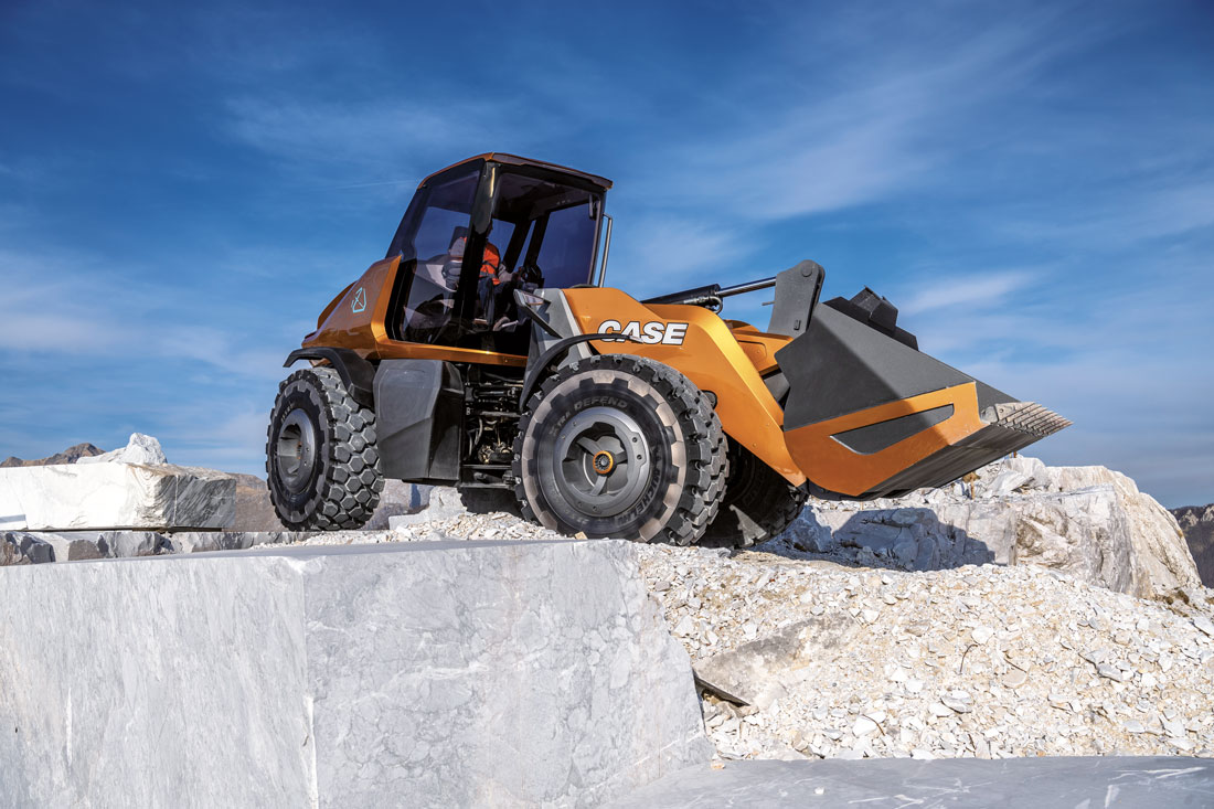
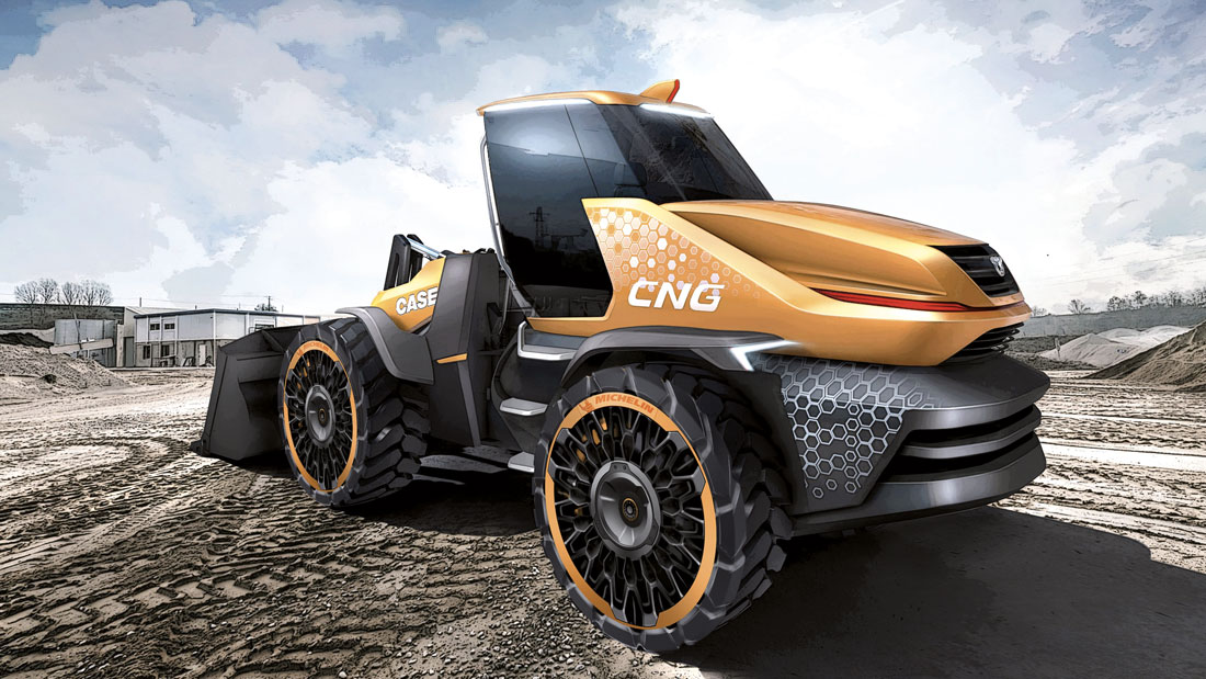
The Case Project Tetra concept was conceived about a year ago by Carl Gustav himself, the new president of Case Construction. Gustav wanted to see how far one could go in terms of the design of and innovation in quarry and construction equipment. Case has always paid a lot of attention to style and ergonomics, so much so that it was even given an award for its cab design in 2018. With this project, however, the company wanted to go a step further.
The aim was twofold: to strengthen brand identity and explore new solutions to understand how the public would react to something new. The company immediately decided to build a wheel loader, which is the most representative vehicle of the whole range. During the initial stages of the project, the broad outline was entrusted to James Lee, a Californian designer with past experience at Honda.
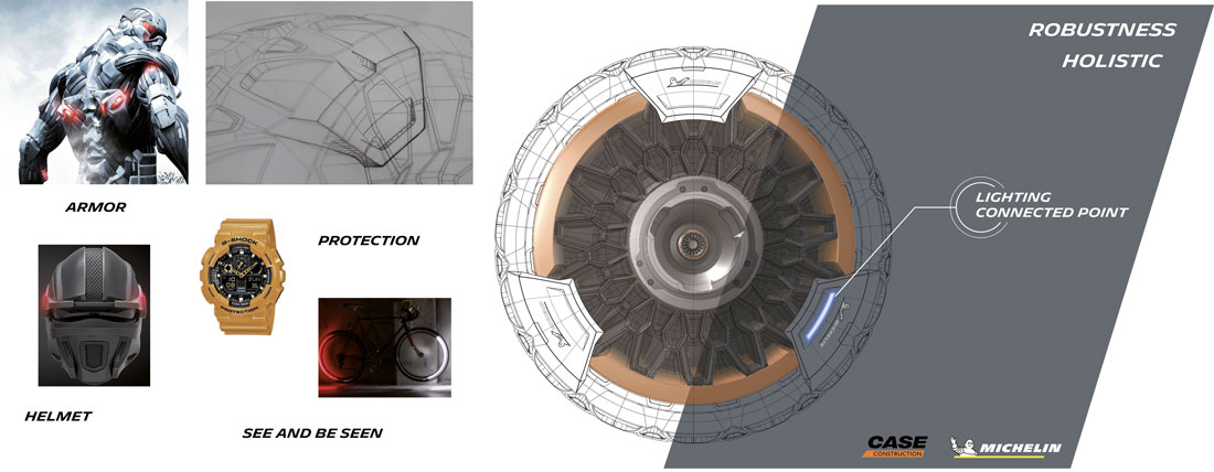
“The inspiration came from a number of factors,” Lee explained. “Until a few years ago, Case saw design as being exclusively linked to functionality. Then we realized that the aesthetic factor was also important. Our symbol, the eagle, is what best represents the philosophy of our vehicles. It is an agile, aggressive, intelligent and efficient animal. Project Tetra has the same DNA. Having clarified this, I identified a series of fixed points, in sketch after sketch; like the pieces of a puzzle, these points allowed me to define the main characteristics. The eagle also inspired the shape. The vehicle does not need to be aerodynamic, but it has a dynamic silhouette”.
The sketches then went to the Italian style centre, which defined the Tetra Project in every detail. It was Jakub Sulikowski, a designer from the Modena centre, who took care of everything. “We immediately wondered how daring we could be with respect to the standard models,” says David Wilkie, head of CNH Industrial’s Design Centre. “Of course, we always worked keeping in mind that the vehicle had to remain fully functional for the operator.”
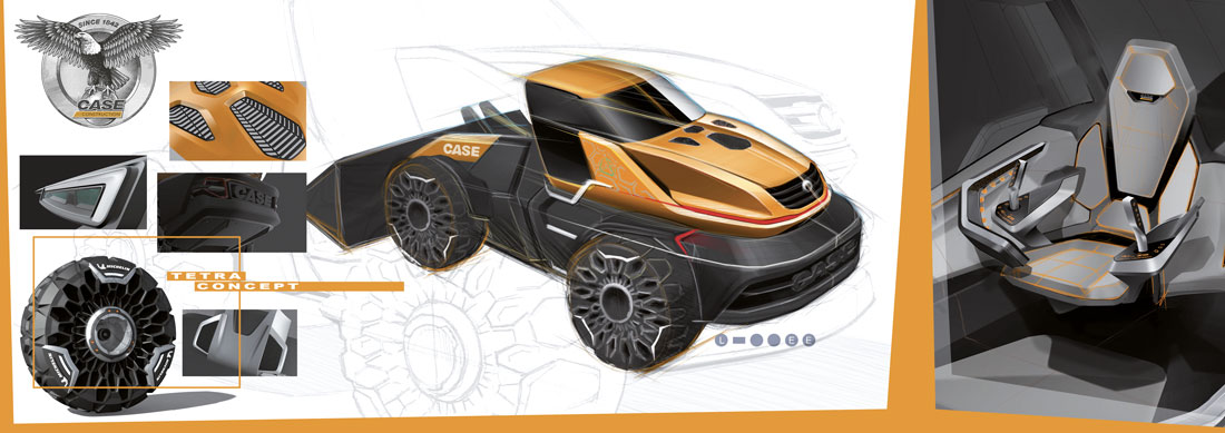
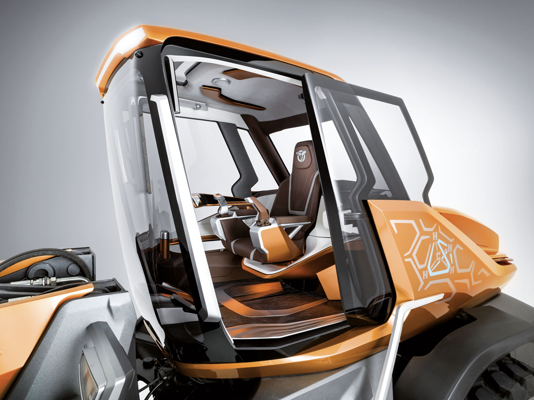
“We immediately understood the importance of the forward-facing cabin. This position greatly increases the operator’s visibility. For the same reason, we decided to replace the classic steering wheel, which has to have a central steering column that obstructs part of the view, with two side joysticks,” says also Wilkie. Project Tetra welcomes you to an environment with clear-cut lines. On board, you’re struck by a sense of space.
The most characteristic features of the cabin are the flooring and the seat. “As for the first,” Isabella Burgio said, “we opted for a stone cladding.” It’s very thin, but it conveys a sense of strength that other materials don’t have. It is an unprecedented solution that has had a strong impact. The whole Colour&Trim study was based on materials that inspire solidity and convey a link with nature”.
This concept incorporates another new solution, Sulikowski explained: “It’s the door: it’s an electrically operated sliding door with face recognition. When it opens, it conceals itself behind a vertical fin placed at the back, so as to be protected and to dissipate part of the heat coming from the engine. The rear part of the counterweight is a distinctive feature: it has a large “central Case logo and is highly contoured. The shovel has also been modified, and the arm itself has a backlit logo.”
(Full article in A&D no. 238)

