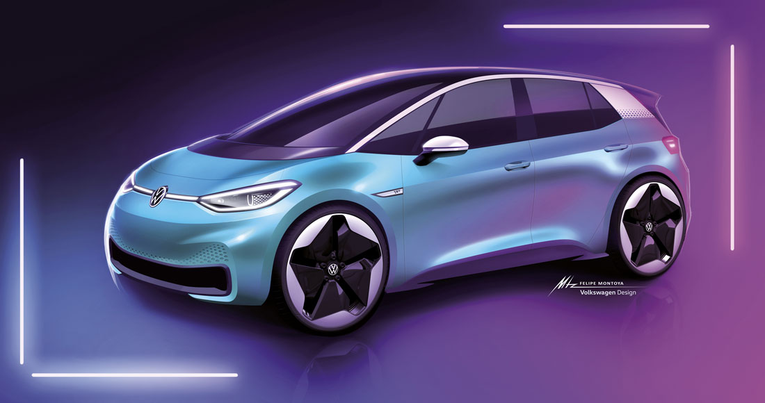
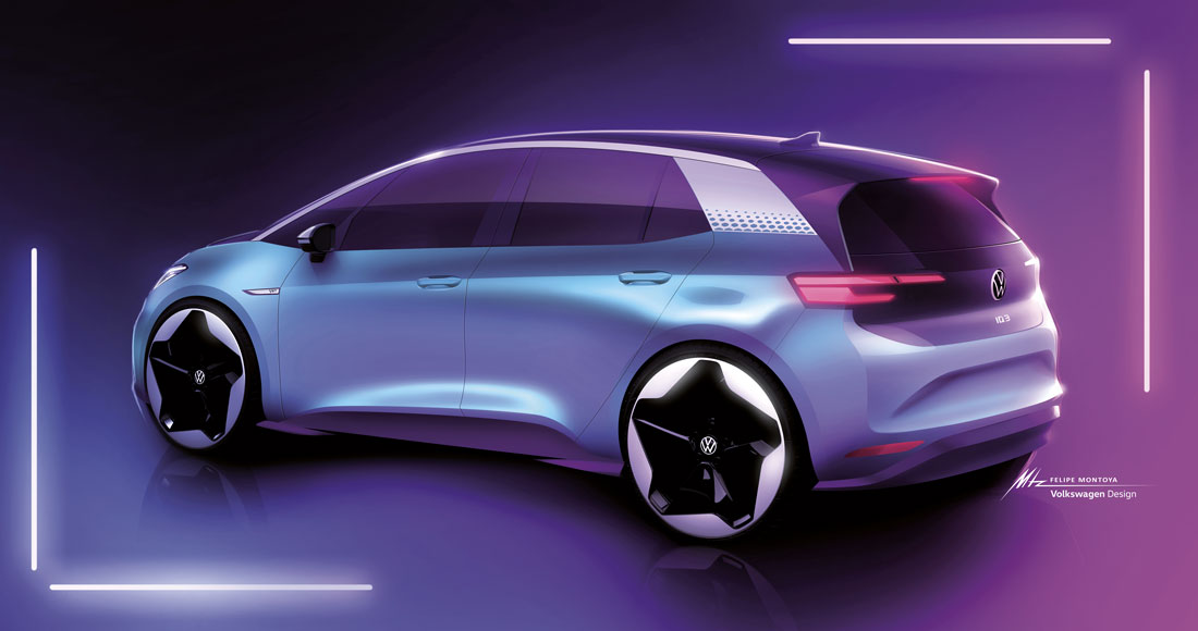
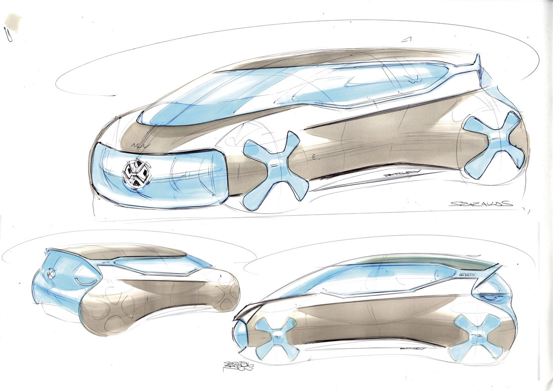
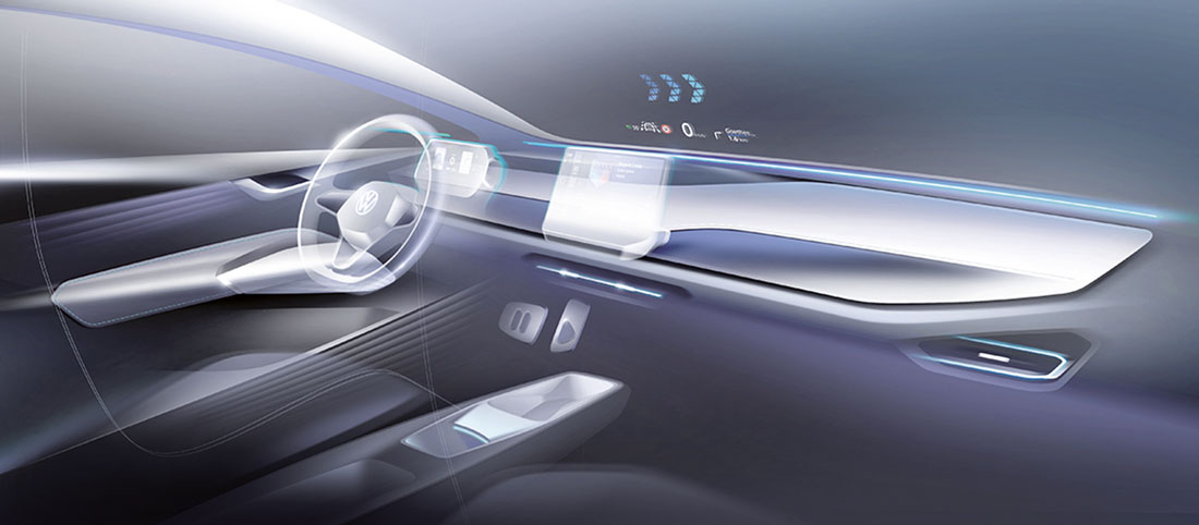
“A clean break with the past, a total transformation”. The conversation with Klaus Bischoff, head of Volkswagen brand design, at the style centre in Wolfsburg, began with an explicit concept: the task of the ID.3, the first electric car from the German manufacturer built on the Meb platform, is to revolutionise Volkswagen’s image and perception.
“From now on, we will be presenting products that make a clean break with the past. Everything changes, we will no longer be offering just cars, but mobility services”, says the German designer. A U-turn that has direct and evident effects on the design of the manufacturer’s electric cars, which Bischoff calls the “ID family” and of which the compact ID.3 is the founder member.
“The ID.3 inaugurates our new styling principles. The first, friendliness, recalls the past: the Beetle or our legendary T1 van, are cars that create joy and the ID.3 is no exception.
But this is no retro design operation. Quite the contrary, we chose a super modern style with few lines and meticulous treatment of the surfaces”. The second criterion is essentiality, achieved with a clean design without frills. Then there’s the logic: “The ID.3 will be used every day, so it’s rational and practical
The first steps in the creation of the car were taken at the beginning of 2016 and led in the same year to the presentation of the ID concept at the Paris Motor Show. “We managed to retain a lot of the elements of the initial project”, explains Bischoff. “Looked at from the front, the break with the past is obvious, but the car is still immediately recognisable as a Volkswagen”.
The new logo stands out on the front. Making its debut on this car, it will be backlit in the U.S. and China, but not in Europe: “EU regulations do not allow the logo to be illuminated in motion as it could be associated with advertising”. The two headlamps have smart LEDs whose luminous signatures form two eyes that can follow the owner of the car around: “How can you not find it cute?”, says Bischoff smiling.
Two upper and lower lines start from the front and wrap around the car, “just like on the original Beetle”. The design team chose black for the roof and part of the boot lid, creating the visual illusion of a lower car. The revolution continues in the interior where, if there were no logo on the steering wheel to remind us, it would be difficult to spot that you are in a Volkswagen.
(Full article in A&D no. 239)

