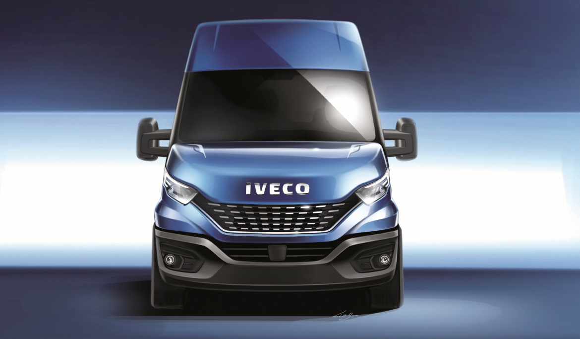
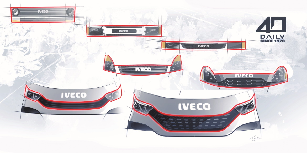
While user friendliness and flexibility have always provided the crucial design framework of light commercial vehicles for urban use, in recent years the more strictly utilitarian motivations have given way to considerations of aesthetic research. This process has affected to a perhaps even greater extent those models long present in the segment: the Daily, for example, born in 1978 and radically updated first in 2001 and then in 2014. “Eight from the start the idea was also to redefine the formal appeal of one of our best loved products”, comments Marco Armigliato, head of Iveco’s styling department.
Although this was a straightforward restyling operation, the development of the 2020 edition involved substantial preliminary studies. “It was very important not to undermine in any way the positive image built up in over four decades”, says Raffaele Vergano, Senior Designer Light Trucks.
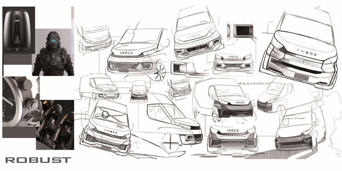
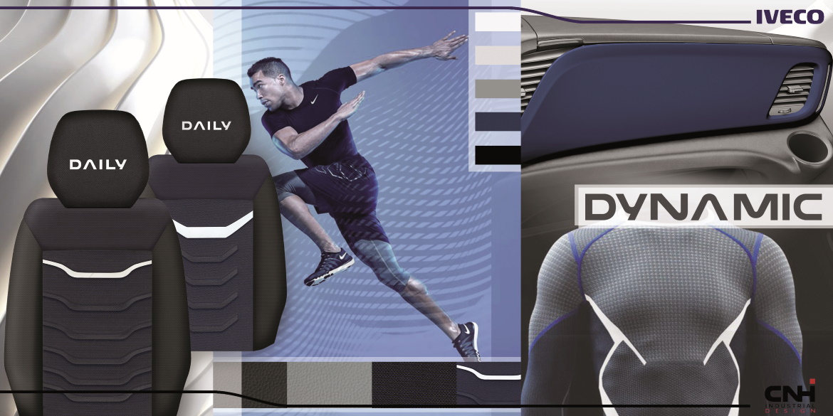
Among the aesthetic approaches analysed – Dynamic, Tech and Robust – the first, based on V-shaped lines, prevailed because it was seen to improve the front’s visual structure: “This original layout allowed us to generate a nimble, modern personality. It also allowed us to blend the bonnet carrying the Iveco wording more harmoniously with the lower section dominated by the bumpers. Previously, the two sections had been separated by a broad painted strip, which interrupted dialogue between the forms”.
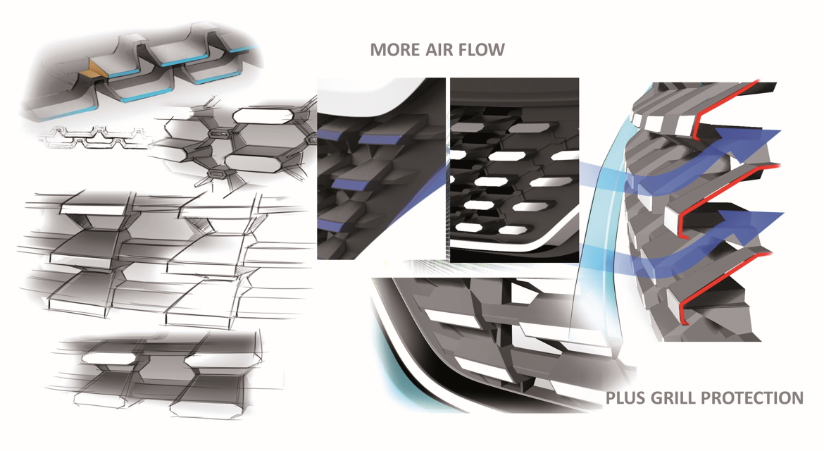
It is precisely this large front bumper that has undergone an interesting transformation involving a three-part structure, to reduce repair costs after traffic bumps in town, an aspect that is “solider, capable of transmitting the idea of protection” and, above all, an appropriate location for the automatic emergency brake radar. This last element, in fact, threatened to be in conflict with the wide lower step necessary on this type of vehicle, so that the driver can reach roof loads or wash the windscreen. Precision analysis of the mutual positions solved the problem.
Work on the details was no less compelling, particularly as regards the lighting which is now far removed from some of the uncertainties of the past (such as the curious matte finish of the previous direction indicators) and convincingly inspired by the most elaborate automotive canons, starting from the “fork” light guides.
While, finally, the tail appears to be completely unchanged, the interior is enriched by a new colour screen embellished with a chrome frame, to which are added updates for the steering wheel and slight trim variations. “We have managed to make the Daily fresher and more attractive without revolutionising it: an evolution in continuity”, concludes Armigliato.
(Full article in A&D no. 240)

