For a number of years now, León has been not only Seat’s best-seller, but also the conceptual inspiration, in terms of design, for other models cooked up in the Martorell workshop. In its fourth generation, and much richer in features compared to the previous ones, the León exploits its new dimensions and the resulting new proportions to offer a formal language to vehicles that will emerge in the next few years. “By simplifying the structure of our design”, Alejandro Mesonero-Romanos explains, “we have instilled the new León with a lot of elegance”. This time isn’t one of the happiest, but hopes are high.
Aligned with competitors
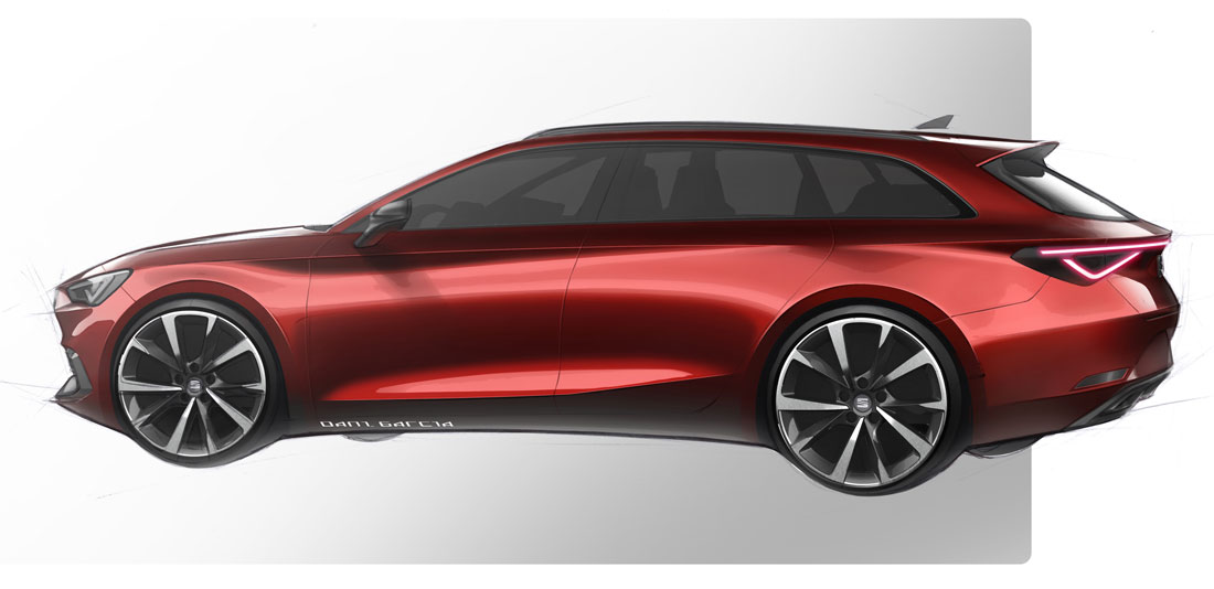
Mesonero-Romanos was, until last July, in charge of design for the Spanish manufacturer and the new León was created under his guidance. Based on the flexible MQB37 platform, the same as the Golf 8, the new León has practically the same width and height of the previous model, but is significantly longer: 86 mm in the 5-door version (4.37 metres) and 93 in the Sportstourer wagon (4.64 metres), which translates into a wheelbase that is 50 mm longer and, thus, into more space for the passengers. Mesonero-Romanos admits that those dimensions were a challenge for the designers. “Now, however”, he adds, “we are aligned with the direct competitors in the C-segment”.
Atemporal Design
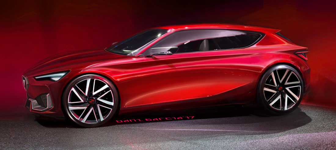
The first drafts date back to the end of 2015, through the typical competition between all the designers. The winning proposal for the exteriors was that of Dani Garcia, who would then have a key role in the team led by Joaquin Garcia. About 85% of the work was done digitally, with foam models before the three clay ones that would lead to the final solutions. “All three had a very similar philosophy, which was refined right from the sketches and the first maths work, one was more extroverted, with more pronounced features, another had more subtle and elegant lines, but, in the end, we found the right balance between elegance, character, sportiness, with an atemporal design that is simple, yet enduring”.
Vertical front end
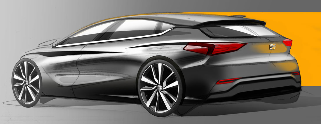
It isn’t always simple to inject elegance and sportiness into a compact segment, but the Martorell designers managed through a strong conceptual evolution that plays on a strong character and cleaner lines. Let’s take, for example, the strong three-dimensional connection between the grille and the LED light units pushed backwards; or the bonnet that gives more verticality to the nose; or the A-pillars, pushed backwards to increase the vehicle’s front proportions. The León’s dynamic personality is also expressed in the tail lights that stretch, as people say now, “from coast to coast”.
Few lines and light effects
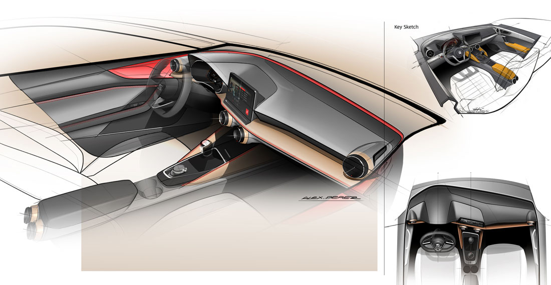
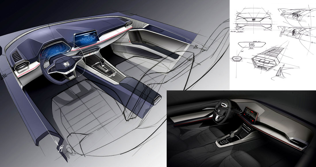
On the sides there are, in fact, just three lines: one from the bonnet, one from the back end, and one low down: “In the previous León, the surfaces served to join the lines, here we have, instead, a continuous surface with lines that place it under tension, providing a thrust capable of giving a change in light”. The simplicity is also clear in the interiors that were initially developed by David Jofre who then was part of the team led by Jaume Salas (C&T in the hands of Francesca Sangalli and Jordi Font). They are distinguished by unusual lightness, by a functional minimalism: a high waistline, a very fine, partially floating, dashboard, turned towards the driver, which adds a sense of protection to that of lightness.
Ergonomics and colour
And then the ergonomic precision, for the comfort of the passengers, just like the choice of materials. “As with the exteriors, the interiors also offer a strong identity through a conceptual simplicity”, Mesonero-Romanos observes. There is also a reference to the city in which this car was born, Barcelona, and to its main thoroughfare, the famous Diagonal: on the central screen, the items are organised diagonally.
(Full article in A&D no. 244)

