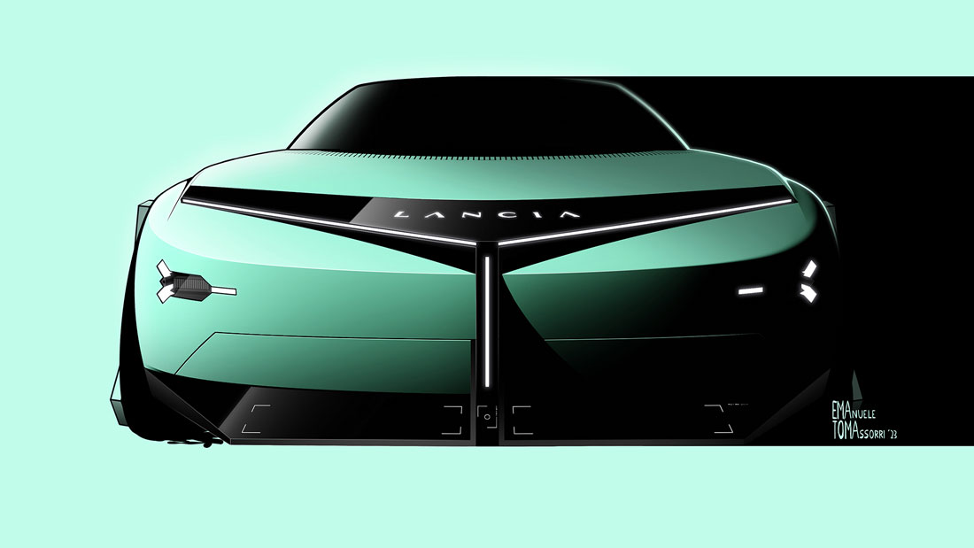
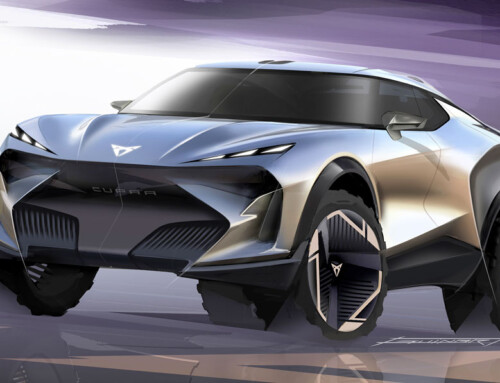
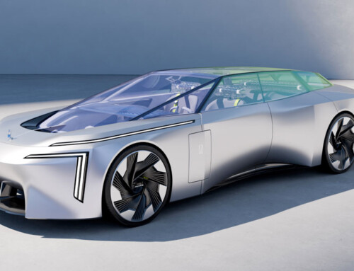
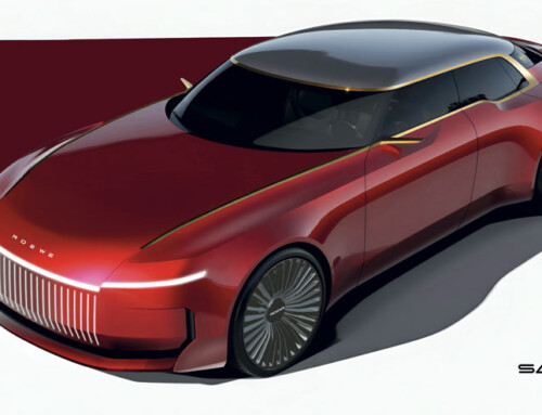
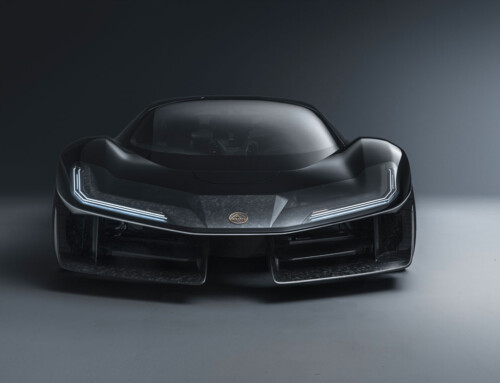
How do you pick up the threads of a century-old narrative? After years during which Lancia has been content to wallow in its home market with nothing but the Ypsilon, the decision to re-enter the global market has given a touch of urgency to this brand story revival. “We started from the speedform introduced in November, that we called Lancia Pu+Ra Zero, where Pure and Radical are part of our design language”, explains Jean-Pierre Ploué, head of Stellantis design as well as of Lancia design. “In recent months, we have evolved it, integrating some features already in production, without betraying its incisive spirit. And we have used a number of key features from the past”.
A dialogue between epochs
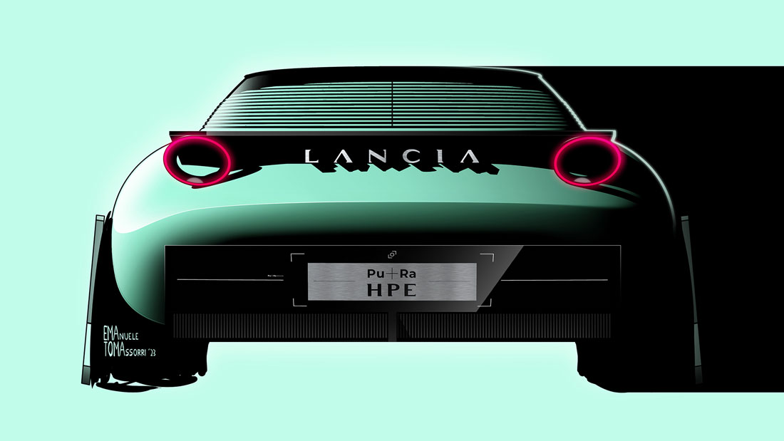
The give-and-take between different eras was a great stimulus. While from the word go there are some explicit nods to the Stratos (the round tail-lights) and the Flaminia Coupé (whose historic Vincennes Blue resonates with today’s Progressive Green), the name itself makes a deliberate allusion to one of the Beta variants (with the E of the original High Performance Estate being given an Electric twist), inspiring the horizontal slats on the rear pillar. The company calls this solution a “Venetian sunshade structure” and this in itself implies a subtle reinterpretation of expressive signs from another era. But Ploué really catches us off guard when he argues: “The geometric shapes on the car body, starting with the circle pattern, are inspired by the simple, elegant forms and the harmony of proportions of neo-classical Italian architecture”.
References to myth
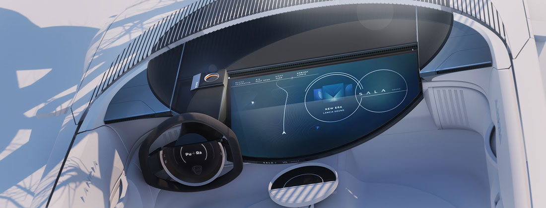
Although the porthole on the roof shares features with the iconic dashboard of Mario Bellini’s Trevi (1980) or the windows of Bertone’s Sibilo prototype (1978), the focus on clean-cut motifs also originates in “the desire to stand out clearly from the DS brand. In French cars there is a feeling of sophistication, almost as if the car had something haughty about it; here we were looking for “effortless refinement”, class arising from the absence of superstructures, pure and radical style in a word”. The intellectual vibe of the exterior seems to encapsulate an interior where the organic relationship between the parts triumphs, starting with the excellent contribution of Cassina’s furniture.
Colours and materials
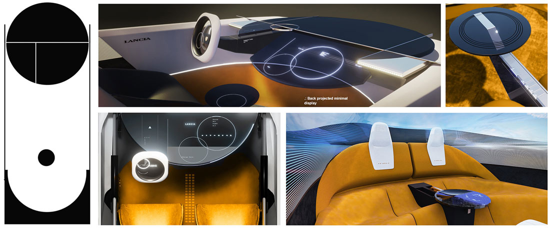
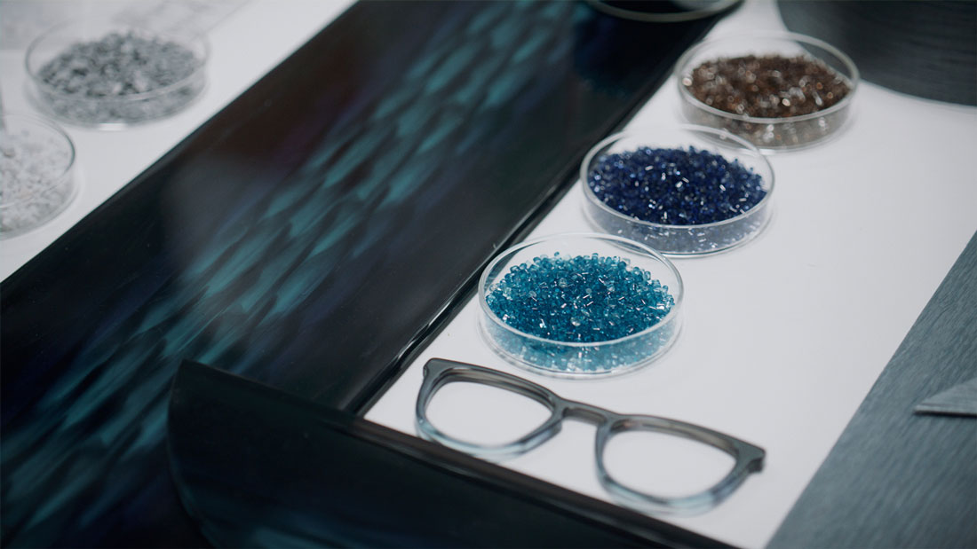
“Rarely have I worked on such a cohesive project”, says Rossella Guasco, who after a long stint in the Group’s colour and materials department is now its vice president. “Everything is amalgamated: from the ecologically certified ochre velvet seats, to the incredibly lightweight Mar/more marble powder coverings, the sustainable Tabu wood from the Biodiversity collection, the nubuck suede and chrome-free tanned leather from Poltrona Frau and the acetate tables from the Mazzucchelli company. What’s more, 70 per cent of what you touch is recycled”.
Eclecticism and interior design
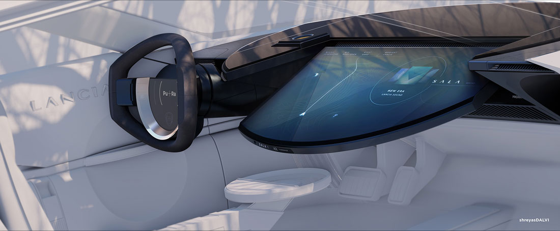
The result as the company defines it is an “eclectic” picture that indulges in a mix of influences and a general “home feeling” complete with wool carpet. Interestingly, this attempt to blend Lancia comfort in with the “domestic” trends of modern interiors does not compromise the automotive references: the beautiful front seats, for example, mimic the backrest of the Maralunga armchairs of the Como furniture manufacturer, while at the same time recalling the oblong headrests and overall layout of the Beta HPE.
Previews of future models
“Many of these interior details will find their way into the 2024 New Lancia Ypsilon”, smiles Ploué, who even goes so far as to indicate the pull-out coffee tables as candidates for the production line. And he also mentions: the fabric used for the seats, the absence of chrome trim, the semi-circular dashboard (but with no moving parts) and, for the first time in the group, the S.A.L.A. infotainment system equipped with Chamaleon and TAPE predictive functions.
(Full article in A&D no. 261)

