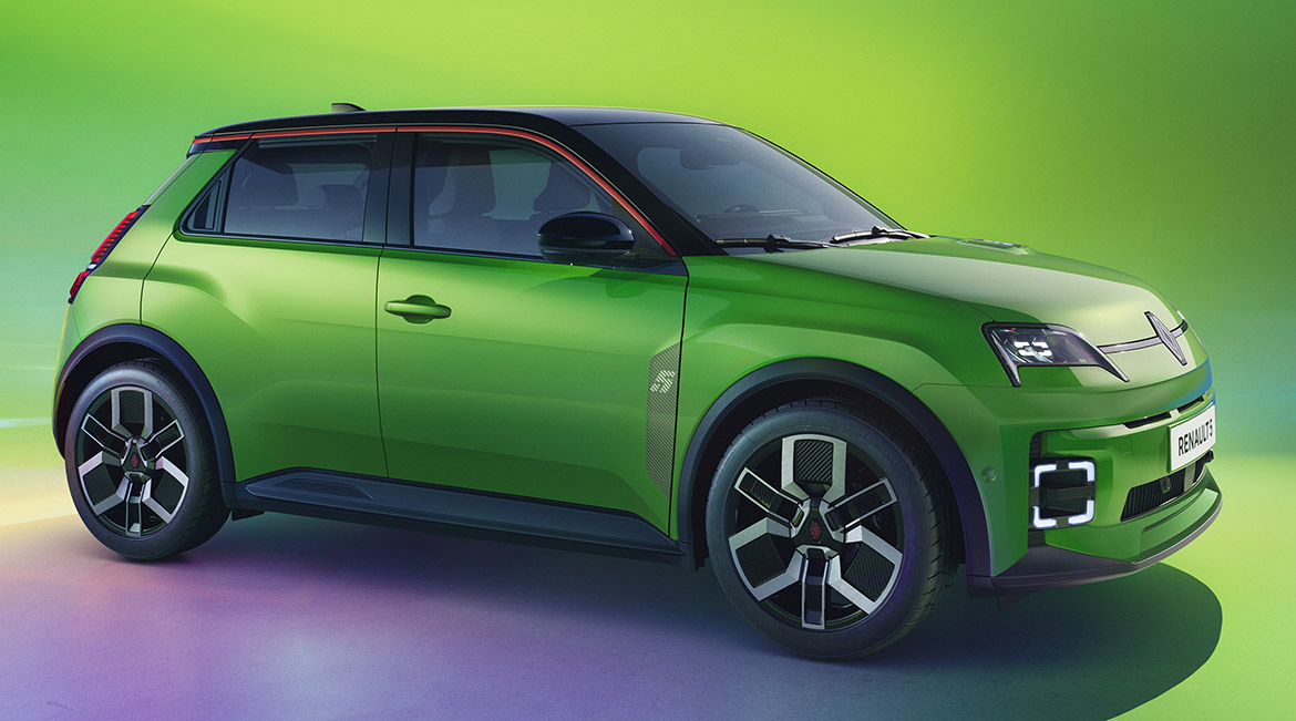
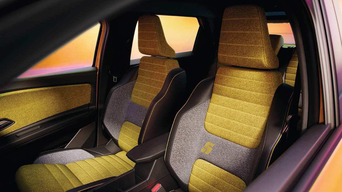
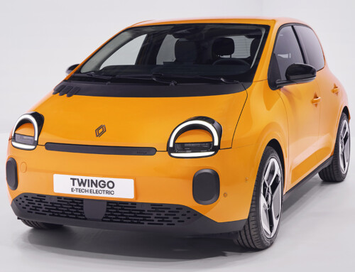
When Renault designed the “retrofuturistic” Renault 5 small EV (complete design story on Auto&Design no.266), it paid as close attention to the user interface as it did to the hatchback’s proportions, stance and interior. The reason? “The Renault 5 is an icon for Renault, so we wanted to do something special,” said Marie Guillaud-Blaise, lead designer experience at Renault Group. The goal was to make the car much more than an object to get from Point A to Point B, she said.
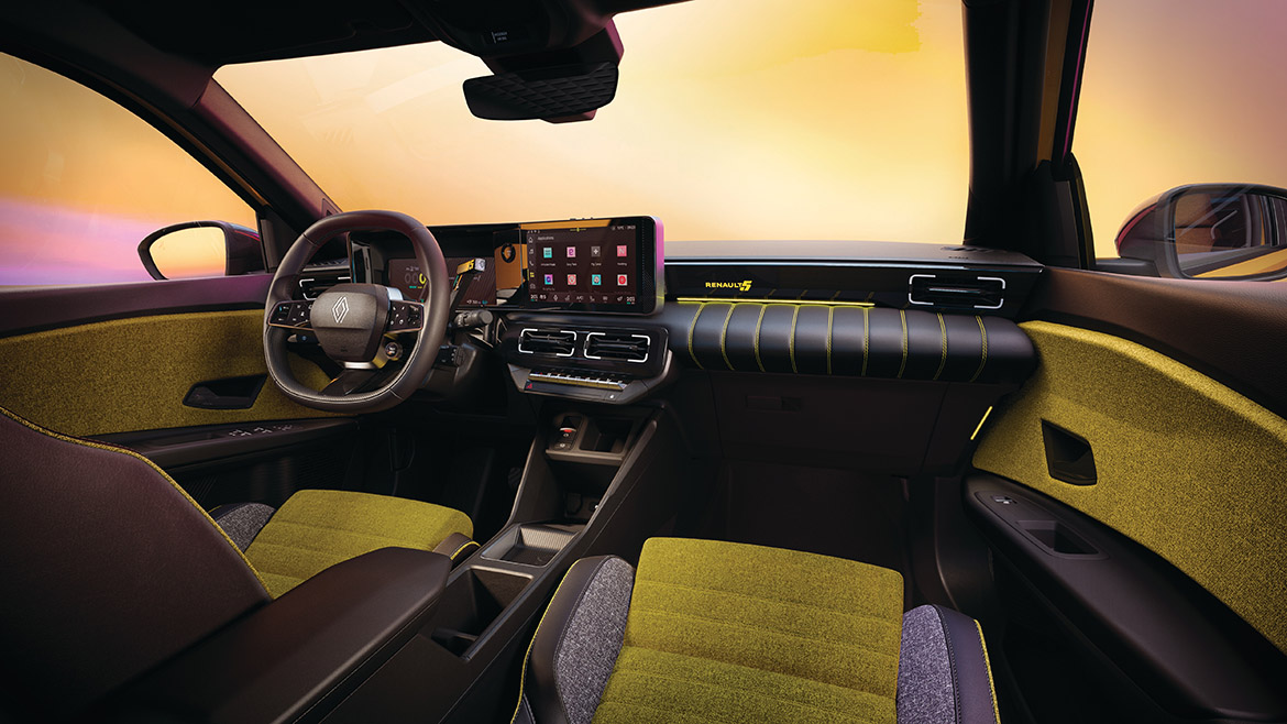
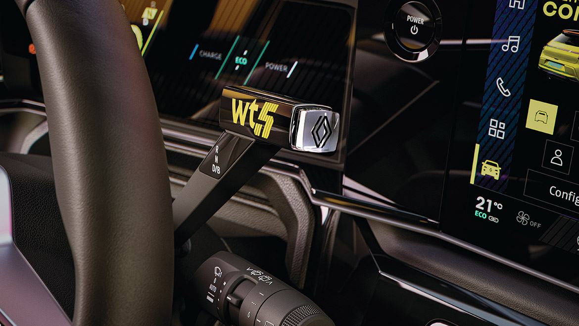
“Special” means that the Renault 5 has its own graphics, with more than 200 combinations of colors, patterns, densities and drive modes that users can customize their digital instrument panel and adjoining touch screen. “You can make the R5 your R5,” Guillaud-Blaise said. The Renault 5 interacts with drivers and passengers through the latest generation of the automaker’s OpenR-Link system, which is based on Google’s connected services such as Maps and voice assistant. Users can also download about 50 dedicated apps. Two screens — each 10 inches wide — are arranged horizontally in front of the driver, rather than the upside-down “L” shape of other recent Renault cars.
The screen in front of the driver conveys information about the vehicle, including speed in colorful alphanumeric characters rather than traditional dials, and a detailed 3D rendition of the car. The touch screen to the right is reserved for infotainment and comfort functions. The Renault 5 also marks the debut of Reno, Renault’s on-screen avatar that flits around the screen, responding to questions posed in natural language and offering suggestions for comfort, navigation and entertainment. Reno incorporates a friendly blue face, inside Renault’s yellow lozenge logo. Two hands float independently on either side of the avatar. “It’s somehow comforting to have something small to talk to,” Guillaud-Blaise said, describing Reno as a traveling companion that makes journeys easier and more pleasant.
Renault designers turned to another aspect of the lozenge when creating graphics for the user interface. The new, two-dimensional “nouvel R” logo that debuted in 2021 has a 28-degree diagonal angle, and the Renault 5 team used that figure throughout the graphics to convey speed, movement and dynamism. For example, state-of-charge bars lean forward by 28 degrees, as if thrusting themselves ahead of the driver. The graphics also make liberal use of the Renault 5’s “pop” colors, bright yellow and bright green, which recall the 1970s hues of the original Renault 5. Colors can be combined with 10 different patterns and four drive modes — Eco, Comfort, Sport and Perso — to create 224 possible combinations. This helps to make a personal connection between the car and driver, said Guillaud-Blaise and Renault design director Gilles Vidal. Another way to cement that connection is a lighted charge indicator on the hood in the shape of the number “5,” where an air vent was located on the original Renault 5. “The car can express itself on its own,” Vidal said. “It’s a real delight. That’s what gives spice to life.”

