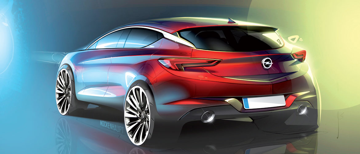
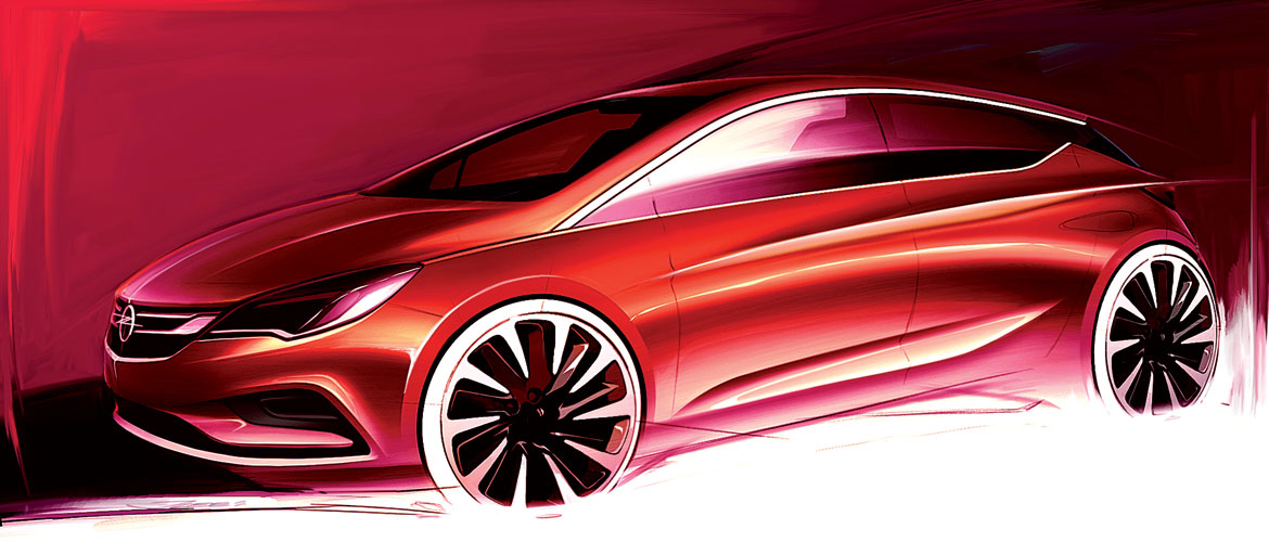
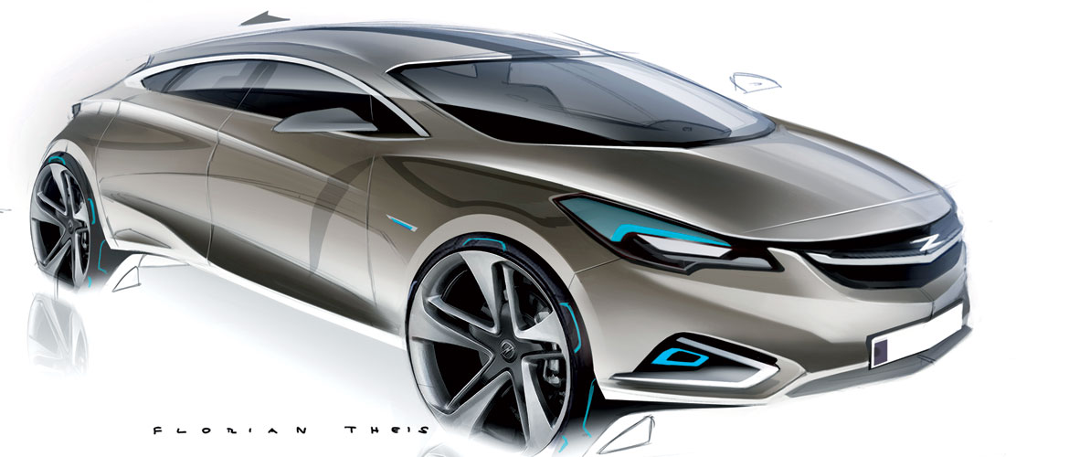
“We took the Astra to the gym, to make it lighter, more efficient and more dynamic and give it athletic power” begins a smiling Mark Adams – design vice president of General Motors Europe – as he admires the latest arrival in the Opel family.
Designed entirely at Russelsheim from a blank sheet of paper, with an efficient body underpinned by an all-new platform, the new Astra interprets the evolution of the brand’s style philosophy towards a theme of: “Sculpture meets German precision”. The soft volumes and sensual lines creating an emotive bond with the user are a legacy from the Monza Concept – the manifesto of Opel’s new design language.
“Monza was a true show car, a portrait of the formal coherence of our design direction, and a concept with strong DNA destined to influence our entire future range”, explains Mark Adams. “Astra is the beginning of a new path, which evolves the previous generation with fresh new elements in keeping with this philosophy, and we are very proud of the harmony and flow of this car.”
Astra is now more muscular, compact and light. “To keep weight down, we also made the tyres smaller – continues Adams – a solution that is never particularly appealing to a designer, but which was offset by visually reducing the entire mass of the body, so that wheels are still to scale.”
“The greenhouse line ends sooner, and we created a floating roof effect by applying dark plastic trim to the pillar which simulates glass, extending the perceived length of the flank towards the rear”, says Mark Adams.
Chief exterior designer Uwe Müller explains how the front view is perfectly balanced and has been made to appear broader than the previous model by “a chromed connection formed by the two parallel lines, which include the badge and cross the full width of the grille horizontally at the top to then join the silver line describing the headlights, with their distinctive wing shape”.
“We wanted an aerodynamic, sleek car, so we focused particularly on the treatment of the tail which, with its sculpted, soft volumes could have seemed contradictory. So as well as the spoiler, we also introduced sharp corners to direct the air at the sides of the rear screen and at the front edge of the ‘simulated glass’ in the C-pillar”, continues Muller.
In the side view, the sculpted centre portion is framed by two distinct lines – with one cut through the flank and joining the taillight, and another at the base pushing the sill outwards. The beltline, on the other hand, joins the headlamp, creating a sense of continuity which accentuates the car’s road presence.
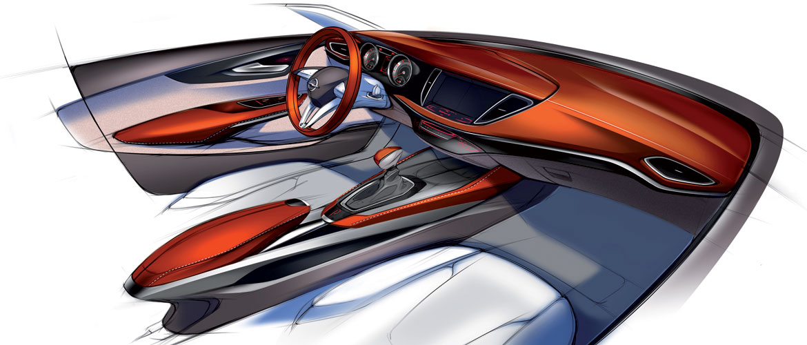
“For the interior, we worked with almost the opposite goal we had for the exterior, to maximise perceived space”, says Mark Adams. Occupants are welcomed with comfort, space and refined materials, and with a sense of protection offered by the tall beltline, while improved visibility – achieved by moving the side mirror lower down on the door, reducing the thickness of the A pillar – contributes to a greater impression of control.
The dash continues the horizontal theme of the exterior, with lines echoing the slender, precise lines defining the grille.
Possible sources of distraction for the driver have been minimised by placing the display high up on the dash to facilitate access. “Our approach was dictated by the saying ‘keep your eyes on the road and your hands on the wheel’”, explains Adams.
“No less importantly, we wanted to democratise technology with this car, bringing high-tech solutions typical of premium brands to the customer.” Astra therefore paves the way for innovation by offering OnStar (the first car to do so in Europe) – an active and passive driver assistance system, and a 4G WiFi connection capable of serving up to seven devices simultaneously. An extraordinary choice of premium features for a car in this segment.
Full article in Auto & Design no. 216
[tz_plusgallery id=”7″]

