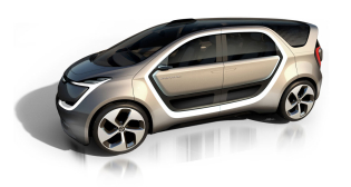
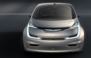
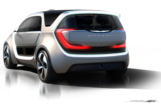
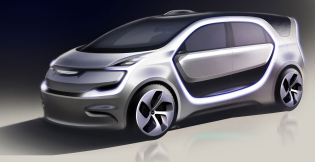
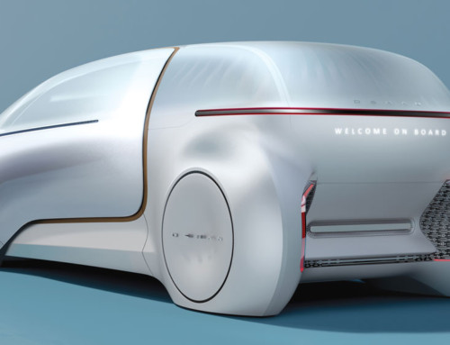
Unveiled at CES 2017 in Las Vegas, the Chrysler Portal concept is a look at future autonomous transport designed specifically for the growing millennial demographic. It’s only right that a team of millennials designed it as well.
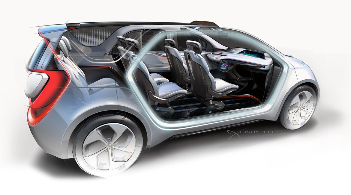
The Portal is a monovolume vehicle that packs a connected, reconfigurable interior space into an exterior package that is 610mm shorter than the existing Pacifica. And, as most recent concept cars professing to embody virtues that appeal to the millennial demographic, it was designed from the inside out.
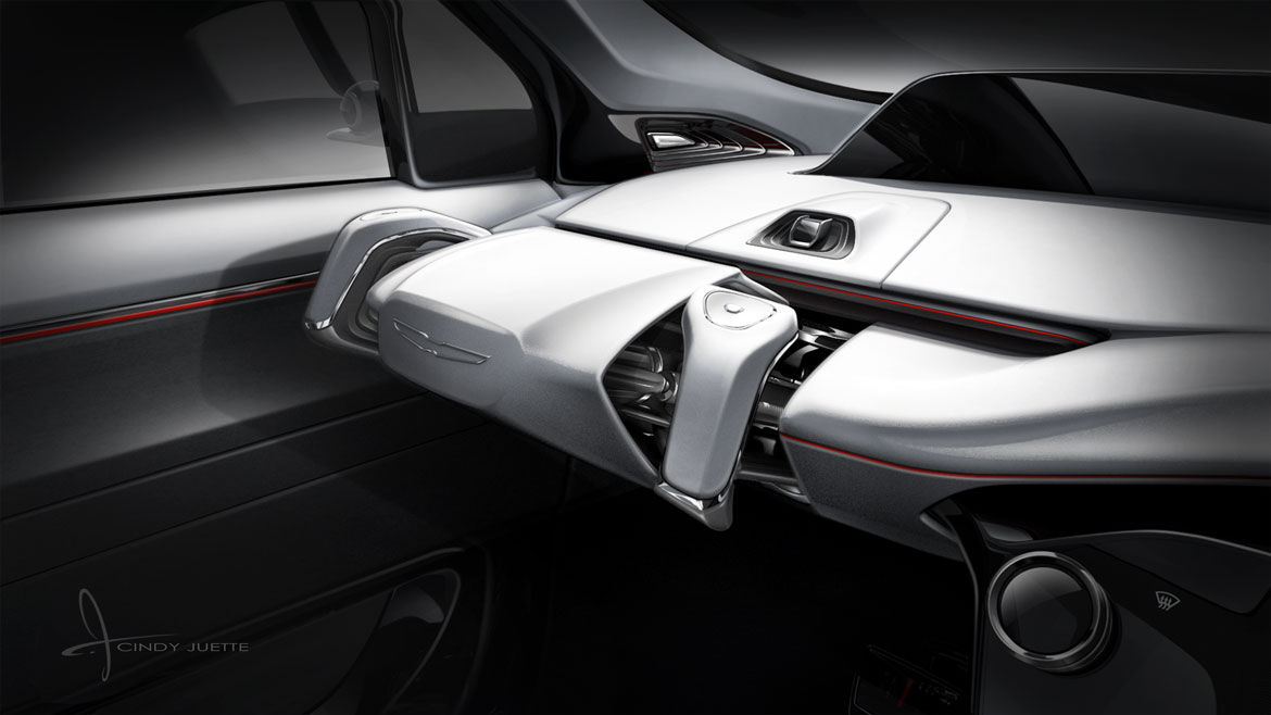
“We decided not to treat it as a conventional automotive enclosure,” says interior designer Cindy Juette. “The idea was that it was a third space, not just a car. The vehicle enables the user to decide how they want to use the space.”
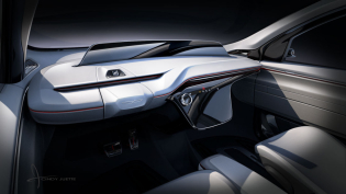
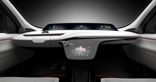
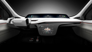
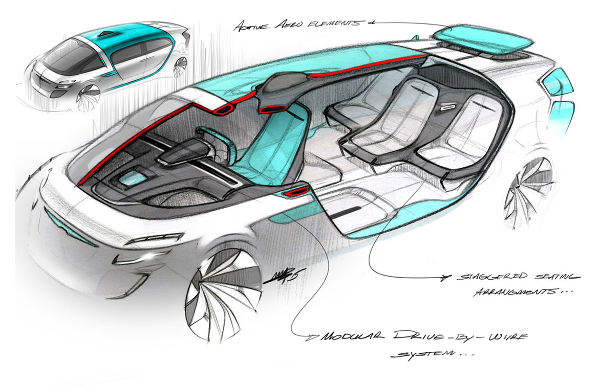
The main focal point of the interior is the instrument panel, which floats between a dark lower pedestal screen and wraparound high-mount screen separating the space like freestanding furniture.
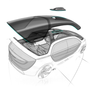
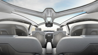
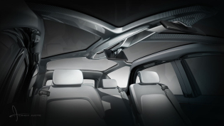
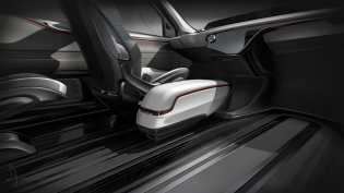
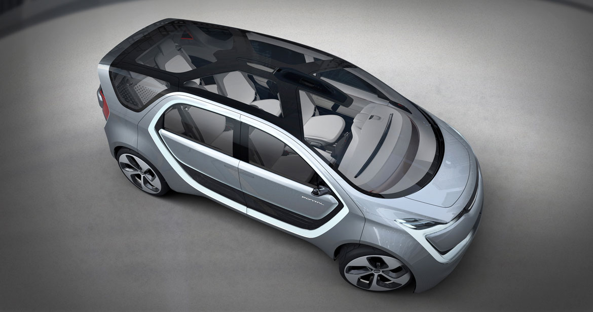
The whole interior has a contrasting hard/soft, dark/light dynamic, which starts with the IP and is carried through to other elements. The hard rear shell on the comfortable seats bridges the gap between utility and luxury, while a skylight roof floods the interior with natural light and balances the dark screens and acrylic floor.
Created by blending sweeping forms with neutral color tones and cossetting yet durable materials, the concept offers users a number of options within its modular interior. Tracks on the floor accommodate modules that can be configured for seating, features and software, and adapted to suit the user’s needs. “The idea is that the space grows with you,” says Juette.
As a nod to the car’s environmentally friendly attributes, the designers also decided to utilize sustainable materials. Everything that’s wrapped and looks like leather is actually PUR vinyl, a recycled material.
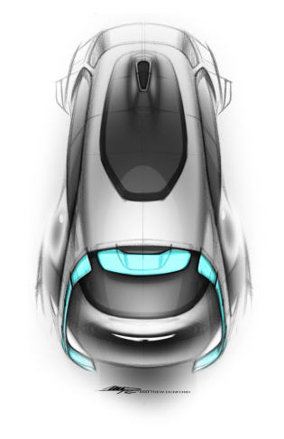
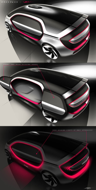
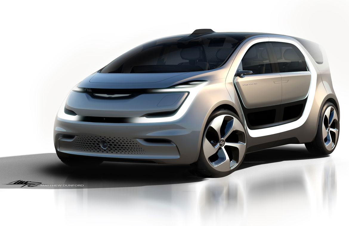
“With this car we really wanted to balance the volume and give the car an athletic, poised stance,” says exterior designer Matt Dunford, citing the importance in denoting stability in the eyes of the millennial generation while also steering away from the flat look of functional vehicles.
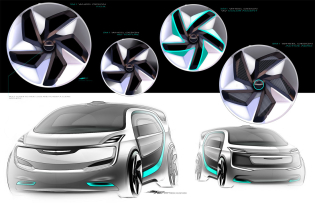
The designers therefore sought to create a seamless “aero-dramatic” exterior design, with flush body panels and minimal offsets. Instead of hiding the electric, autonomous technology, designers put it up front: a pixelated area in the lower front bumper becomes the focal point of the front end, a theme that’s been repeated around the car.
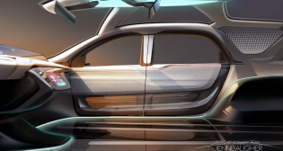
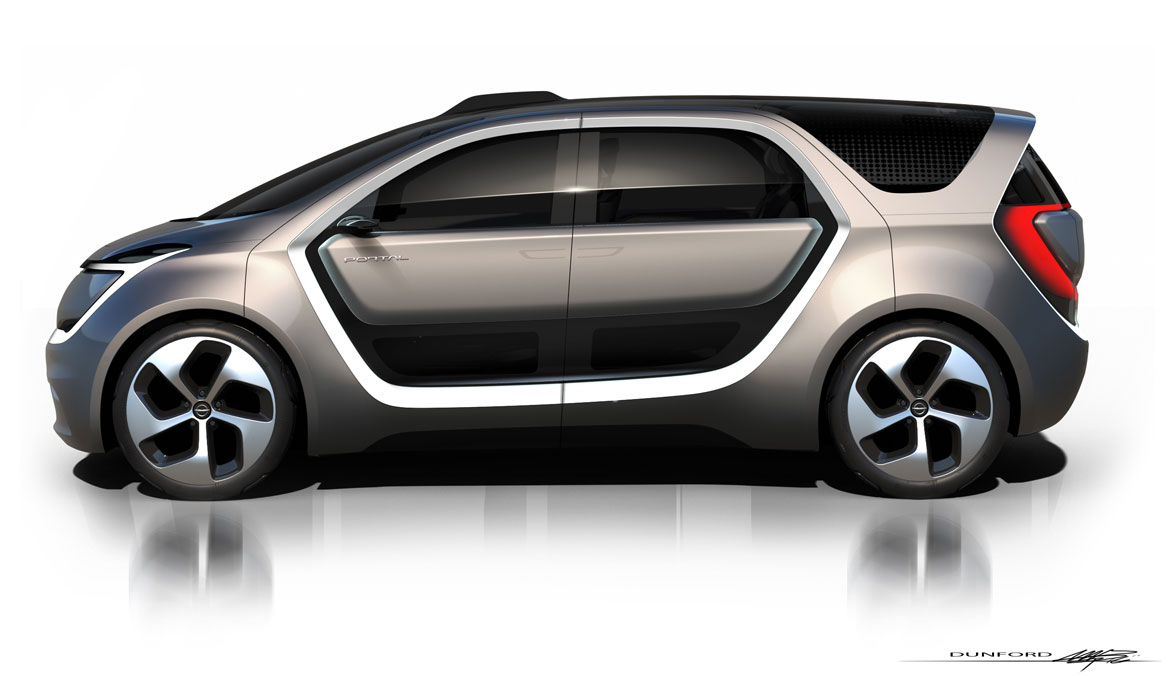
The defining element is the portal shape around the doors, a theme that’s kept alive in different ways through the exterior. In combination with the lighting and blacked out graphics, the portal theme represented a fresh take on the front end, says Dunford. “It’s something that the Chrysler van can lean on in the future.”
The rear end carries over the portal theme of the bodyside and again acts as a functional aspect of the design. It enables the car to communicate with other vehicles and can be seen from far away. “That’s what drove the shape and the design,” says Dunford.
Full article in Auto&Design no. 223
