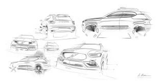
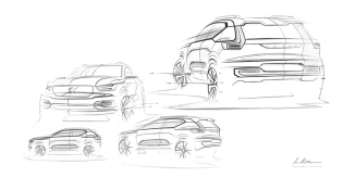
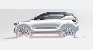
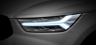
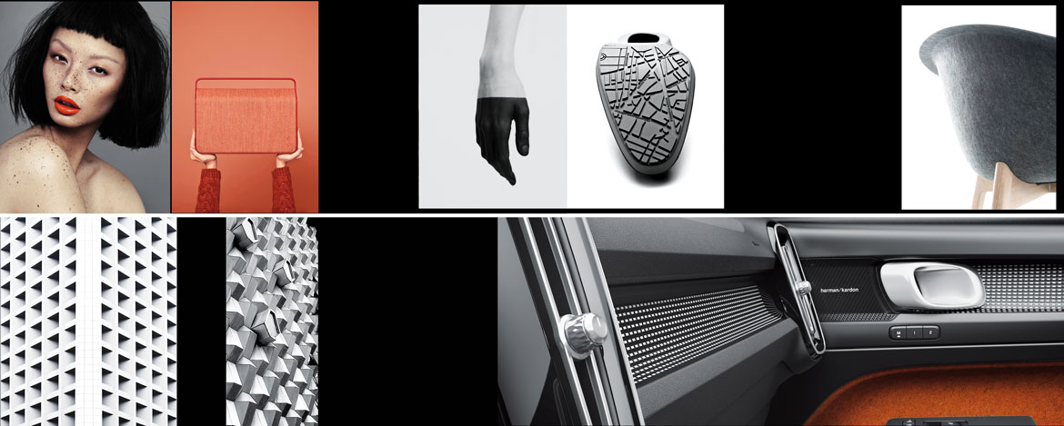
Fashion, art, architecture and contemporary culture all coexist in the unconventional spirit of the Volvo XC40, “a premium car, but in a different way”, as Robin Page – Senior Vice President Design Volvo Cars – likes to say. Iconic and with a strong expressive identity, it reaps the benefit of a creative process inspired by multiple sources, mostly non-automotive.
“When we started imagining the XC40 – unprecedented for our range, as well as the first Volvo to use the new compact modular architecture (CMA) developed with Geely – we chose to work outside of the box, break out of the mould and create something special. A car capable of expressing our DNA and our stylistic principles through its own unique personality”, says Robin Page.
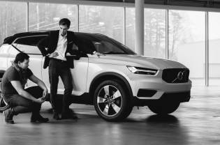
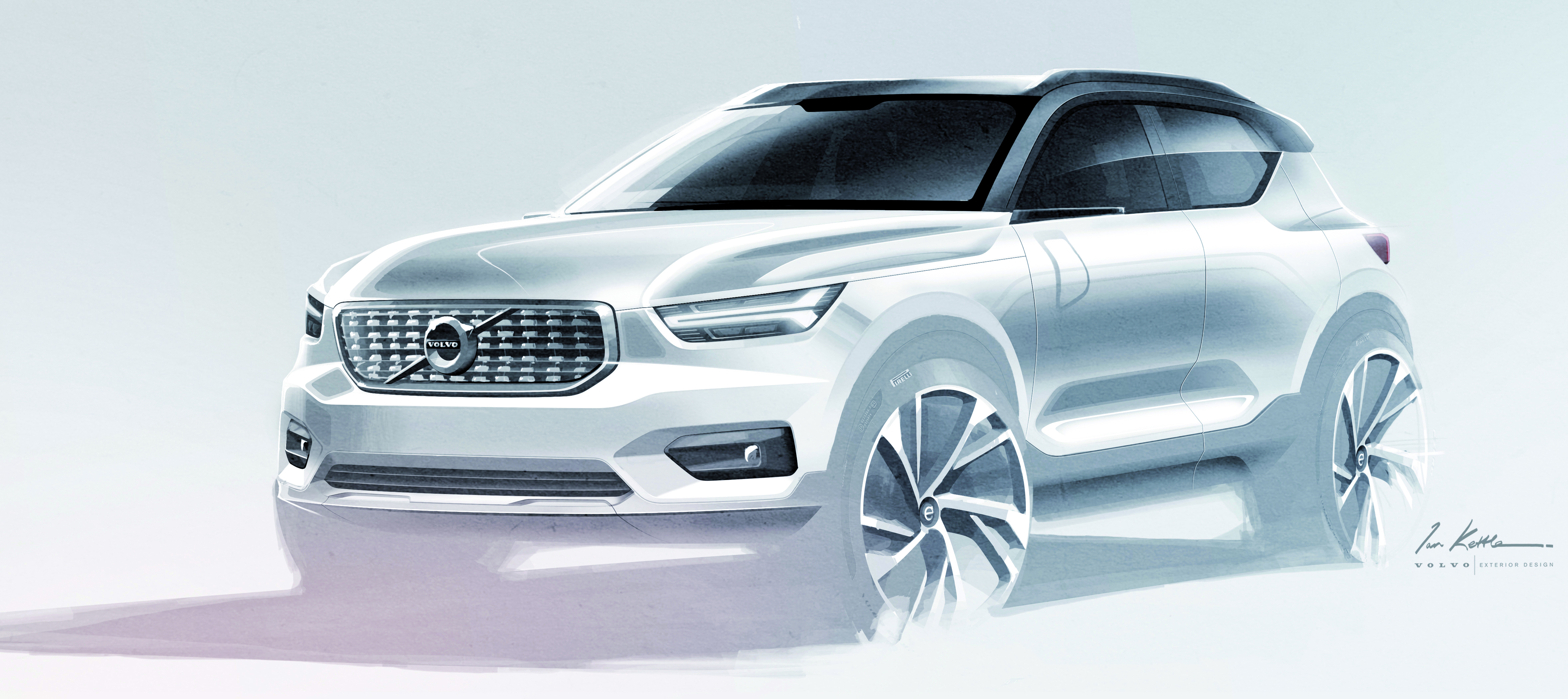
The project, which got underway in 2013 in parallel with that of the Volvo XC60, took its first steps with an in-house competition that generated eight proposals for the exterior design, from among which that of Ian Kettle, lead exterior designer of the project, was chosen.
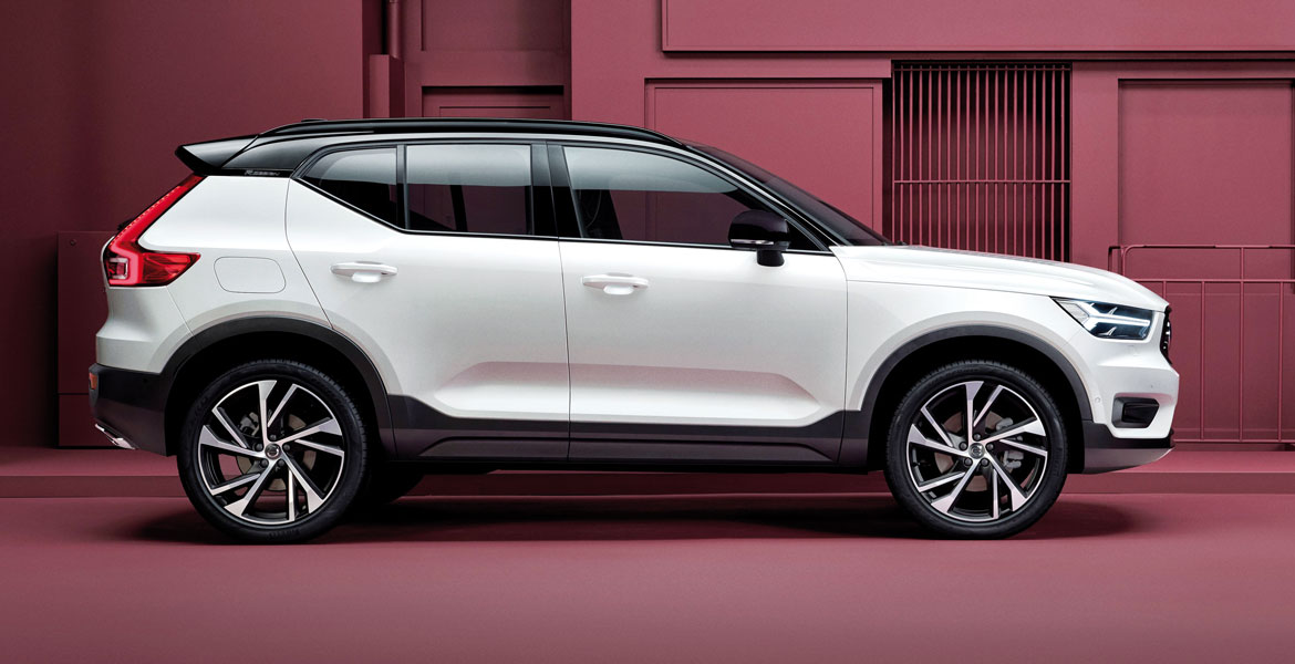
“The distinctive features of the XC40, such as the graphic shoulder solution that, thanks to the clear line cutting the C-pillar, makes it easier to construct the colour-contrast roof, were immediately clear”, explains Maximilian Missoni, Volvo’s exterior design director.
Now two years ago, after addressing a total renewal of the styling language and range, which saw its first expression in the decisive, recognisable design of the XC90, “when it came to the XC60 and XC40 we acted with strong aesthetic coherence and respect for our new design criteria, but interpreting everything on the basis of profoundly different visions. Dynamism and athletic power for the first, grit and compact volumes for the second”, continues Missoni.
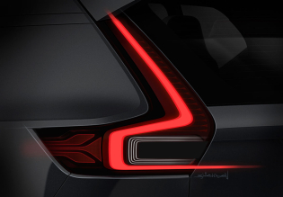
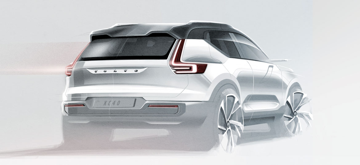
The Volvo XC40, with its solid, muscular forms pointed up by negative surfaces that play with light, is also characterised by iconic graphic features, such as the silhouette and its marked profiles, the handling of the rear window and that of the beltline that climbs diagonally and connects with the pillar.
The front has an eye-catchingly sharp and determined look. “We often try to compare front view aesthetics with the physiognomy of an animal, in order to focus on the expression we want to achieve. For the XC90 we had a lion’s face in mind, while for the XC40 the animal that seemed most suitable to us was the British Bulldog, and I would say that it was the right choice”, smiles Missoni.
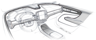
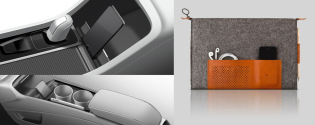
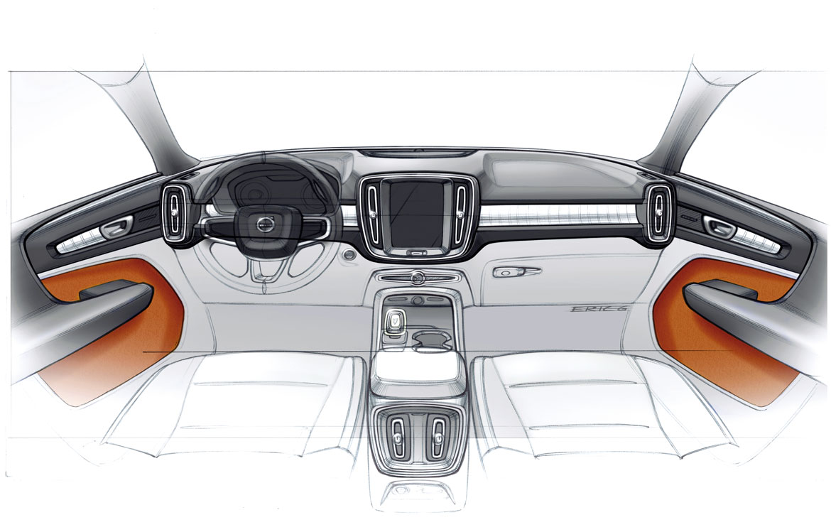
As for the interior, the project for which was headed by Eric Gunnarsson Hörnsten (lead interior designer), classic materials give way to red-orange felt 97% made with recycled plastic bottles (also used in the carpets, a solution inspired by the Concept Estate), the metal printed with diamond-shaped patterns and soft touch plastic that reproduces a map of the city of Gothenburg, the Swedish company’s home town, on some parts of the dashboard.
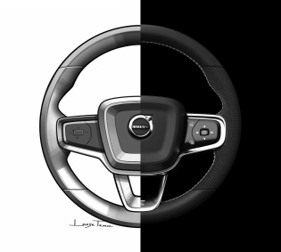
Once again, the dashboard architecture puts man at the centre, as dictated by the new Volvo philosophy, which benefits from the technological solutions already seen on the XC60 and from a clean, minimalist design because “to express itself, good design does not need to scream or be brash, but to be clear and get straight to the point”, comments Page.
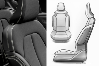
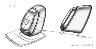
Thanks to an in-depth market investigation into how people behave in cars, the team was able to design the whole user experience by integrating user needs, desires and habits. The result is interior space that is organised with innovative and intelligent solutions worthy of the best product design, with multiple modular storage compartments designed specifically for every need. Having everything under control, safe and at your fingertips helps you focus full attention on your driving, and safety has always played a key role for Volvo.
Full article in Auto&Design no. 228
