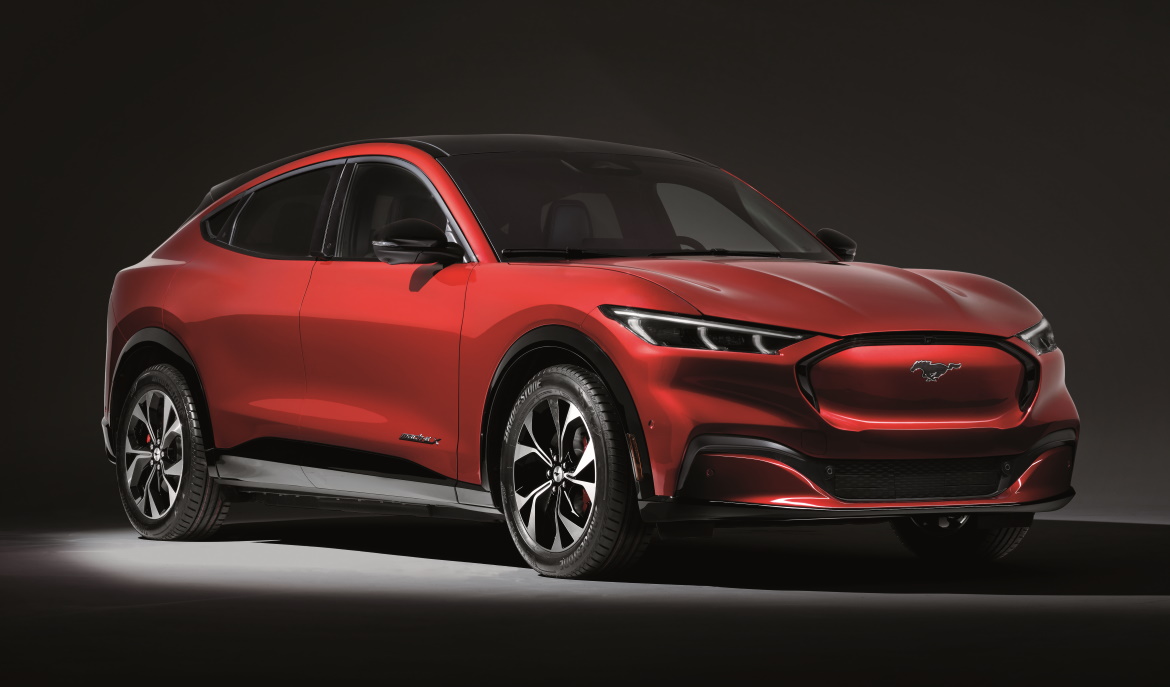
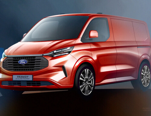
There are cases where the best option is to backtrack and rethink a project from scratch. This is what happened to the Ford designers of the Mach-E, an electric SUV of dynamically attractive proportions which styling-wise ran the risk of being – in the words of the designers – a practical dustbuster. In the summer of 2017, the Dearborn team had presented a model that responded to the initial brief requesting the first electrically-powered car in the history of the Blue Oval. “The top management were not convinced, they didn’t think it was representative enough for Ford and they asked us to pull out our strength as a company and completely rethink the project”, says Joel Piaskowski, Global Head of Design Cars & Crossovers, North America.
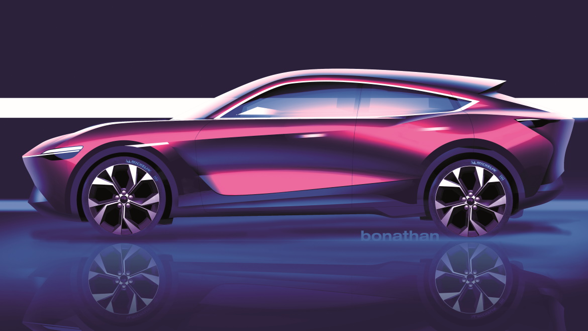
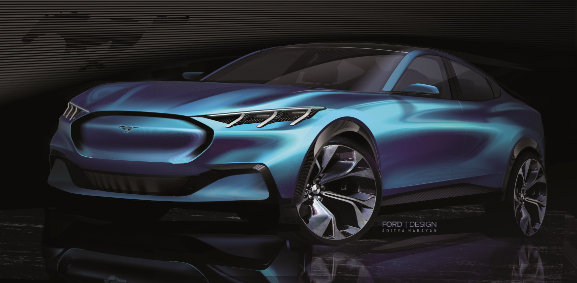
So new horizons were explored and the reference vehicle soon became the Ford that best expresses passion and strength: the Mustang. “The way was open for fantastic new body proportions”, continues Piaskowski. “We increased the wheelbase, upped the dash-to-axle distance and lengthened the bonnet. And in particular it was the visual profile of the vehicle that proved to be the winner, the way we used the black panel along the descending roof to create a much more fastback silhouette. More Mustang”.
The team was fully involved. Jason Castriota, now Global Brand Director BEV and part of the Edison Team, dedicated to Ford’s electrified vehicles, explains how the design approach changed totally when the project was restarted: “I was chosen as the new chief designer and together with Chris Walter (exterior designer, Editor’s note), and the engineering, marketing, and communication teams, we set up an “energy room” to identify the type of vehicle we really wanted to make”. “We had the opportunity to design a more exciting car, putting to good use a heritage and a passion for the car dating back 55 years”, adds Gordon Platto, Design Director North America.
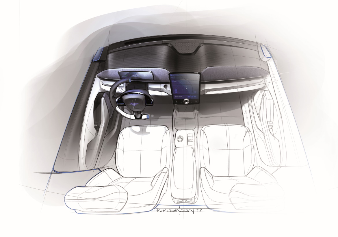
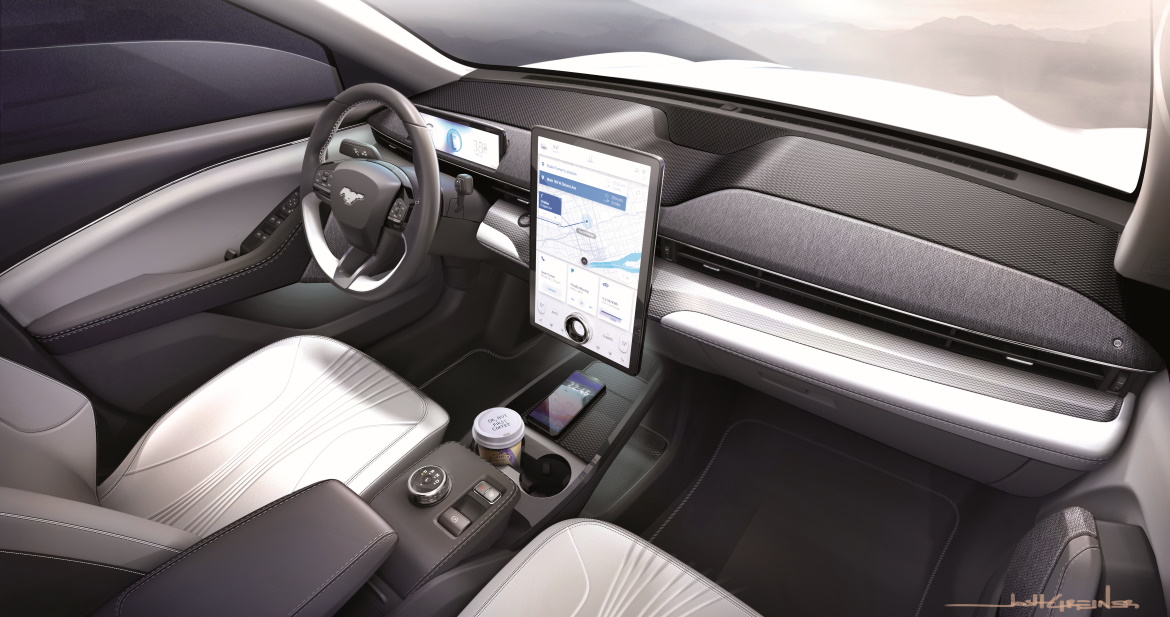
The three-bar design of the front and rear light clusters is another clear Mustang citation, a link that can be seen inside the car in the three-spoke steering wheel and the dashboard with the double-brow top line. On board, every detail is a direct consequence of the human centric approach, explains Rachel Robinson, who was responsible for defining the interiors together with her colleague Josh Greiner: “We did global research in the three major regions, America, Europe and China, with a simulator to see how potential customers behaved and interacted with the environment. Many people, for example, don’t like putting their bags on the floor, and that’s how the storage compartment came into being in the centre console, under the armrest”.
“We thought we had found gold with all the ground space given by the flat floor, but this was not seen so positively by users. We risked not doing the right thing”, adds Platto. The same was about to happen with the HMI screen, which was originally designed in a 12″ format. This was one of the many elements defined with Edison Team inputs.
“From the studies carried out in China we realised we would not be competitive”, notes Castriota. The result was a large 15.5″ display showing multiple functions without having to “browse” through screenshots. “This became the focal point and allowed us to keep the dashboard simple, without too many buttons”, Robinson said.
(Full article in A&D no. 240)

