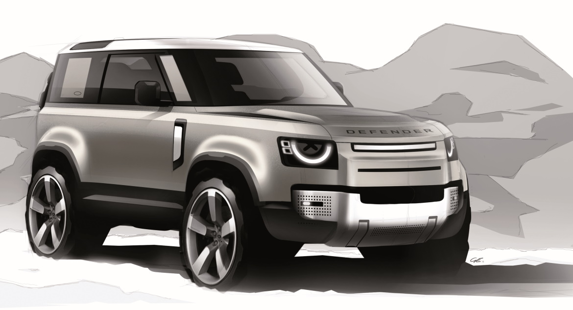
It’s up to the market to decide whether the new Defender is, as Land Rover claims, “an icon reinvented and instantly recognisable” – that is, the new, natural heir of an all-purpose vehicle that has basically remained unchanged for 70 years. In any case, the long wait is over: the secrecy that, for a long time, has enveloped the creation has given way to images of a modern car with an attractive design. It is a design with character, even if it is less spartan than its predecessor. “We’ve found the right formula for volumes and shapes”, Massimo Frascella claims, “designing our battle horse in a modern – not retro – key, with an eye to simplicity and practicality”.
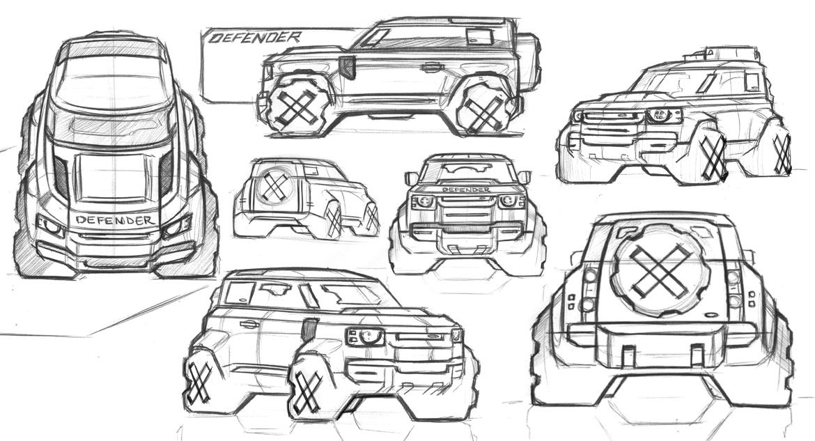
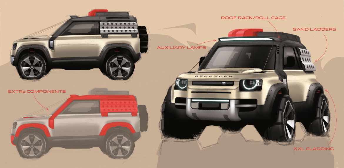
The key to this design story couldn’t be anything but respect for origins. “We had to keep the elements that could represent the Defender spirit”, Frascella explains: “above all, the silhouette, and then the broken line of the roof, the very short overhangs, the distance from the ground, the shoulder along the whole side, the pronounced wheel arches, the spare tyre mounted on the rear, and the side-hinged tailgate”. There are two versions: the longer 110 (5.02 metres including the spare tyre), the first to enter production, and the shorter 90 version (4.58 metres with tyre), which will follow in the coming months.
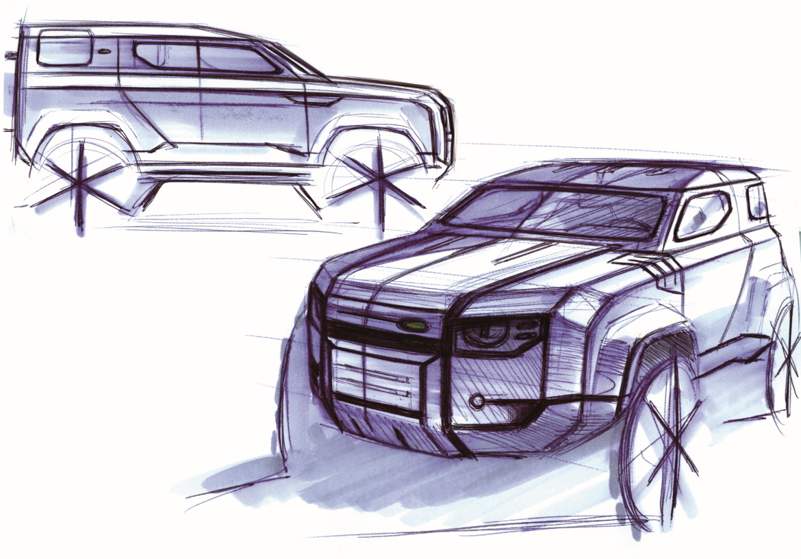
The 110 will be able to have 5, 6, or 5+2 places, according to the pre-selected configuration, and both will have 130 optional accessories, as well as four accessory packages (Explorer, Adventure, Country, and Urban). The development of the project took six years. “Six years of an enormous history”, Frascella remembers, “a different type of exploration was needed, through research sketches, including industrial and functional ones. And then, having clarified the fundamental principles, we made five clay models on a 2:5 scale to refine our ideas on style and proportions”.
The higher-ups chose Frascella’s model, which was then milled on a 1:1 scale for final approval, with the blessing of Ratan Tata. “Then there was the long journey of creation, with feasibility studies”. Alongside McGovern and Frascella, Jeremy Waterman, Julian Wiltshire, Andy Wheel and Simon Grant were also engaged in working on the exteriors. “We even created a Defender Studio, with the model at the centre and all the design boards around it, in a climate of total immersion, until the creation of the final design and the construction of the LR1 prototype”.
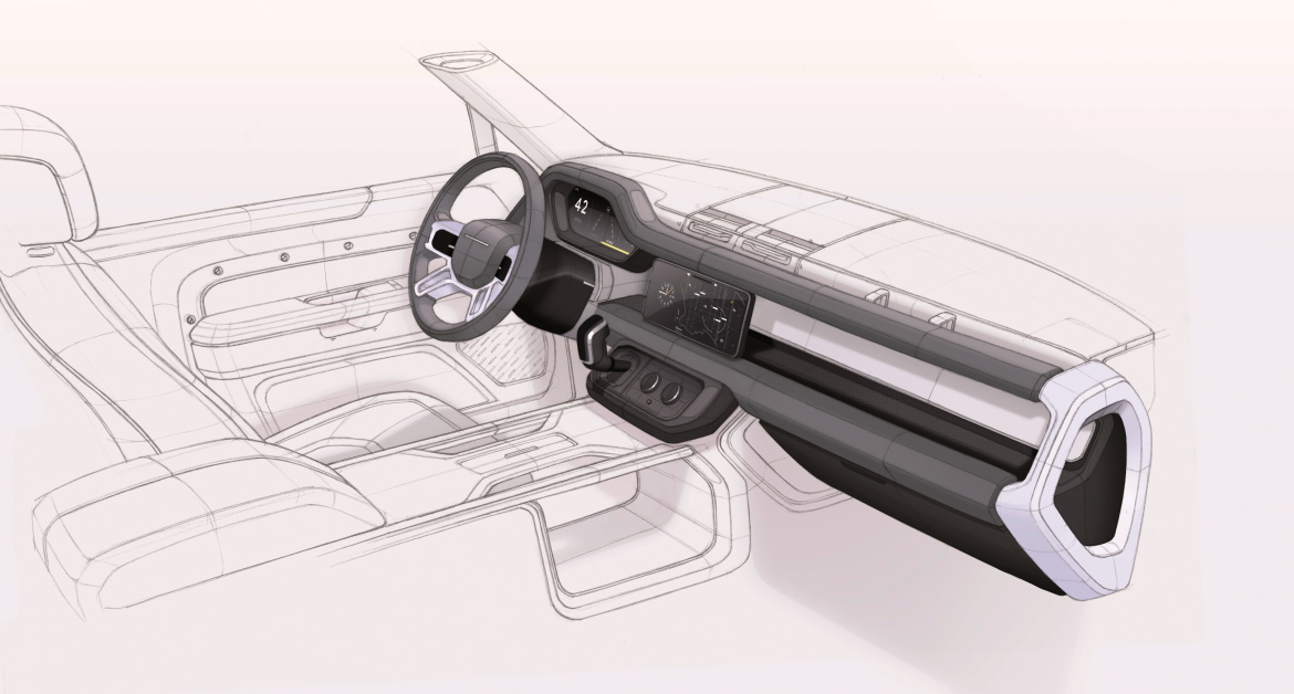
Mark Butler, Nick Finney, and Alan Sheppard, along with Amy Frascella for Colours& Materials, moulded the interiors. Every single element has changed, but the final result is distinguished by continuity: the magnesium dashboard remains, but the seats have been completely redone, and the gear lever, moved to the dashboard, creates space for a third, central seat.
“It is the ultimate automotive icon”, Frascella claims: “We wanted to ensure its expression was neither too aggressive nor too playful, hence the more rounded front end, compared to the old model, but the still angular back end. To achieve this, we worked a lot on the light units: although they are rounded and not tapered, they allowed us to give the car a more welcoming look, less severe than the old Defender”. In short, as McGovern says, it is a Defender that is “inspired, but not constricted by, the past”.
(Full article in A&D no. 240)

