CLASSIC STYLE AND DYNAMISM
Alfa Romeo Giulietta turns 10, a milestone that also marks the end of its production. Here is the design story published on Auto&Design no. 182.
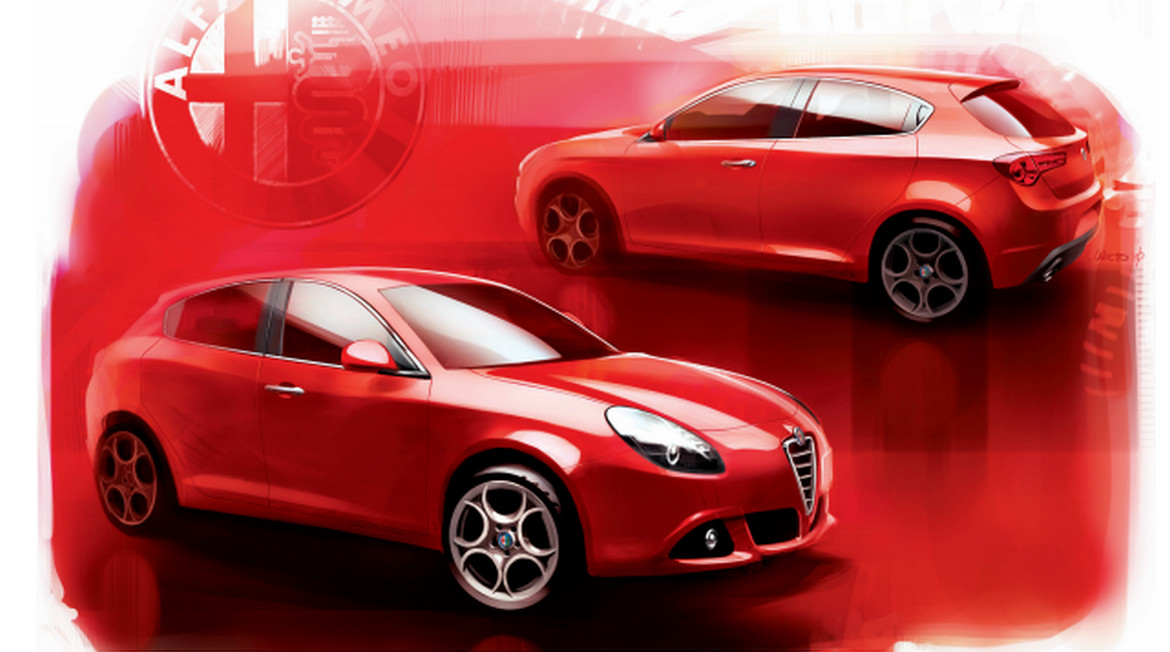
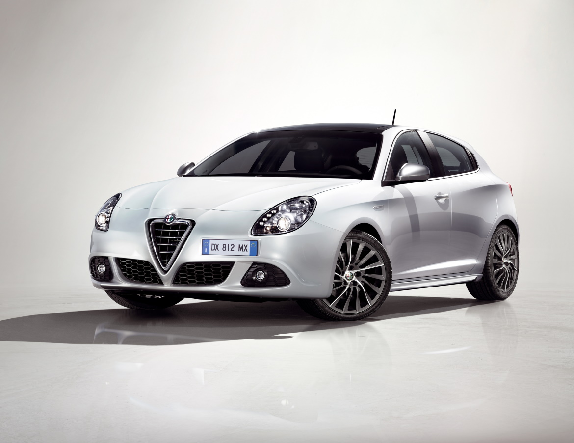
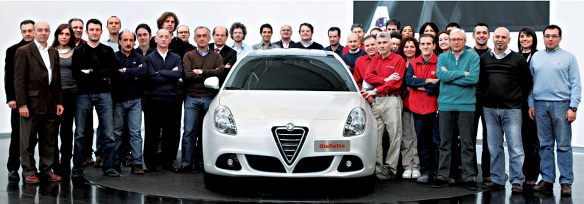
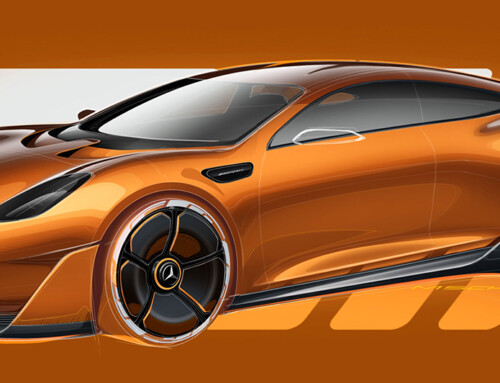
Presented at the 2010 Geneva Motor Show, the Alfa Romeo Giulietta is a concentrate of Italian style and Alfa taste: in its proportions, in the refined language of its surfaces, in the ergonomics of its interiors, and obviously also in its engines. A little “grown up” compared to the 147, it is better placed in the gap between the Mito and the 159. In the words of Lorenzo Ramaciotti, Fiat Group design manager, while Alfa was recently entrusted to Marco Tencone, “it is a car for those who don’t want to sacrifice anything to have an Alfa”. Above all, in the intentions of Alfa designers, it is a “more mature” car, a “C segment with well-defined premium qualities”.
“Sometimes in the past – observes Ramaciotti – Alfa were considered compact but not very habitable, beautiful but uncomfortable: this wants to be an Alfa that puts together two worlds, that of dynamism and Alfa charm, but also that of complete use, without unresolved points”. It’s certainly bigger than the 147 – 4.35 long, 1.46 high, 1.80 wide) due both to the constant and general growth of all the cars and the increase in equipment, including airbags, air conditioners and so on. “The real challenge – says Ramaciotti – is to make them bigger and richer without making them heavier”. The answer came from style.
“The point was not to make a supervillain car. Did we have to raise our voices like our competitors? No, the path we chose was one of greater sophistication, simplicity and proportion. Compared to the panorama of shouted cars, with very heavy marks, the Giulietta is extremely sober, it has only two marks on the sides and two on the front”. The cry is, if anything, in the engines: four, all turbocharged and all Euro5, two petrol (120 and 170 hp) and two diesel (105 and 170 hp). Giulietta is the daughter of many constraints. The most important, perhaps, is the use for the first time of the new Compact platform itself on which all the Fiat group’s C-segment cars will be developed, but also the smaller segment Chryslers.
And then there’s the pedestrian collision regulations. “They take on new dimensions starting from the nose, which then drag across the whole car”, notes Alessandro Maccolini, chief exterior designer: “The Giulietta was the first Alfa to have to take charge of it, not least because the Mito already took the work that had been done on the Grande Punto”. Without forgetting that the regulations, as Ramaciotti points out, came at a later stage: “At the beginning it was only about the bumper, now it is about the bonnet and windscreen”. With such constraints – and you don’t have to keep quiet about the airbag spaces – the important thing was, says Ramaciotti, “not to show the effort made, to behave a bit like those athletes who can compete with a smile on their lips”.
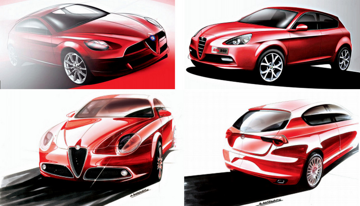
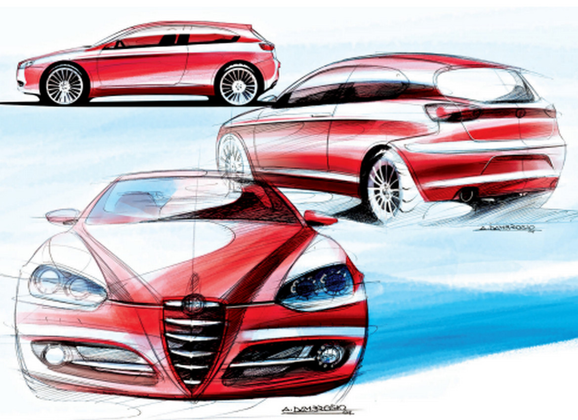
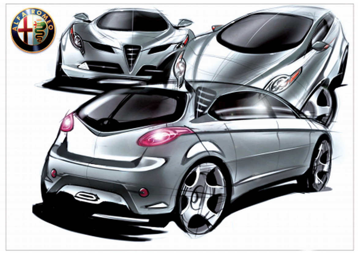
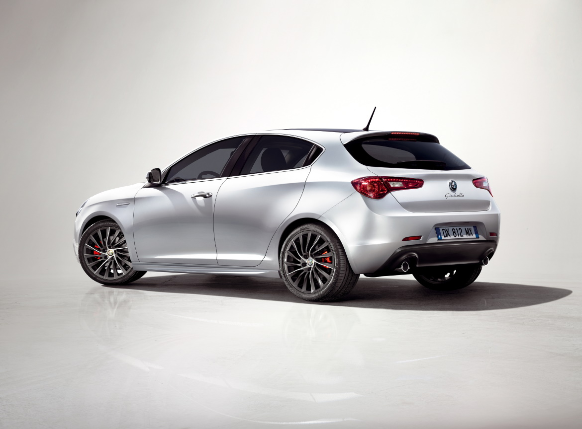
“In 2007 – says Ramaciotti – there was a further recording in front and behind, to make slightly different graphics and give more autonomy compared to 8C and Mito, starting an evolution of the theme that otherwise became too replicated: it was a car a bit closed from the point of view of volumes, now breathe more”. Ramaciotti sees this car as “a single sheet, a kind of eggshell”; which is then pulled up by two ridges on the bonnet that end up in the floating shield (“In this way it is perceived as a three-dimensional object that allows a more expanded graphics, it is not just a chrome trim”) and by two side marks that mark the wheels, two moustaches that disappear on the doors and resume in the rear arches with concave surfaces that become convex. There are also very delicate passages, like the lines above the Alfa trilobus.
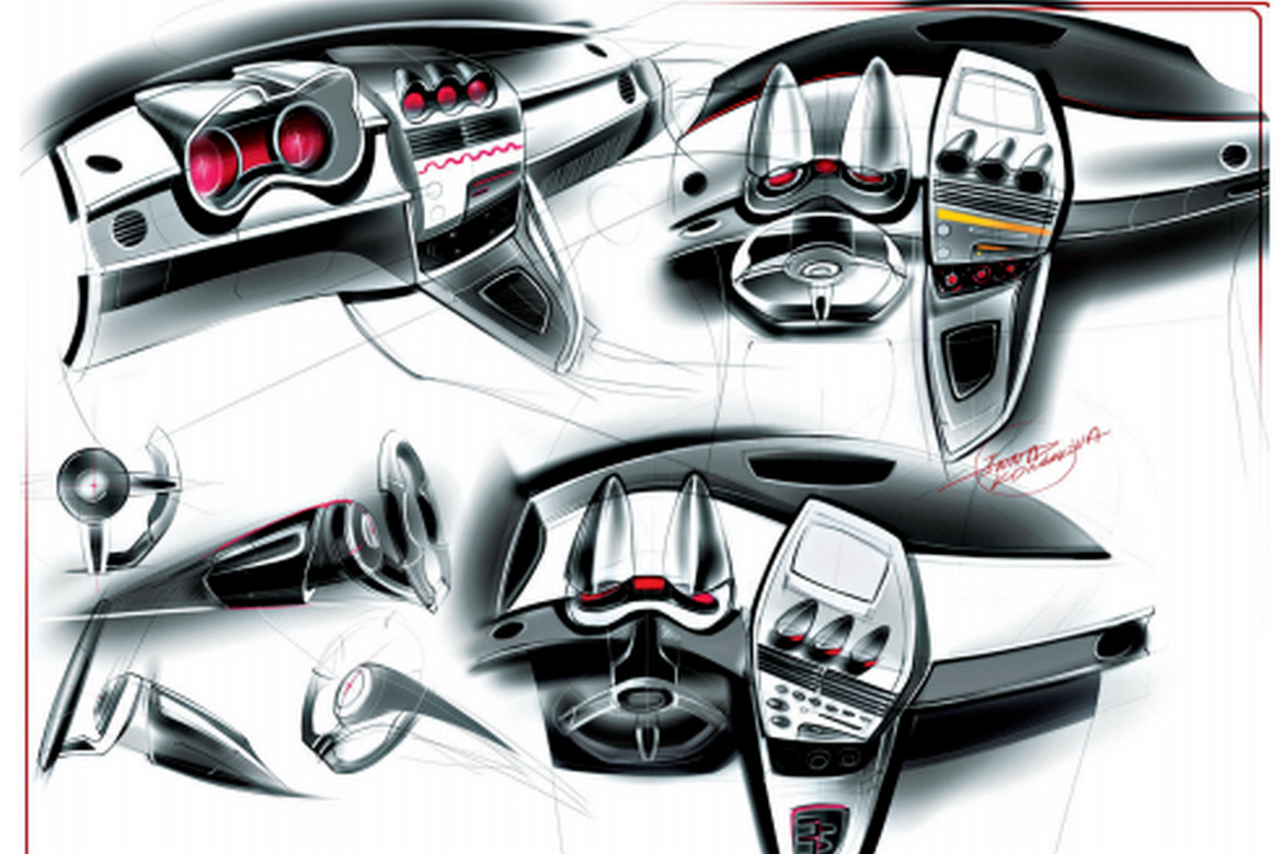
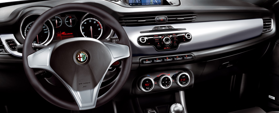
“While the exteriors are affected by a magnification that has made us work to make the car more compact – observes Maccolini – paradoxically, the interior has done the opposite work, an effort to make them bigger, more spacious”. Ramon Ginah, Alfa’s chief interior designer at the time, adds: “We tried to reduce the number of visible objects, to simplify, to focus interest on the important elements. The horizontally developed interior design has created an architecture that subdivides the functionality. In the fascia there is the radio zone, in the middle zone there are the controls related to driving, in the lower part there is the climate zone. It’s a great help for the driver”.

