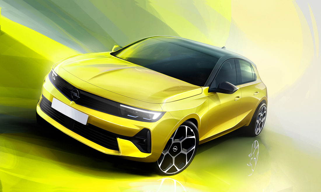
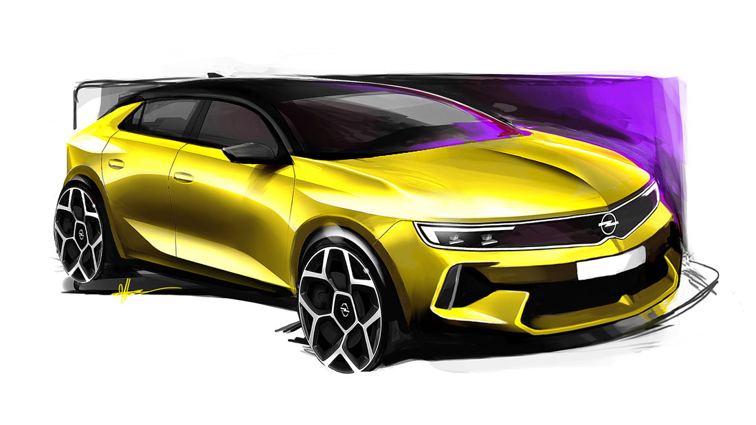
In pointing out to Mark Adams, Opel’s head of design since 2002, that the sixth-generation Astra has strong, energetic lines, he immediately replies: «That’s true, but they are also very clean». And he wraps this expression with an entirely Germanic taste, far removed from the subtle minimalism of certain competitor proposals.
A few strong lines
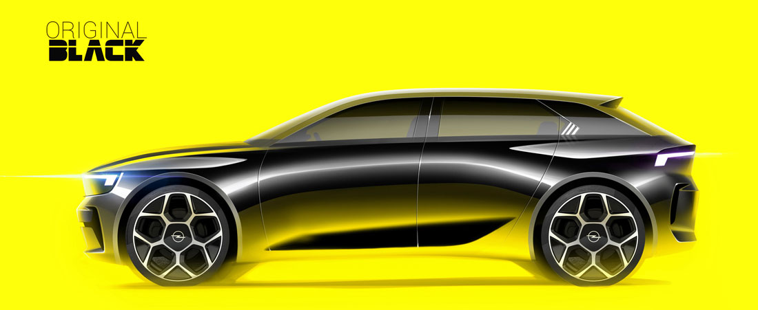
Here, the economy of the elements («We didn’t want any hint of overdesign») also achieves their greater incisiveness: «The car is crossed by a few lines that give it a strong visual framework, from all angles. On the sides, for example, a curve just below the beltline fades into the wheel arches and creates a well-thought-out texture. Everyone notices the Vizor, our new radiator grille, but the overall impact is the result of much more complex work”.
“Controlled” muscles
In this sense, the references go back to the GT X Experimental, the 2018 prototype that indicated the company’s next direction in style, from which, among other things, the “compass” criterion derives. Overall, the language has already been applied for the first time to the smaller Mokka, but this time it has a decidedly more mature slant, which Adams attributes as much to the proportions as to an interesting management of the surfaces: «The Astra is naturally much lower and more profiled than a crossover, especially in the versions with the black roof. This has not, however, led us to emphasise sportiness insistently: while the Mokka is brash, proud of its forms, here we preferred to focus on “controlled” muscles».
Solid interior
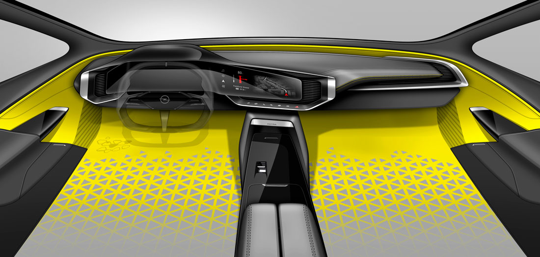
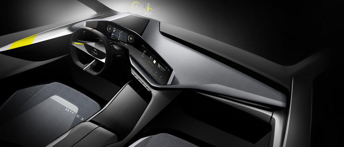
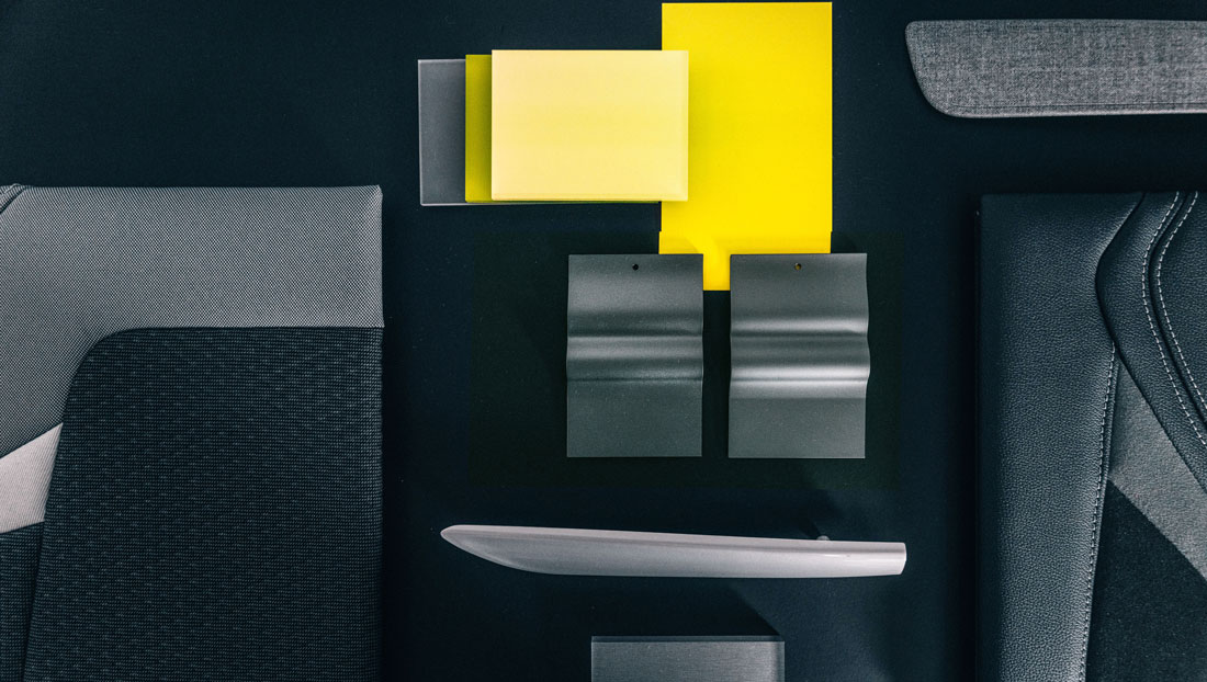
This muscularity, according to the designer, is not diluted by the many components in common with the latest Peugeot 308 (windscreen, front windows and roof panel): «These elements were chosen together with the Lion team because they fit appropriately to both projects».The German feel returns starkly in a cabin where «the two screens on the dashboard, one for the infotainment system and the other dedicated to the instrumentation, are separated by a gap of just half a millimetre» thanks to the solidity of the frame, then boasting a glass panel extended to the furthest available edge, thus taking another cue from the GT X.
The infotelematic system’s layout
There are also subtleties such as «the “thumb rest”, which allows the hand to be oriented in the most correct way in order to operate the touchscreen quickly and precisely», the now classic separate air conditioning controls and «the icons through which you can retrieve your preferred configurations for on-board services, designed in the shape of the Opel models».
Berlin spirit
This last detail particularly amuses Mark Adams and, surprisingly, turns out to be significant because it «fully represents that ease of use that we hold dear, as it is linked to German pragmatism». There is no danger, however, of stumbling into austerity: «People often associate Germany with the stereotype of a flat, uncreative quality. But today the country is very different, with a modern vibe, just think of cities like Berlin. This is the spirit we want to convey on wheels».
(Full article in A&D no. 251)

