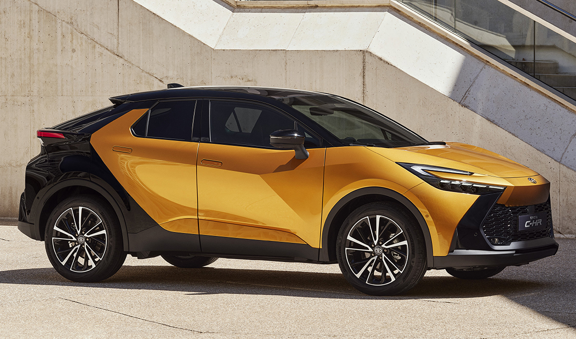
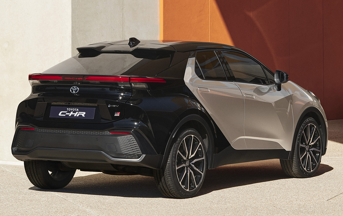
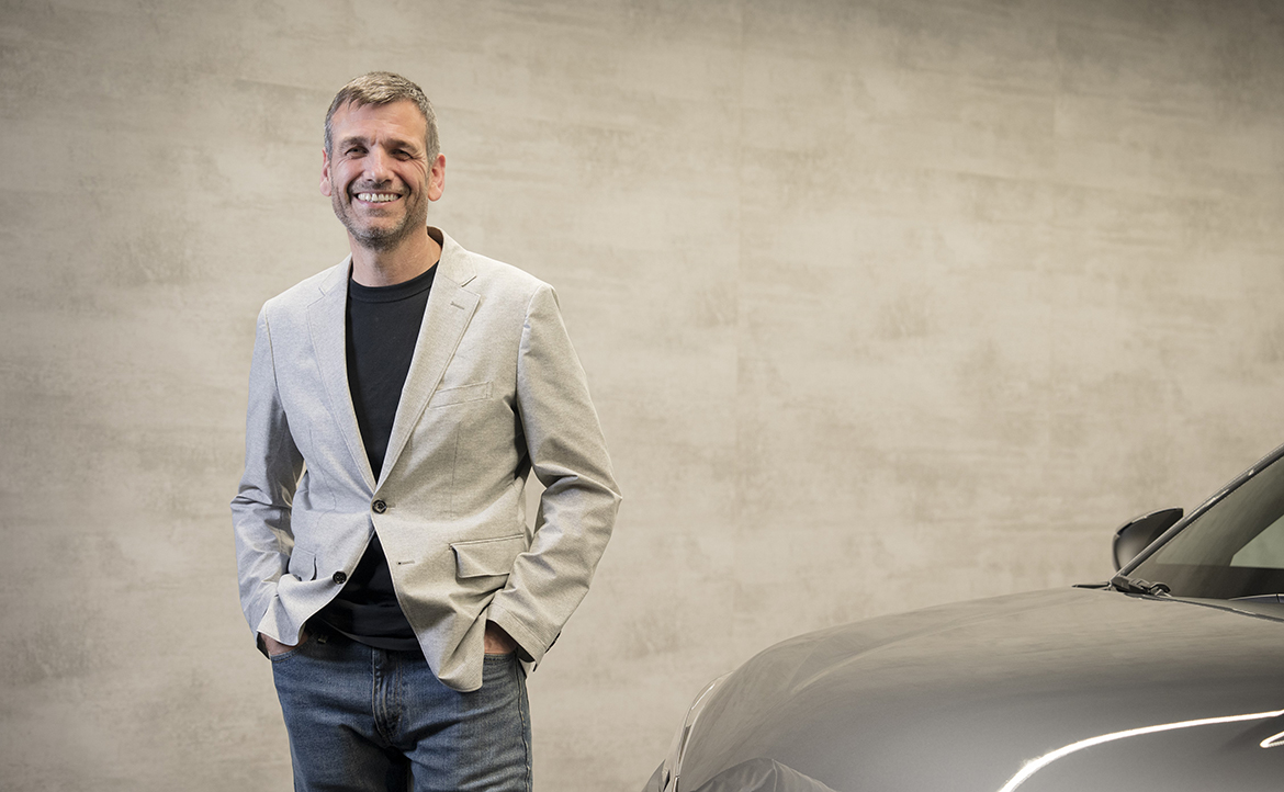
“It’s a diamond on four wheels”. This is how Simon Humphries, Operating Officer and Chief Branding Officer Toyota, defines the new Toyota C-HR with its faceted surfaces, harking to the first generation in looks, yet new in every detail and taken to a truly exemplary level of refinement. “The theme is quite similar to the previous, but we wanted to highlight it even more. We condensed that feeling of agility, making it in some respects even stronger”, he tells us at a meeting in Milan.
“The C-HR has been critical to the image of the Toyota range. I remember when we were working on the project with Fukuichi-san and we said that it was a very strong design but applied to a simple architecture, very similar to a stagecoach, with the wheels at the four corners”, he says, quoting Tokuo Fukuichi, his predecessor who headed all Toyota and Lexus design. “That basic architecture has remained very similar, but the styling is different: at that time we didn’t have the references we have today after introducing the Aygo Cross and the Yaris. So the C-HR has been able to evolve, but still remain vital and vibrant”.
The “diamond cut” of the new C-HR is clearly evident on the sides and front end, which picks up on the C-headlamp theme of Toyota’s new generation of models, “but also in the rear we made the theme much more distinctive”, notes Humphries, who also emphasises the importance of the two-tone treatment, “we wanted to try to build the colour into the form rather than apply it afterwards”.
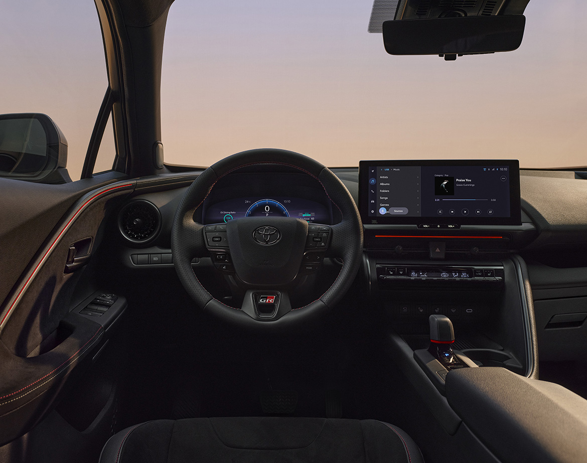
The new Toyota C-HR was designed in Brussels by the team under Tadao Mori, Head of Styling, with contributions from the design centre in Nice (TEDD) for the initial exterior and interior themes, and in Japan (TMEJ) for the development of the interior, as detailed in the cover story of the next issue of Auto&Design (A&D no. 261, July/August 2023) due out in the next few days.

