A giant employing more than 35,000 – with 29 R&D centres, 20 production sites, a design centre with premises in Turin and Lyon – entirely given over to realising commercial vehicles and buses that are functional, cutting-edge and attractively designed. Iveco Group is also active in the Powertrain and Financial Services sectors. For almost half a century, it has been designing vehicles to carry goods and people worldwide, however, for the past two years, its journey has taken a new direction following the spin-off from CNH Industrial. It has also been given an independent listing on the Milan Stock Exchange, the aim of this being to attract new investment and build brand authority.
From the logo to the lineup
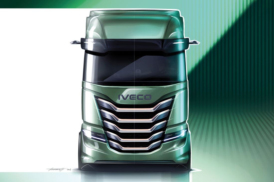
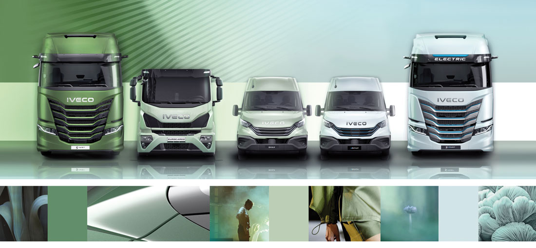
“It was a radical change that had to be reflected in the brand image, starting with a new logo and comprehensive product restyling”, says Marco Armigliato, Head of Centro Stile at Iveco Group, who heads up the group’s twenty designers. The logo was therefore updated, the creatives retaining the original lettering, but redesigning the components to give them a softer, more technologically advanced aesthetic. On the back of IVECO’s hefty €1 billion investment on the new MY24, the design team embarked on a comprehensive rejuvenation of the entire lineup, spearheaded by a thorough overhaul of the S-Way to enhance its functionality and appeal. The exterior makeover focused on increasing customisation options at the front. Armigliato continues: “The grille has been modernised and can be customised with an array of colours and materials. A choice guided by the demands of our customers, who are particularly discerning when it comes to picking distinctive identifiers for their trucks”.
New interior for the S-Way
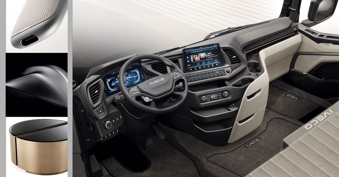
A substantial effort was reserved for the interior: “Here too we listened to customer feedback and came up with the idea of dividing the cabin into three distinct areas”, Armigliato says. Ideas for the interior were cut down to three, the end result being a mix of options that included a professionally rewarding driver’s seat with driver-centric, car-inspired controls and even an ignition button on the steering wheel, a central service area with pull-out drawers, and a living area providing the driver with colourful, practical solutions. “We went for warm colours for the chill-out area, to convey a more serene ambiance, with materials inspired by modern furnishings”, explains Isabella Burgio, Color&Trim. “The living area has soft, friendly forms”, Bruno continues, “prioritising comfort with a sinuous element embracing the dashboard and creating a cocooning effect within the passenger compartment. The central ‘utility’ part is given over to technical controls and stowage spaces: the former now has a more orderly layout, the latter larger and more comfortable”.
Technology first
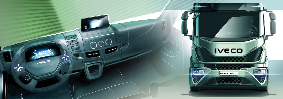
A radical change that has included technological advancements: 10- or 12-inch digital instrumentation in front of the driver, combined with an 8- or 10-inch infotainment system. “All screens are customisable just like our smartphones”, explains Francesco Turina, UX/UI Design. “The intention was to develop fully digital instrumentation that would help the driver in all phases of driving and manoeuvring, so alleviating fatigue as well as improving the on-board experience through the integrated connectivity services”.
The new Daily
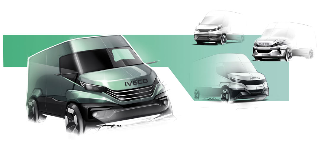
This infusion of cutting-edge technology has involved the entire range, as has the arrival of new driver assistance systems that are the backbone of the revamped Daily. “Active and passive safety regulations required the inclusion of Advanced Driver Assistance Systems (Adas)”, explains Raffale Vergano, Light Commercial Vehicle Design. “We therefore incorporated three radars in the bumper along with a crash-box. The front fascia was also redesigned with detailing enhanced by the new launch colours, including a striking green”. An operation that put designer pencils to the test, as Michele Deconcini, Powertrain & Advanced Design, recounts: “The area we worked on was well defined and our aim was to preserve the inherent strength and aesthetic appeal of the Daily. We explored all options and found the optimal solution by exploiting the band-like design of the front of the van”. Among the main innovations in the interior is the floating wing at the top of the dashboard, which is split into several open segments where notebooks, pens, paper, smartphones or tablets can be stored (there are also non-slip mats and a section equipped with an inductive charger).
The Crossway bus
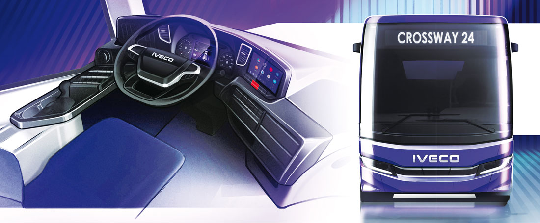
The need to introduce new sensors and safety systems also underlay the design of the new Crossway, the bus that in a variety of versions is intended for city and extra-urban transport. The new generation was designed by the Lyon style team dedicated to buses: as Alexandre Verwilghen, Bus Design, explains: “We positioned the large radar at centre front across all versions in the interests of family feeling. The slim, horizontal LED headlamps make the new face more assertive and technological”. Volumes are cleaner, the overall line more personal. A project that pays attention to how transport is evolving and which also has sustainability in its sights by keeping an eye on electrification: “For us, every challenge is an extra stimulus: we will offer vehicles that are increasingly clean, functional and, of course, beautiful”, concludes Armigliato.
(Full article in A&D no. 265)

