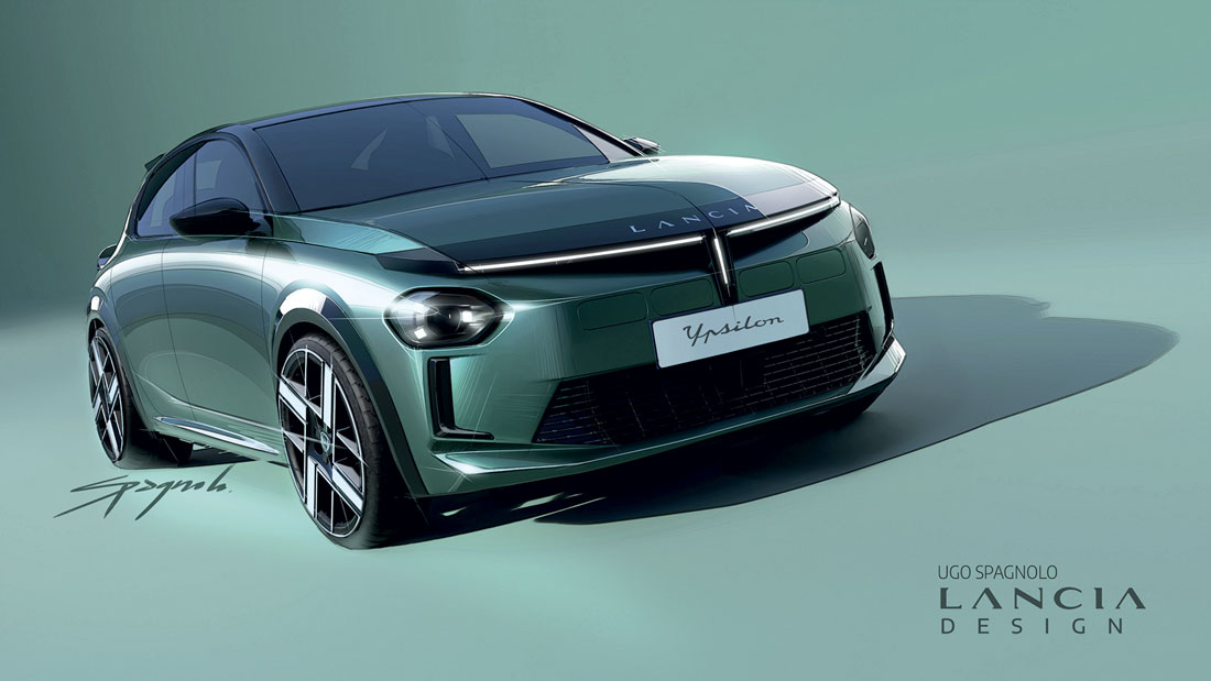
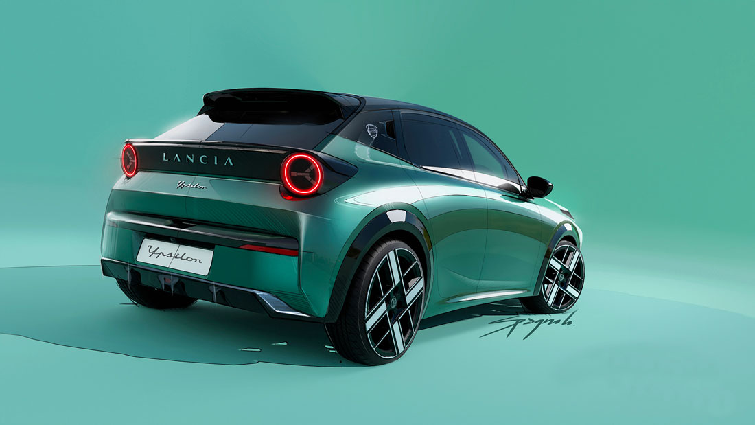
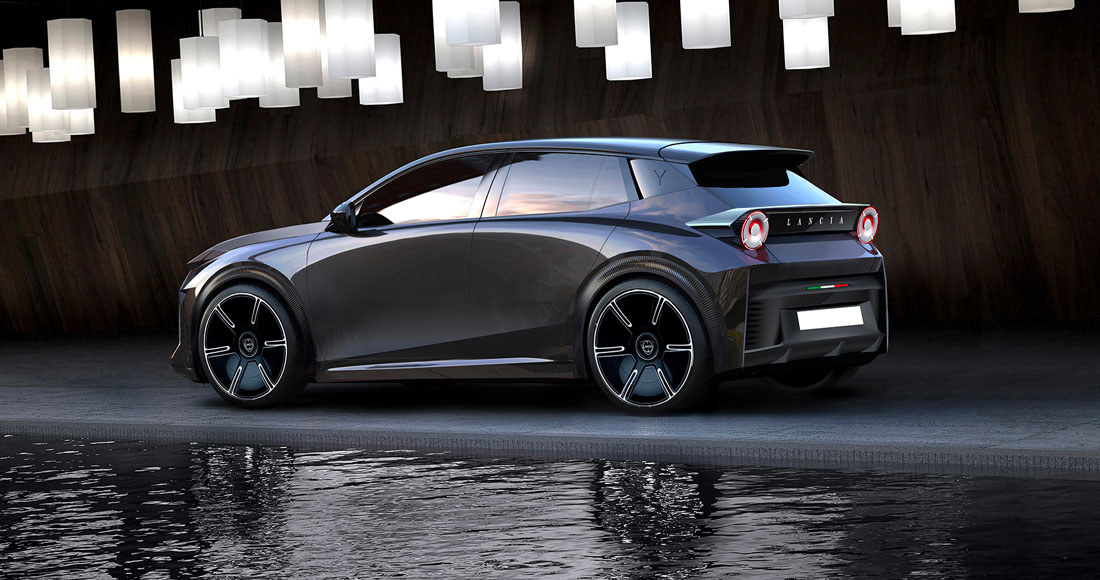
Passion, revenge and pride. Three feelings that are rarely associated with a car or a brand, but in the case of the new Ypsilon they are more than appropriate. When in early 2021 Carlos Tavares, CEO of Stellantis, asked Luca Napolitano, CEO of Lancia, to present him with a plan for the rebirth of this legendary Italian brand, the design team set off at the speed of light. And so Jean-Pierre Ploué, Chief Design Officer of Stellantis, took on the task of giving Lancia a new stylistic life and called a number of the group’s designers to the project with the aim of creating a team (now numbering 11 people) that would soon be walking on its own two feet.
Six month for the revolution
“Many people came expressly to ask me to work for Lancia. There was passion in their eyes and when I told them about the possible plans for the rebirth of this glorious brand, they lit up”, says Jean-Pierre Ploué, whom we meet in his studio at the Lancia style centre in Turin, where it all began three and a half years ago. Among them was Gianni Colonello, who was appointed Head of Lancia Design at the end of May: “The mission was demanding: we had six months to establish a new stylistic path for Lancia, laying the foundations for three models that would arrive over the next seven years. The first? The Ypsilon, then the Gamma and, finally, the Delta. For the Ypsilon we had to create something unprecedented, belonging to a higher segment and winking at a neutral and even younger audience”.
More sportiness
The city car has abandoned its role as a hatchback to embrace the forms of an elegant compact saloon without abandoning a certain sporty taste. “The new Ypsilon is the founding member of a family of models and has had the task of establishing Lancia’s new stylistic pillars”, Colonello continues. “We summed them up in four fundamental points: Iconic, Consistent, Meaningful, Eclectic. We discussed what the real added value of Italian design was and we all agreed on the ability to skilfully mix classical elements with futuristic and original ideas”. The team thus identified in the works of Carlo Scarpa – a Venetian architect who designed, among other works, the Brion Memorial – geometries and eclecticism consistent with Lancia. “We sought a more geometric and less automotive look, which was seen with the Pu+Ra HPE concept car that, in fact, was hiding much of the new Ypsilon”.
Reference to the past
From the very first glance, the desire to revisit the Lancia goblet with three luminous elements at the front was clear, while the hexagonal headlights and the small louvres of the air intakes (open in the hybrid variant, closed in the electric) were inserted at the far sides, in homage to models such as the Fulvia Sport Zagato and the Fulvia Coupé. Above the goblet the Lancia lettering is in aluminium and will be so for all cars to come, while at the rear the full-width black band containing the lights is a clear reference to the Stratos. “The round tail lights belong to a certain tradition of Italian sports cars, but embrace the contemporary. Every detail has been carefully studied and we have always tried to markedly differentiate the Ypsilon from the compact saloons of the Stellantis group built on the same platform (ed., the CMP)”, says Colonello.
The interior’s table
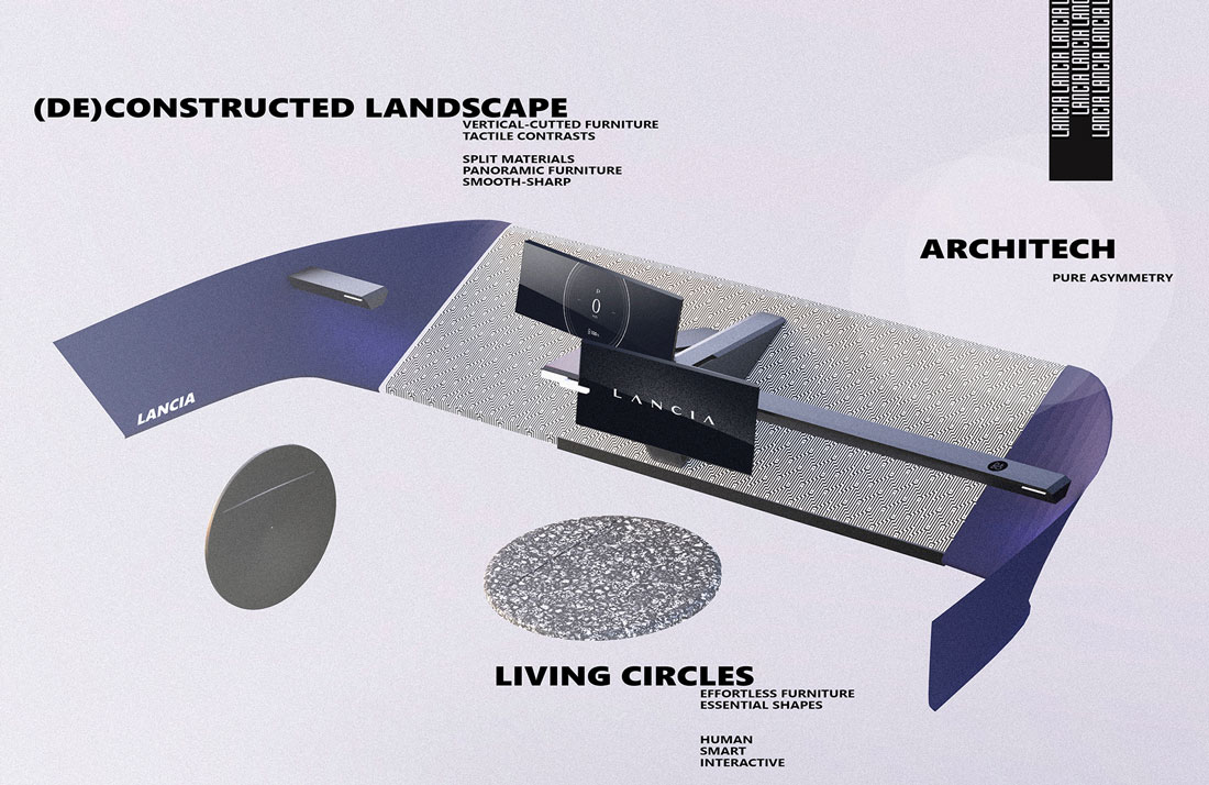
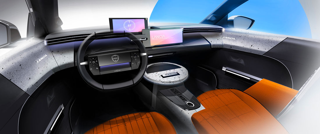
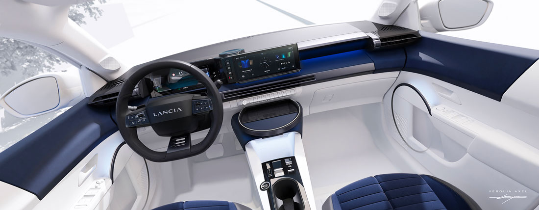
Mission accomplished one might say, as the little Lancia has its own distinct personality even in the interior, where one element stands out more than the others. “Have you ever seen a production car with a small table on the dashboard? The idea came from an everyday experience: the first thing each of us does when we get into a car is empty our pockets of our phones (ed., there is induction charging on the circular surface), keys and wallets. So we thought of an extra space where you can also put a PC when you are stationary or charging the car”.
The ”panno Lancia” is back
Fabrics and colours are the core of the interior. In fact, the C&T team wanted to recreate the historic Lancia cloth and reintroduce bright, eclectic and elegant colours at the same time. The launch and limited Cassina version (in collaboration with the well-known furniture brand) in dark blue is the most classic, but the other variants see orange and electric blue colours that brighten up the interior. To be as contemporary as possible, the materials chosen are also sustainable: they range from vinyl to recycled plastic, just as the polyester of the velvet-effect carpets and seats is recycled. The laser treatment of the interior plastics is a further detail that enhances the perception of quality, as are the black frames of the two displays from which to read the instruments and control the S.A.L.A. multimedia system.
(Full article in A&D no. 267)

