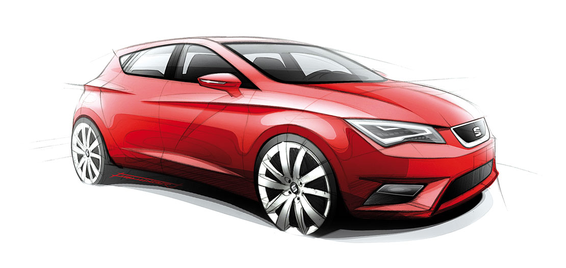
Alejandro Mesonero-Romanos calls it a “child of two fathers”. He’s one, the other is Luc Donckerwolke, who (until July 2011) preceded him at the helm of Seat design. He’s talking about the new León, presented at last Autumn’s Paris Motor Show. It may even be said that the new car has a third father in the sunshine of Barcelona. While representing a radical departure from the previous generation León designed by Walter de Silva when he was in charge of Seat style, it also remains true to the philosophy imposed by de Silva himself to all the brands in the group in the name of coherence and synergy within the group. “I agree with his view – says Mesonero-Romanos – design must be an example of simplification, not complication. The hard part is subtracting elements, not adding them. Simple, pure and durable themes: this is the philosophy of the new León.”
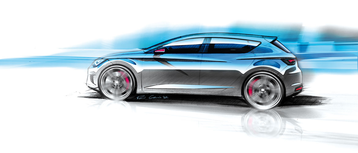
Mesonero-Romanos sums up the project plainly: “The starting point was the excellent MQB platform – the same as the Golf and Audi A3 – which is not only flexible enough to let us make the necessary modifications, but also ideally proportioned, which is an essential factor because, if the platform isn’t well sorted to start with, there’s nothing you can do about it. This was an excellent skeleton to be fitted with a great suit.”
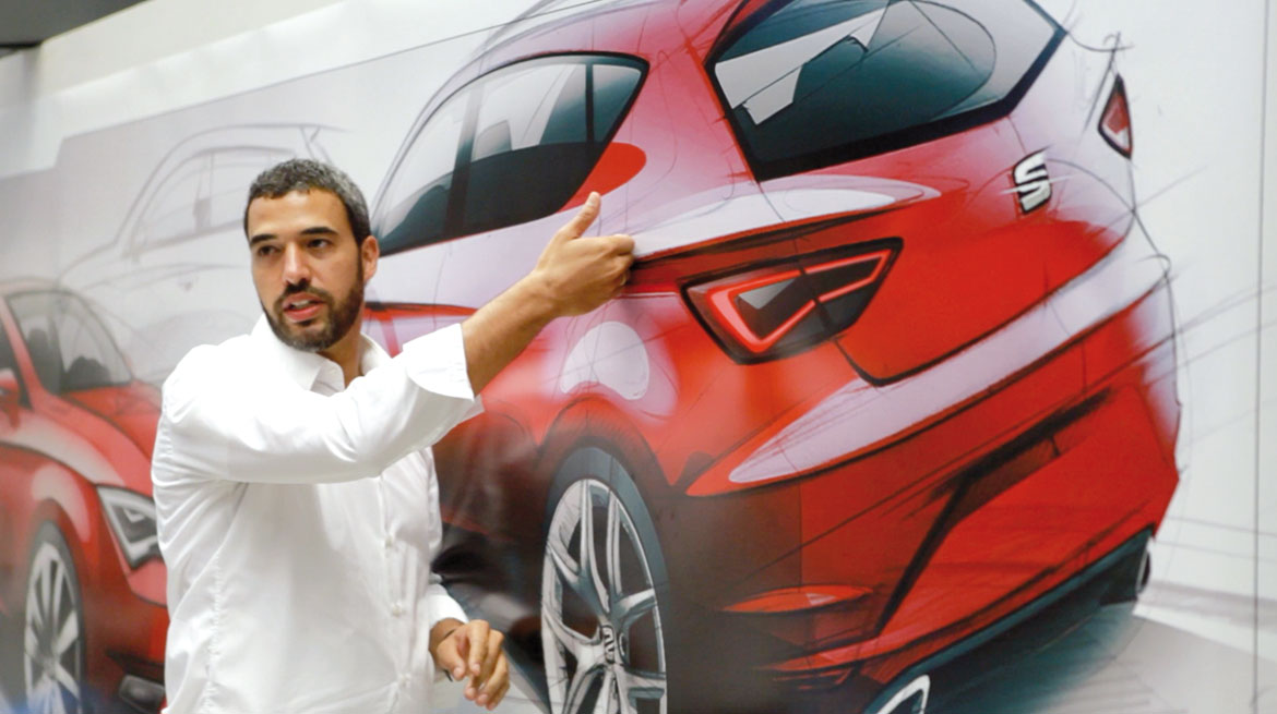
The double blister theme in the flank has been kept, although the dynamic line is now more horizontal to accentuate length (4.24 metres, 5 cm less than the previous generation, but with a longer wheelbase) and maximise tension, like a tightly strung bow. The two creases in the flank are offset from each other, with the higher rearmost line lifting the tail and accentuating the muscularity of the shoulder to dispel any impression of fragility. Juan Perez and Jorge Diez (now director of exterior design for Seat) focused much of their work on the front. All the lines flow into the main element – the grille-nose – while the lower area is reminiscent of a sprinter on the starting blocks, contributing to giving the car an impression of how it feels to drive: dynamic, fun, spirited and light.
Also debuting on the León is the new Seat badge, which is less prominent than before and more squared (while the S is now split by two lines only). This badge will eventually appear on all of the Spanish brand’s models.
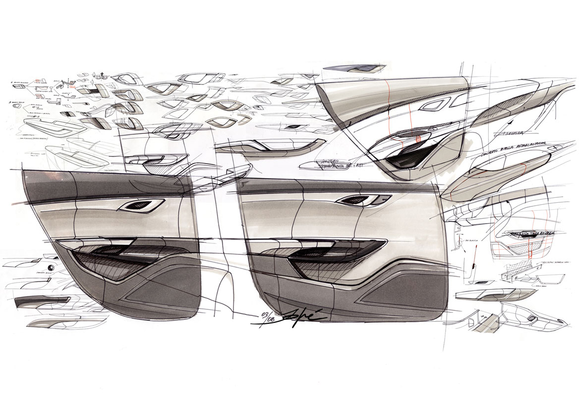
The interior design, by Jaume Sala and his team (with Melinda Jenkins and Jordi Font working on colour and trim), makes perhaps an even more significant break from the past. “The dash is simple, the volumes are light to avoid any possible feeling of oppressiveness, and the upper zone is driver-oriented with the dials in line with the screen. Creativity must go hand in hand with functionality, otherwise it becomes pure style.
Full article in Auto & Design no. 198

