Not every car can be deemed an automotive icon. Fewer still ever make it to see their 50th anniversary. The Ford Mustang is one of those rare vehicles that achieved both of those milestones, and its now entering its sixth generation.
“The challenging part was to attract a new younger generation of Mustang customers to carry the brand forward without forgetting today’s diehard enthusiasts,” says Joel Piaskowski, Ford’s North American director of exterior design at the start of the project.
Before the design work began, customers were asked how they perceived the Mustang over its then 47-year history. This yielded three images that provided the basis for the exterior theme: a fist punching through glass called ‘breaking out’; an image of a black panther coined ‘power and control’; and one of Steve McQueen defined as ‘masculine cool’.
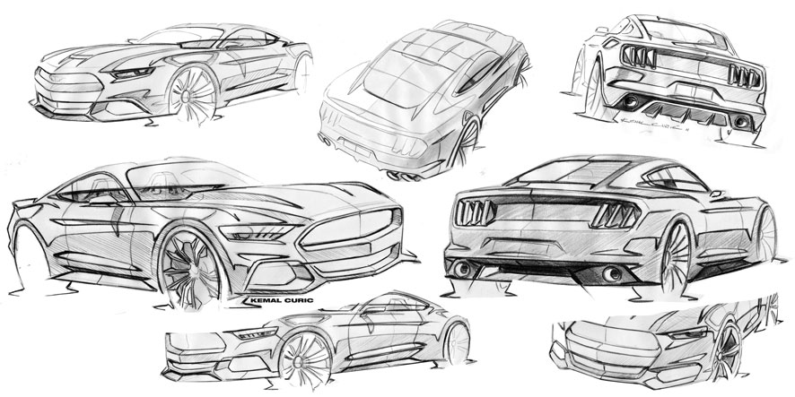
“We set out to do a brand new car and challenge everything,” said exterior design manager Kemal Curic. “What we did first of all was re-proportioned the entire car. We made it wider, lower, more aggressive and sportier.”
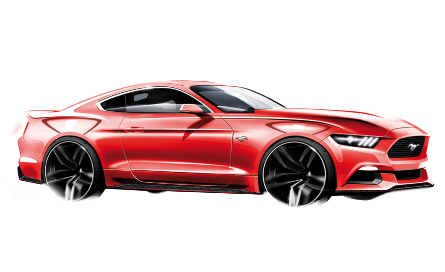
The key was to give the 2015 Mustang a new proportion whilst retaining some of the aesthetic cues that link to its golden history. The team made the new car considerably lower, with a 32mm lower hood; shaved 30mm off the roof height and lowered the decklid 70mm.
To lengthen the profile, the A-pillar was moved 32mm rearward and the ‘hockey stick’ motif on the bodyside was removed. A unified DLO graphic covering the B-pillar added visual length, while the
surfacing topography was revised. “We wanted to address the Mustang aesthetic to introduce a more sculp-tural quality,” says Paiskowski.
The most significant perceptual change is in the rear ¾ view. The 70mm wider rear track and the tapering greenhouse allow the body to extend 40mm over the rear wheels, giving the car powerful haunches absent from the previous generation.
Referencing the 1968 Shelby Mustang fastback, the forward canted grille pays homage to its forebears while the ‘shark gill’ DRL graphic of its headlamps lends a more contemporary expression and adds graphical consistency.
The steeply raked rear fascia also mimics the forward momentum of the ‘shark nose’ trapezoidal grille at the front but with a more contemporary 3D quality.
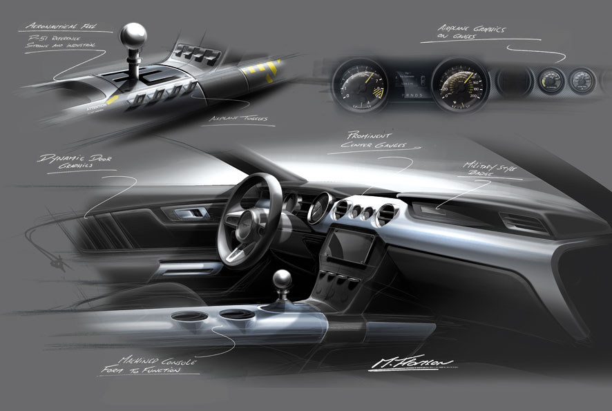
The interior also revisits iconic Mustang design elements while reacting to customer feedback. “We knew that the Mustang had to have four invitables,” says chief designer Doyle Letson. “It’s got to have the double brow, a symmetrical IP, large analogue gauges in front of the driver and honest premium materials.”
While the new Ford Mustang retains a lot of iconic elements of its 1967 fastback forebear, it’s nice to see the car move forward into the new millennium. Redesigning an icon – let alone for its 50th anniversary – is without a doubt one of the most rewarding projects a designer can work on, but it’s also one of the toughest to pull off.
The article continues in Auto&Design no. 205

