Six bars of ambition. This is the new identity of Wolfsburg’s luxury offering, on the grille of a sleek four-door saloon positioned higher than the Passat, just a whisper away from a flagship. “This car is part of a transformation that is redefining saloons globally”, explains Walter de Silva, the Volkswagen Group’s design chief. “There is a marked tendency towards a more fluid, less standard tail, at times at the very limit between one segment and another: it is no accident that here we explore an area that closely resembles the coupé while retaining excellent roominess and four accesses”. The urge to be dynamic is redrawing the contours of German prestige and sets the Sport Coupé Concept GTE up as a promising brand styling manifesto that is destined to inform designer creativity before cars actually start rolling into the dealerships (in mid-2017). The first, interesting “programmatic” idea emerges in the new visual incarnation of the front which is dominated by a sweeping chromed pattern that gathers grille and lighting clusters into a single unit. “While in the past lighting management was always subject to the technical availability of suppliers, with the designer having to comply, today exponential advances in lighting technology make it possible to literally “design light”, like a graphic line or a hideaway pattern. In this interpretation, the upper moldings of the grille slot in directly at the edges of the small led headlights which come to life as light filaments when necessary”, says de Silva. The traditional graphic construction of the front, consisting of a particular assembly of perceptible “signs” (headlights, air intakes, ribbing and profiles) form a new compositional balance, in line with the extreme linearity of the entire body.
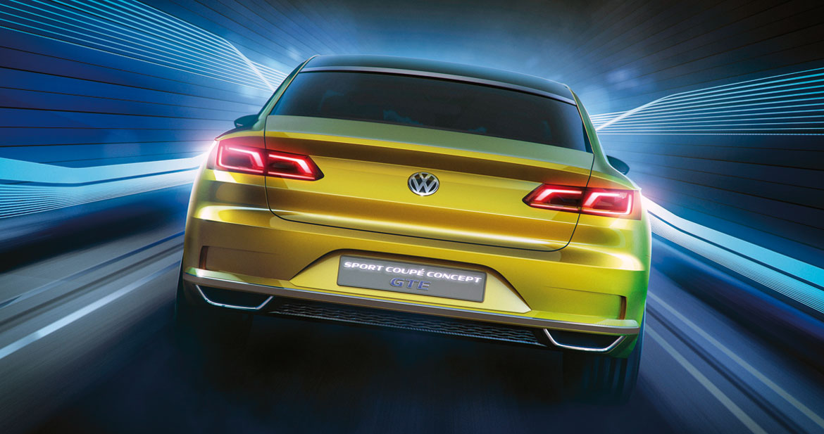
After all, Wolfsburg drawing boards have always ignored ornamentation in their pursuit of opulence. “We don’t want to betray the brand’s formal approach, we don’t want to abandon simplicity as a value, or water down the interaction between “pure” geometrical forms like straight lines and circumferences, for example where the wheel-houses dialogue with the beltline”, confirms Klaus Bischoff, Volkswagen brand design chief. “And to be so rigorous while at the same time achieving an impression of freshness, you have to know how to manage proportions. In the Sport Coupé Concept GTE great attention has been paid to the relationship between volumes, the designers worked hard alongside the engineers to get the most out of the MQB modular platform, starting from the long wheelbase”. The result can be seen first of all in the bonnet that extends fluidly along the ribs, giving the masses a forward-oriented look in the manner of a real coupé. But the entire configuration of the front volume proves rather stilted, perhaps even more than the tail: thanks to the very advanced wheels and the moderate height of the bonnet (which lifts automatically in the event of hitting a pedestrian), the transverse architecture is skilfully dissimulated and it is easy to imagine all the real power of a longitudinal engine.
We are struck by how the emotive style of the whole is unaffected by the stringent rationality constraints: “The horizontal lines on the side, the calculated effectiveness of the ribs and grooves, the precision of the depths and convex surfaces are typical of an almost mathematical approach to forms”, continues Bischoff, but the effect of the silhouette or the line of the rear window (incidentally incorporated in an astonishingly big tailgate that confers an unexpected injection of practicality) are no less attractive for that. Indeed, the studied minimalism of some of the lines points up the sound architectural design of the body and the quality of the details: “Generally speaking, the creation of luxury is an add-on process. You load up the vehicle with formal elements to communicate its value. Volkswagen has applied a more global, more substantial approach: we have redefined the standards for transmitting depth and content without sliding into ornamentation or the baroque, while we continue to pursue excellence through moderation”.

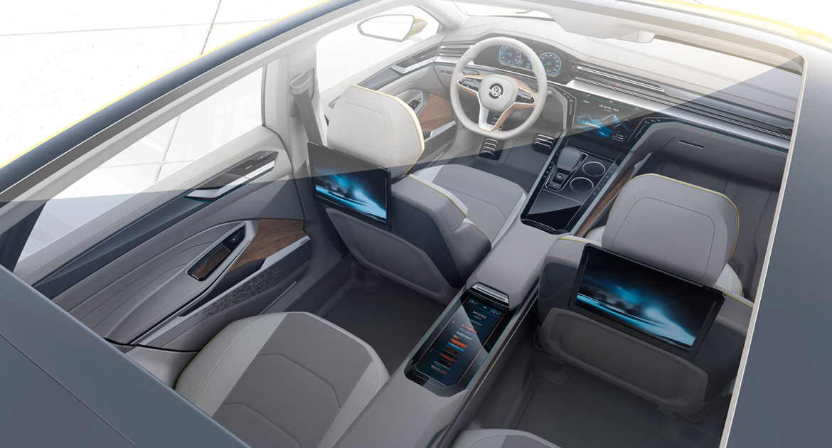
The cabin too is marked by a sophisticated sign and visual essentiality as though the designers didn’t want to fatigue the user’s senses, while still guaranteeing a rich, all-embracing perceptive experience. The upholstery and all trim textures enhance parts of the interior that are generally forgotten about in a sort of cocoon effect that is not without sportiness or geometric definition: the open-pore wood, for example, is used graphically to point up the three-dimensional nature of the steering wheel and the tunnel, like shading. On board you have a general feeling of toning down: “We tried to make the transit from one surface to another as fluid as possible: even touch screens and fingertip controls are flush with their glossy black frames, without gaps, to physically represent the inclusion of technology in the project. And ambient lighting creates an informative belt that runs round the passengers and signals functional areas (such as handles) and helps passengers to relax”, concludes Bischoff.
The article continues in Auto&Design no. 214


