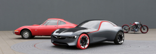
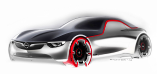
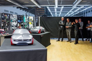
“Returning to a small size and pure simplicity was the idea when we started working on this GT concept in the summer of 2014,” Mark Adams, vice president of Opel/Vauxhall design in Ruesselsheim, Germany, said. “But we did not do anything retro. That wasn’t the way to go. What we did was draw from the past to make it fit today.” Still, the show-stopping GT displayed at March’s Geneva Motor Show expressed the same character as the original GT from 50 years earlier.
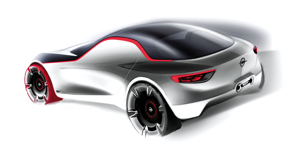
“Most important, it is small again and with proportions to make it feel admirable, not a super car which its technical layout says it isn’t.” The new GT is only 385 cm long, 168 cm wide and 118 cm tall. Adams: “That gives the model a smaller footprint than the Corsa. Yet, with rear-wheel drive, a 145hp three-cylinder engine placed behind the front axle-line and weighing under 1000 kg, it is a real sports car. Just like the original GT which in its day was more of an icon than the Opel Manta.”
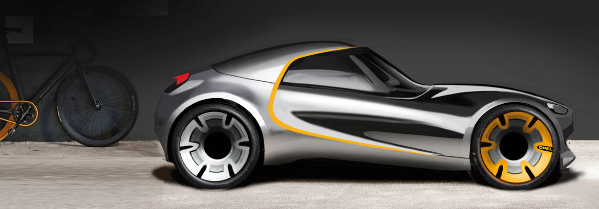
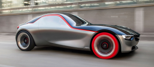
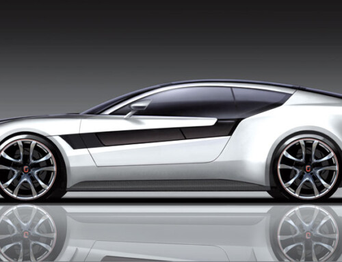
On first acquaintance, onlookers are surprised by this new GT. It is small indeed, very nimble, and stands out for its pure presence and simplicity. But the lack of a clear beltline by virtue of the fact that the side windows are body-coloured, gives the car totally different, almost minimalistic proportions. “But that’s the essence of the car,” Adams explains, adding that Opel CEO Karl-Thomas Neumann was shocked when he first saw the body-coloured side windows before agreeing.

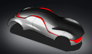
This application has taken the effect of dark smoked glass one step forward, just as you can see on modern public transport buses where adverts entirely cover the windows! Opel’s well-known ‘blade’ graphics on the side panels are re-interpreted in a more sculptural way and the rear hips are very characteristic because the body volume flows up from the rear wheel centre line.

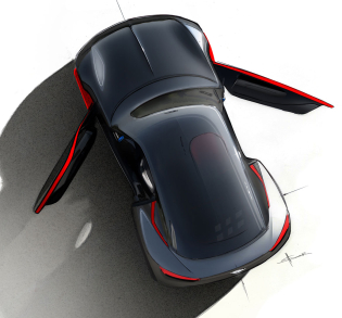
The lack of a vertical shut-line between door and front wing comes from the ingenious door hinges, positioned well forward of the A-post and hidden behind the actual wing panel. This is the work of Opel’s packaging mastermind Frank Leopold who tried to create a wider entrance than the small body would allow. The total expression of the Opel GT results from its innovative graphics. A red belt running from the front wing sweeping up over the door opening towards the rear plus the contrasting dark smoked yet transparent rooftop enhance the outspoken silhouette. “Yes, with this concept, Opel’s and General Motors’ traditional clarity of design, which was lost for a while, is back again,” Adams concludes.

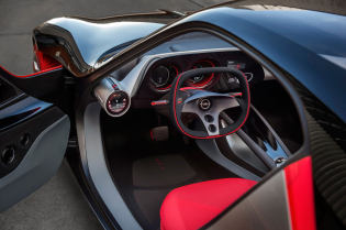
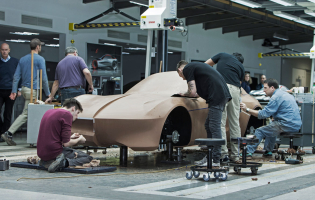
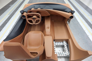
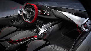
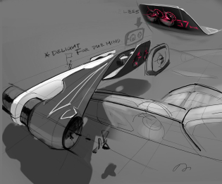
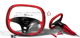
Inside, the very low doors, whose size is hidden on the outside by the grey side window application, surprise and create a spacious environment. The same effect comes from the downward inclination of the dashboard towards the floor creating extra legroom just as in many production Opels from the past. The button-less instrumentation – every function is operated by a touchpad – also adds to the simplicity. The instruments themselves have a very three-dimensional effect. The GT design was chosen out of 5 proposals and then executed in Opel’s advanced design studio under studio chief Friedhelm Engler and project leader Boris Jacob.
Full article in Auto&Design no. 218
