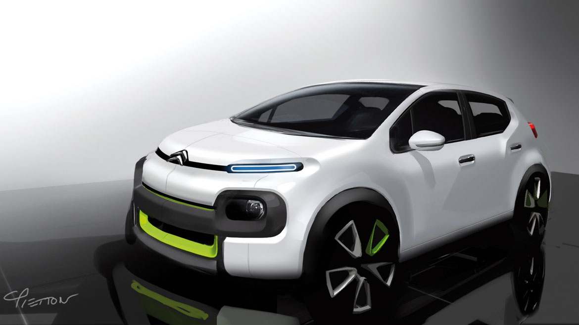
With a smile, Citroën design director Alexandre Malval describes the new car as “audacious”. And perhaps, after the fourteen years of success of a style that has established such a fond following largely because of its friendly, rounded tail, it took courage to change direction. But there’s more to it than that, as in recent times, a large volume product has rarely veered away from conventions with such conviction. “We wanted to create a new, attractive silhouette, with a more compact, road-oriented look but without stooping to aggressiveness” says exterior design director Cyril Pietton, condemning today’s obligatory taut, muscular lines sculpted into excessively busy surfaces.
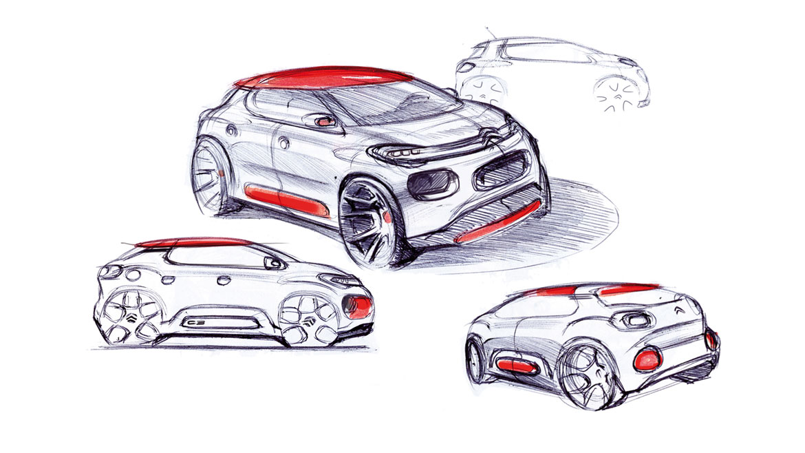
The formal device used by the designers offers an original and interesting interpretation of horizontality. Here, unlike its use on German cars, the absence of ascending lines is not intended to create a sense of rationalism, uniformity and precision but to generate originality, harmony and serenity, giving the car a certain stance without aggressive overtones (while still attenuating some of the excessively feminine traits of the previous C3). The ensemble of full forms, the visual consistency of the face and the profusion of “square modules with rounded corners”, as Pietton calls them, all confer to describing an instantly perceptible relaxed-but-dynamic equilibrium, which is the key of the entire design.
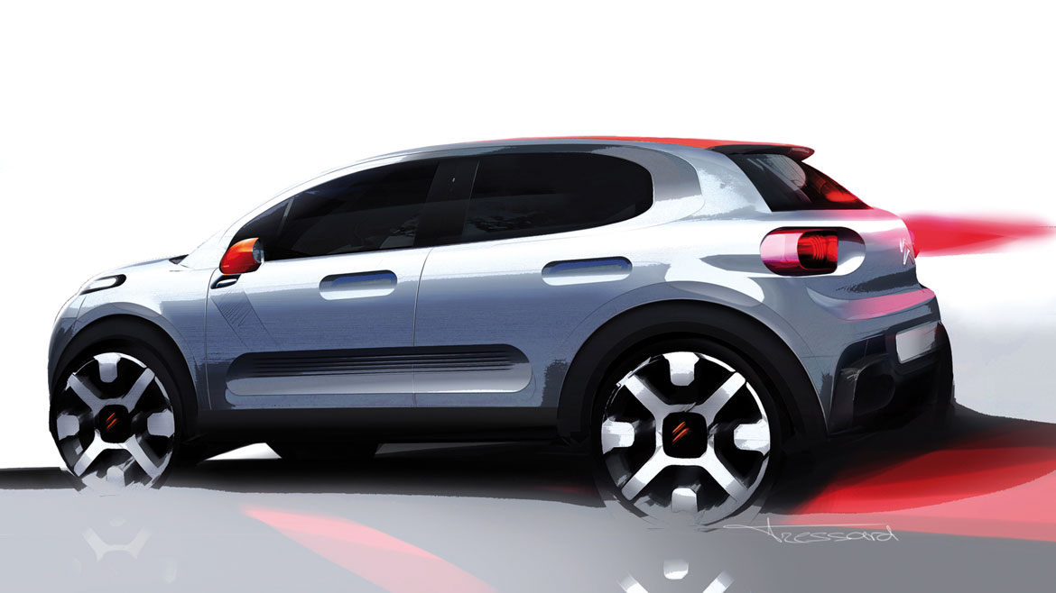
A number of aspects on two different levels make sure that the design is anything but boring. The first of these levels is more obvious, with a proliferation of visual cues lending character to the body: from the matte A-pillars, coloured frames, cladding on the wheel arches and contrasting roof to the redesigned Airbumps which, unlike on the C4 Cactus, are no longer an identifying feature but an additional option (“but I’m not sure if I’d choose them or not”, quips Pietton). Under the surface, however, is a second, more profound and sophisticated sensation, which accentuates the style without muddying its legibility: a host of pop references.
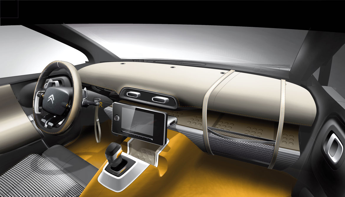
“The choice of a horizontal layout – picks up Malval – brings the car much closer to the canons of product design than automotive design. The finished look is imbued with references to the world of plastics, of vivid colours and solid forms unmistakeably citing masters of industrial design such as the Castiglioni brothers and Sottsass. Citroën is a pioneer of this school, which was ushered in with the launch of the C3 Picasso by Carlo Bonzanigo in 2009, to which the new arrival owes a great deal.”
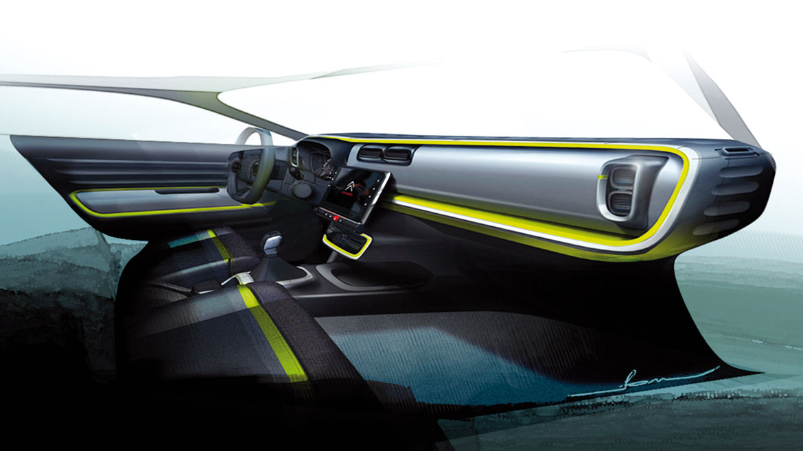
Naturally, everything about the cab is intended to cocoon occupants in a personal microcosm. “We have transferred the universe of interior design into a car”, says interior design director Jean Arthur Madelaine. “We even went to the Milan Furniture Show to hunt for inspiration”, he says, explaining why the seats are structured on multiple geometric planes, with a contoured backrest and three-dimensional side bolsters, just like a designer sofa, while the dashboard is traversed by a swath of fabric.
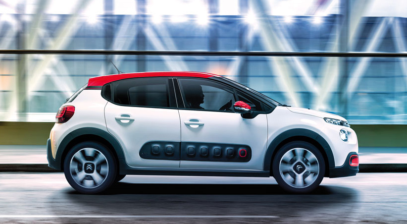
The C3 is also the first in its segment with an entirely touch-technology interface, because, as Madelaine points out, “whether you live in a castle or a bedsit, you’ll still have an iPad in your home”. It’s no coincidence that this is a “popular product in the noblest sense of the word” concludes Malval with yet another smile.
Full article in Auto&Design no. 220


