“The critical issue? Perhaps the time difference between Italy and Japan. That’s the only thing that comes to mind”, quips Alberto Dilillo, design manager for the 124 Spider and currently head of Fiat brand design. Like the other members of the team that is fully deployed in the via Plava offices, he transmits peace of mind and satisfaction. And he has no hesitation if you ask him to explain why: “The last spider we worked on was the Barchetta. It was 1994. Returning to the segment more than twenty years later we could not wish for a better technical base”.
The Japanese chassis of the fourth generation Mazda MX-5, clad in new Italian fairing – “a bit like the special bodies of times gone by”, he says – thus proved to be an excellent opportunity.
But the gestation of the project was not all straightforward: initially, indeed, the management wasn’t even sure which brand was best suited to receive the precious technological transfer and develop the discovery. A question of product planning, individual brand objectives. The choice of Fiat was made official within the company between the end of 2013 and the beginning of 2014 with the ambitious aim (which would be achieved) of an official presentation as early as March 2016 in Geneva. “We like to think that it was also a philological choice designed to have the 124 repeat the same road that had been taken with the 500”, says Andreas Wuppinger, at the time Fiat brand design chief and today head of FCA interior design for the EMEA region: “Namely the re-reading of an undisputed icon as a contemporary industrial object, with timeless style and high international impact in a Fiat-Abarth context”. All agree.
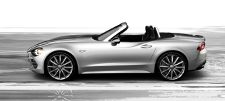
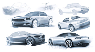
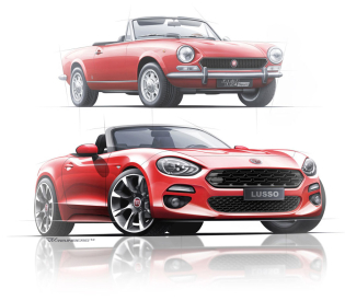
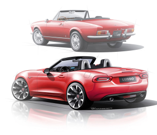
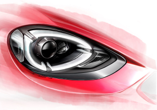
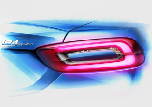
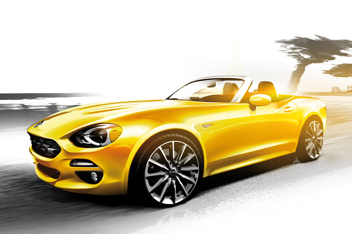
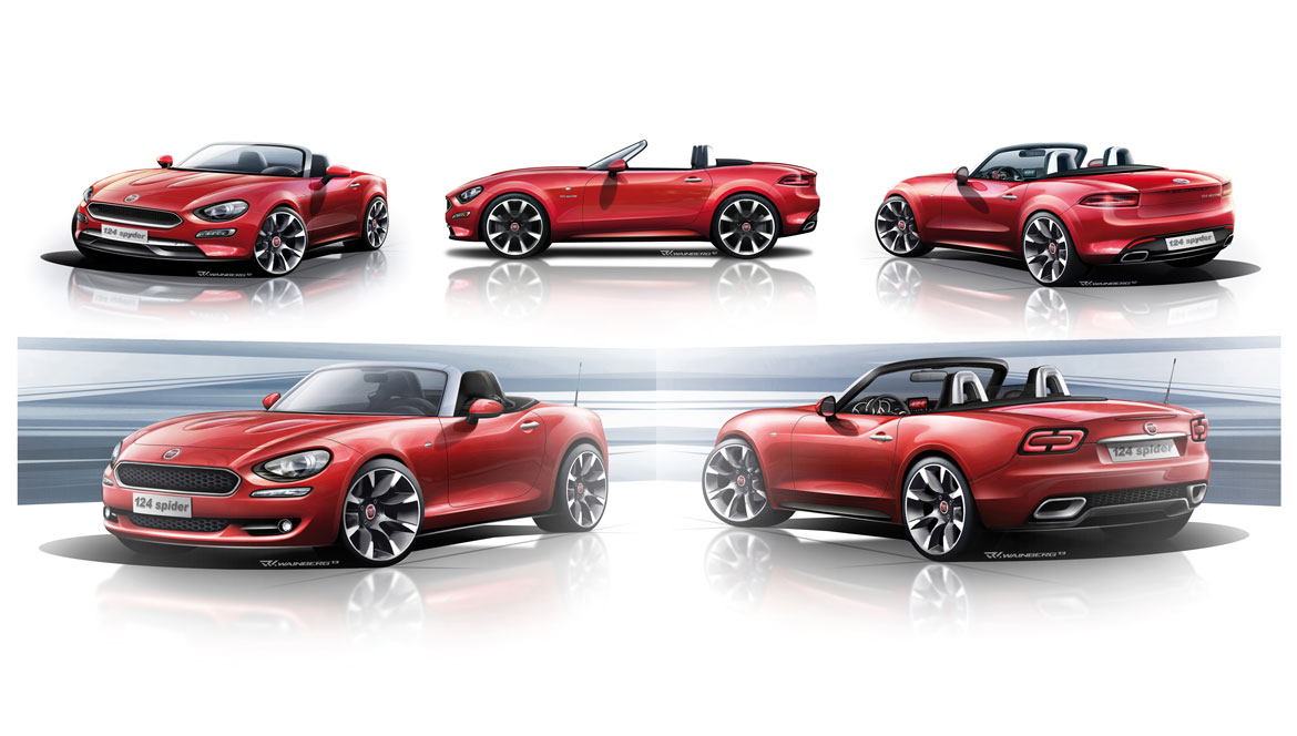
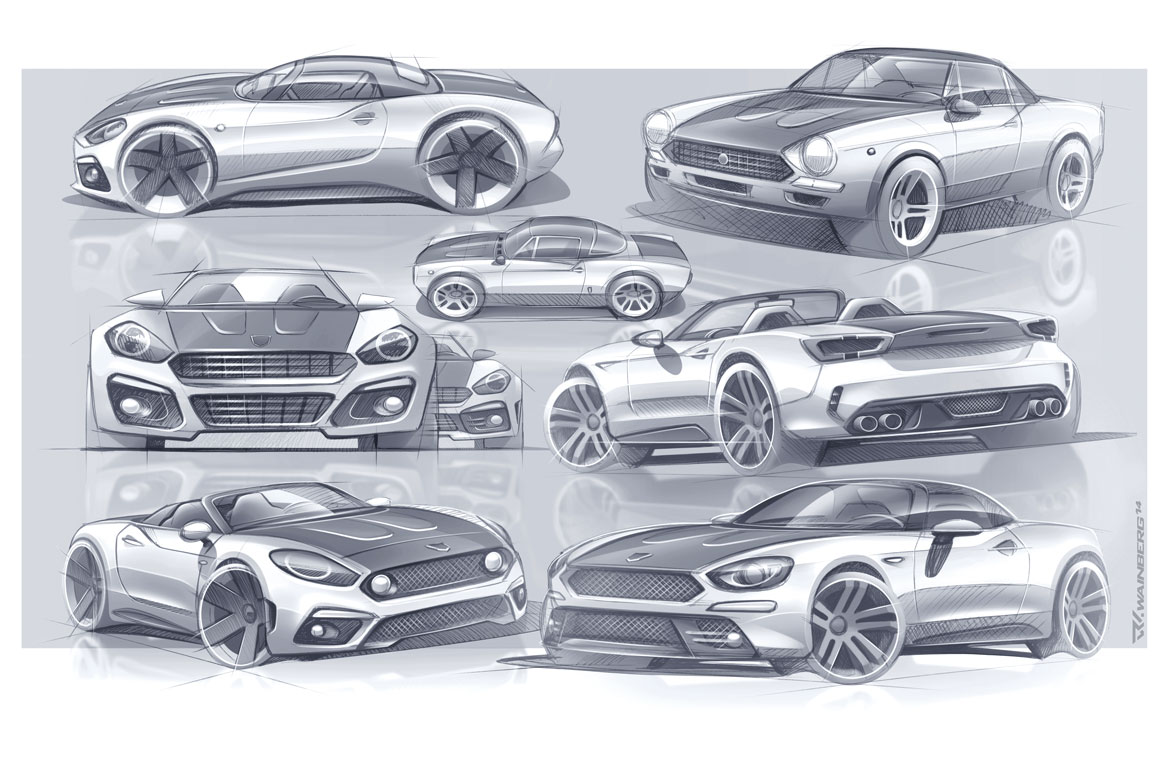
Once the go-ahead had been given, styling research moved forward quickly along the lines of the semantics of the 1966 Sport Spider (front hinging on the link between light housings and grille, the rear with dovetail geometry, horizontal lines). A new operating problem would soon emerge, however: “We knew absolutely nothing about the direction in which our counterparts at Mazda were moving”, explains Felix Kilbertus, who oversaw the design of the externals. “We only had one meeting with them and when we started to design there was always the worry that we might be unwittingly copying them, maybe to an important degree. Sure, we complied with specific criteria here and we could count on a 13 cm longer rear overhang. When we saw the two vehicles in their final versions and realised how different they were, there was an authentic sigh of relief”.
“In effect, one of the most interesting aspects of the entire project was our constant engagement with the methodologies of others”, reflects Dilillo. “We discovered we had a partner who was in many respects better structured but also more rigid, above all in terms of time management. That’s not the case with ourselves. We found that we were decidedly flexible and we accelerated the process”.
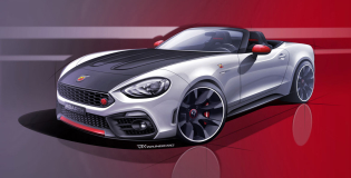
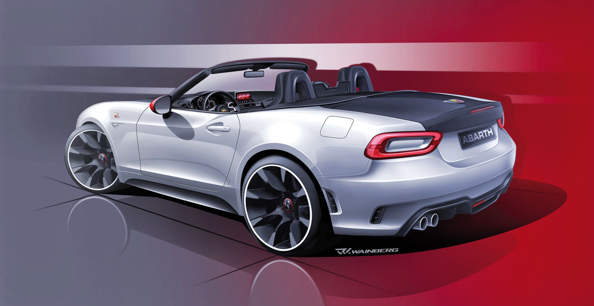
Responsiveness was made even more necessary when it came to designing the Abarth variation which had been set in motion in parallel right from the start. “This combination was something absolutely new, conceptually too”, says Ruben Wainberg, the Abarth design chief. “Starting from a single sketch, the two “sisters” mutually influenced each other, for example in the shared adoption of the bonnet humps and a housing for the side skirts which would then be developed differently on each”. Surprisingly, moreover, the more “wicked” sister plays with the graphics to simulate a non-existent reduction in ground clearance: “The effect is achieved simply by modifying the volume of the bumpers and increasing the matte black zones, just like the versions prepared in the ‘Seventies”.
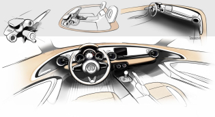
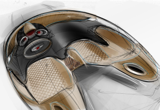
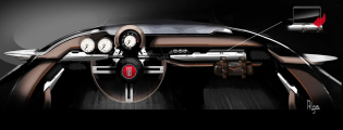
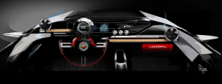
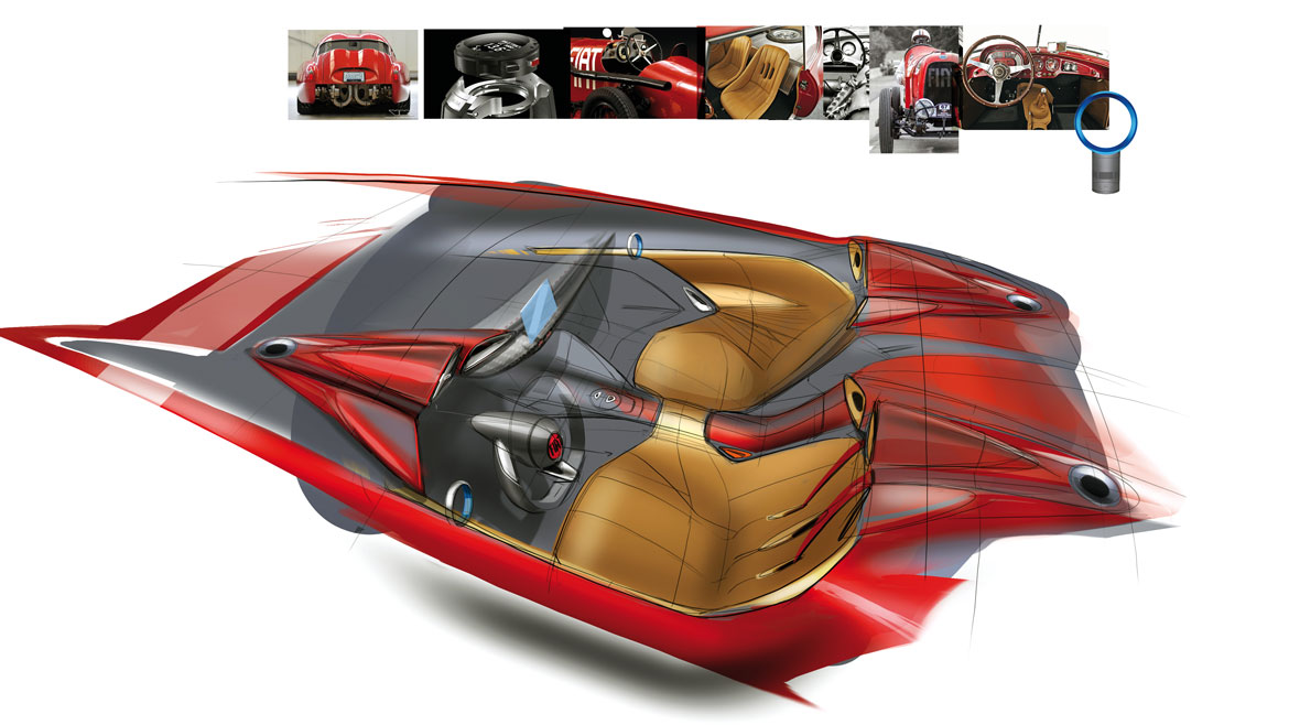
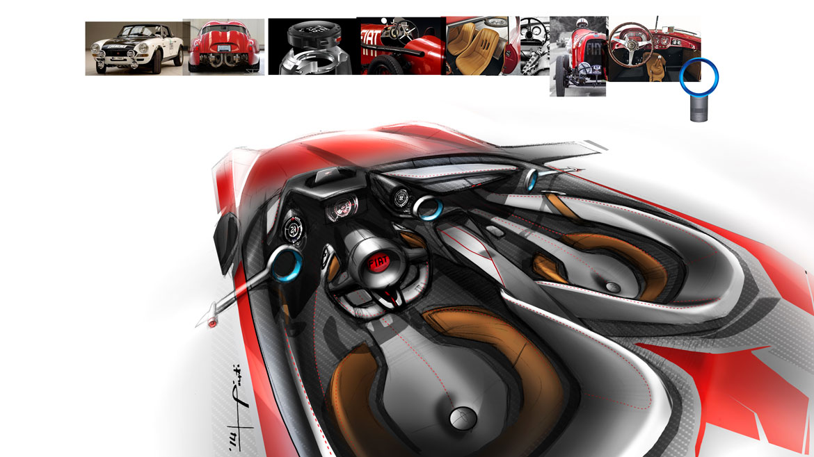
Given the complex construction of the externals, the cockpit is developed within tighter, albeit more refined, margins. “It was not possible to make too many inroads into the Japanese layout for cost reasons and because it was ergonomically perfect”, explains Virgilio Fernandez, interior design chief. “But we did aim to achieve a much more material atmosphere, use our leather, and achieve a classic and contemporary old-tech tactile and visual language”. “We even modified the seat stitching”, echoes Roberto Corongiu, head of the project’s colour&trim. Right down to the details, then, the project aimed to be warmer and more touristic. More in compliance with the idea of the Italian spider.
Full article in Auto&Design no. 220
