For decades they accompanied families along the road to social, economic and technical evolution, in Italy and in Europe as a whole: compact Fiat models proved that they, more than other cars, were a reliable choice for so many young professionals and fathers looking for a concrete, spacious product that is able to communicate both modernity and stylistic appeal. Those were the years of the 128, the Ritmo and the first Tipo, excellent everyday small cars which for many years constituted a certainty for Italians and a thorn in the competition’s side. “In a way, the spirit of the new Tipo family represents a return to those years,” said an enthusiastic Andreas Wuppinger, the head of interior design at FCA for the EMEA region.
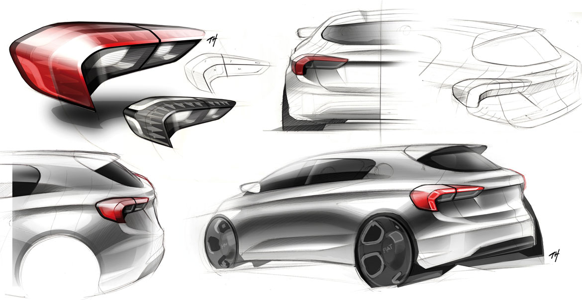
“While many car makers today think that segment C demands continuous recourse to the latest gadgets, our ideal was to develop a new mix of technology, robustness and exploitability, offering a very complete car without overdoing it,” he continued. The project, which initially only envisaged a three-box version, demanded a simple, straightforward car body (‘no frills’, as Alberto Dilillo, head of design for the Fiat brand effectively described it), but one that was also generously endowed with visual solidity and ‘road presence’. And Klaus Busse, head of design for Fiat, Abarth, Lancia, Alfa Romeo and Maserati, commented that: “My favourite parts about the Tipo besides the sculpture in the surfaces are the many functional details: design needs to have purpose.”
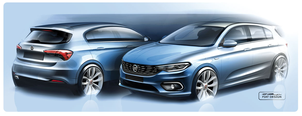
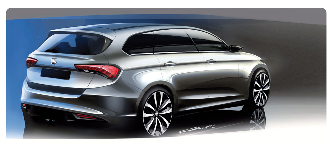
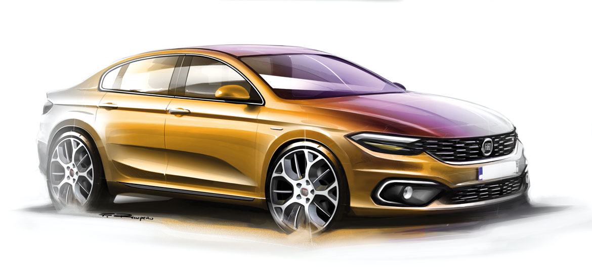
The articulation of the range has evolved ‘naturally’, as the various team-members all confirm: some photographic interpretations of the first four-door version enabled us to understand how powerful the lines were in their simplicity, to the point that they directly inspired other similar versions. Which is the opposite of what usually occurs, when one starts by recognising the need for new bodywork and then has to find a style to dress it in.
The principle of the fluidity and intelligibility of the shapes combines perfectly with the need to give the car “consistency”, particularly at the front end. Even aerodynamics uses strategically positioned profiles and openings: “There are two elements that I really like about the Tipo,” confessed Busse. “The lower outboard front fascia openings for example, that in so many designs we see these days would be fake, but on the Tipo are a functional aerodynamic device. Or the double bubble roof that, while retaining a low silhouette, provides extra head room and eliminates the roof crossbar.”
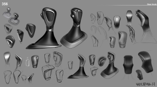
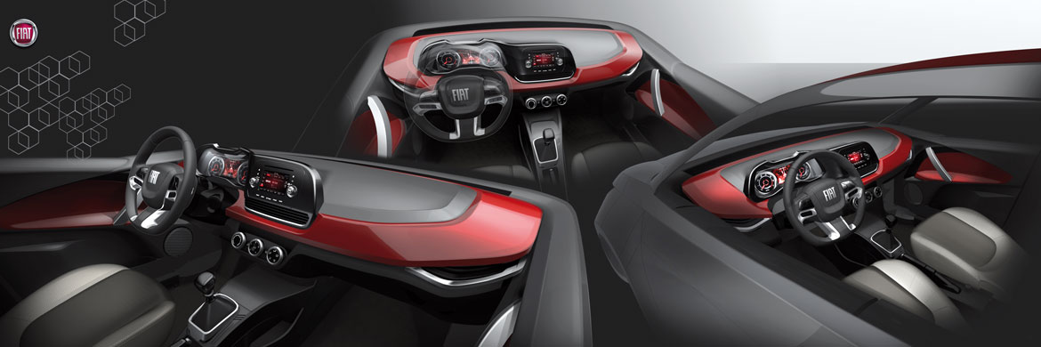
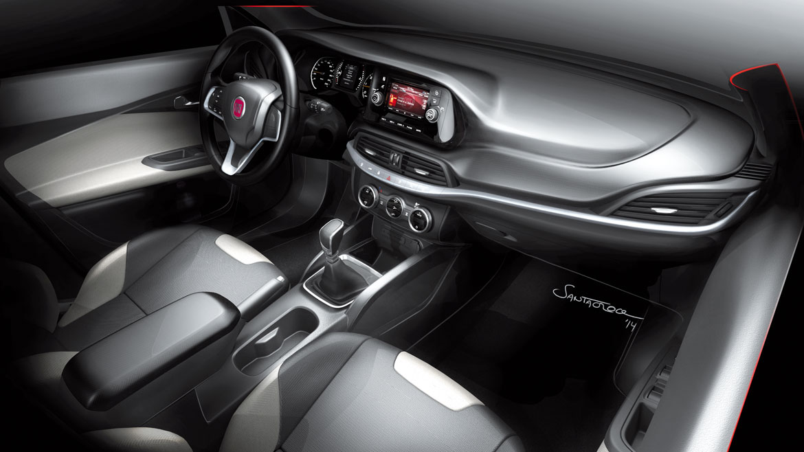
The bodywork, which is perfectly “intelligible and comprehensible” according to interior designer Carlo Santacroce, is combined with a passenger compartment conceived by the same principles, perfectly in line with the contents of the project, enhancing its packaging. “It is not easy to design a car with an international vocation and to make it so consistent,” commented Dilillo, “but the total freedom we enjoyed when we designed the bodyshell also helped us with the interior.”
The interior pillars are only slightly inclined, to create a facia that is limited in depth so that it is less imposing, corroborating the psychological impression of roominess.
Intelligible concreteness, reassuring simplicity, and friendly packaging: is there a more effective formula to return to the compact Fiats of the past?
Full article in Auto&Design no. 221


