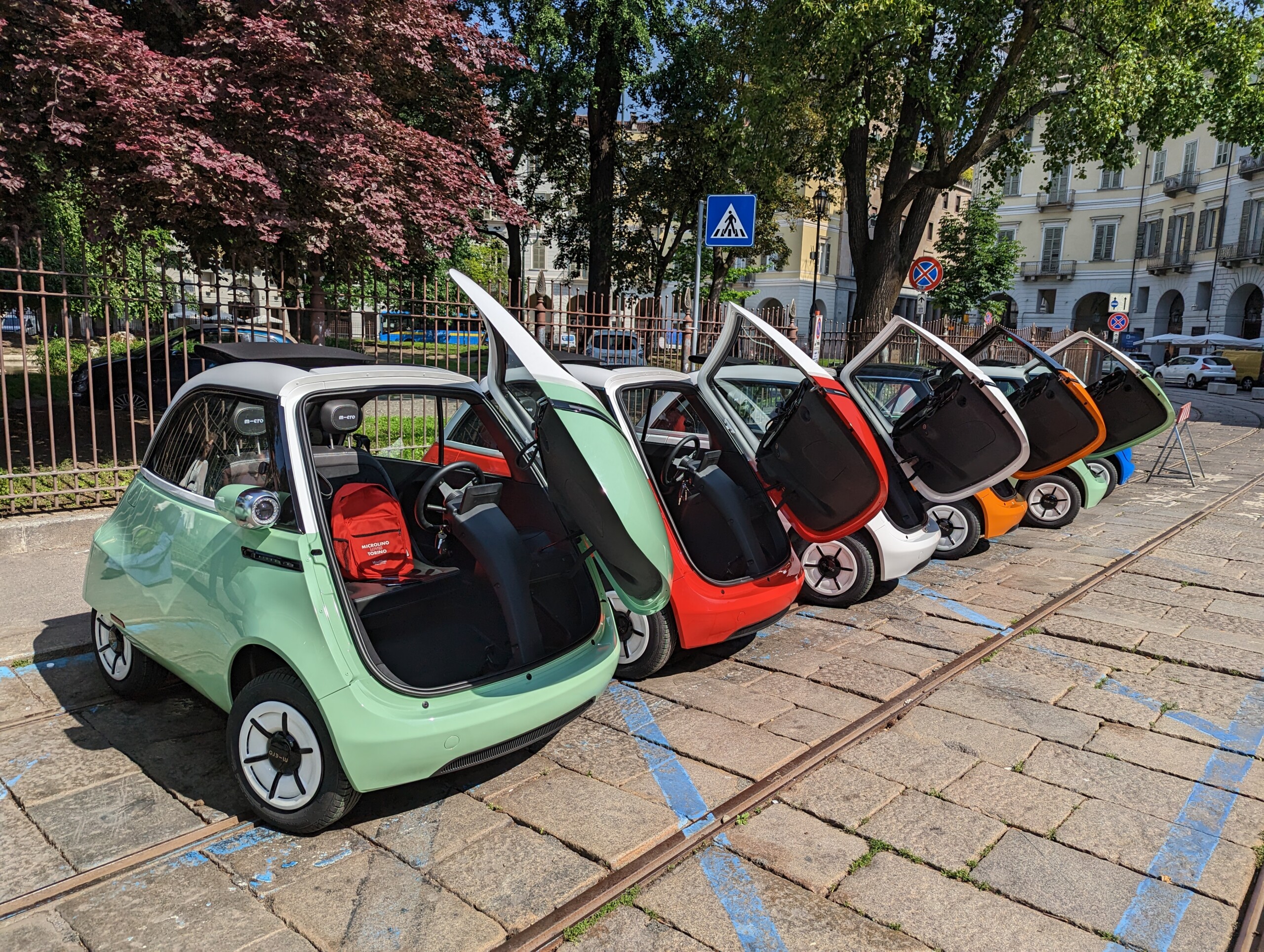
There’s a lot of Italy in the Microlino, the micro car we drove in Turin, developed by Swiss company Micro Mobility but produced and designed in Turin. The cute Bubble Car runabout was designed by Icona Design, which has reinterpreted in a modern key the unmistakable lines of the Iso Isetta, that unique symbol of mass motorisation that animated the 1950s. “The project was based on a few key points”, explains Antonino Barone, exterior & concept designer. “The teardrop shape, with its narrow rear track, and the big front door that gives access to the passenger compartment are clearly the most eye-catching elements”. The Microlino’s appearance, however, has also tapped into streamlined vehicles. “The inspiration is classic”, continues Barone, “but there are modern touches, such as the horizontal lighting strip on the front suggestive of RoboCop.
We wanted to keep the vintage look but use the graphics to project this vehicle into the future”. The Microlino has the feel of a modern car, not only because of its electric powertrain and load-bearing body (a rarity among light quadricycles), but also because of a set of solutions that are both simple and sophisticated. It is minimalist but meticulously designed, inspired by the “less is more” concept to keep the weight down but also to emphasise attention to detail. One example? The projecting front lights house the mirrors on their rear.
“Light quadricycles tend to imitate standard cars”, explains Davide Cannata, design manager, Icona Design Torino, “whereas on the Microlino the approach was exactly the opposite: we wanted something unique shape- and materials-wise. When you design a car you think about factors like speed, aerodynamics and road stance. Here the opposite was the case, but a lot of research went into conveying an overall sense of quality. We wanted to create a sophisticated interior using just a few elements and working on the materials. The simplicity is dictated by the fact that this vehicle, which started out as a private vehicle, may in future be used for shared mobility projects, which have other demands”.
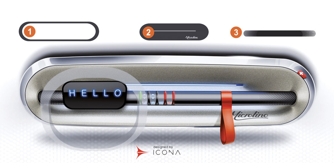
Generally speaking, the main challenge as far as the interior was concerned was to reorganise all the spaces to cater for the presence of the front door. “The dashboard was a challenge”, says Cannata. “On the Microlino it moves with the door, and a traditional design was out of the question. This prompted us to look for alternative solutions; reviewing how individual items were distributed, exploiting for example the sides to accommodate large pockets”. Barone concludes: “What we are really pleased with is that the Microlino, which started out as a friendly, slightly anthropomorphic car with a decidedly retro feel to it, is versatile and can reach a wide user base. It also looks credible with dark, matt paintwork, burnished wheels and slightly sportier details. And this was a nice surprise”.


