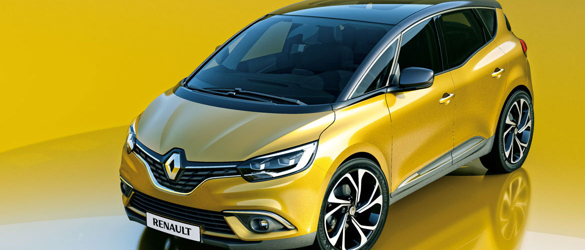
“It is the icing on the cake for our design,” smiles a proud Laurens Van den Acker, head of design at Renault. The new Scénic seems to have what it takes to breathe new life into the compact MPV segment. At Renault they are very positive: “It was basically all about re-inventing a segment that we had invented in the first place,” continues van den Acker. “It is a very sophisticated car, which is easy on the eye but not easy to design, because it is complicated making an MPV interesting and attractive. But my team have done a wonderful job.” Delphine De Andria, head of segment C strategies, comments: “We wanted to produce an MPV that would be not only functional – in terms of modularity and practicality – but also desirable, able to win back the customers lost to crossovers.”
Van den Acker’s design philosophy is expressed in a graceful image: that of a flower with six petals, which represent love, exploration, family, work, play and wisdom. MPVs are renowned for their practicality and capaciousness, in other words, the ‘family’ petal. “And the new Scénic,” comments Agneta Dahlgren, head of design for the M1 range, segment C, “is certainly family, but also love.” In Van den Acker’s words: “It is for parents who are still in love and do not only use the car to do the school run.” But how can these concepts be transformed into a car without falling into the trap of another crossover (Renault already has the Kadjar)?
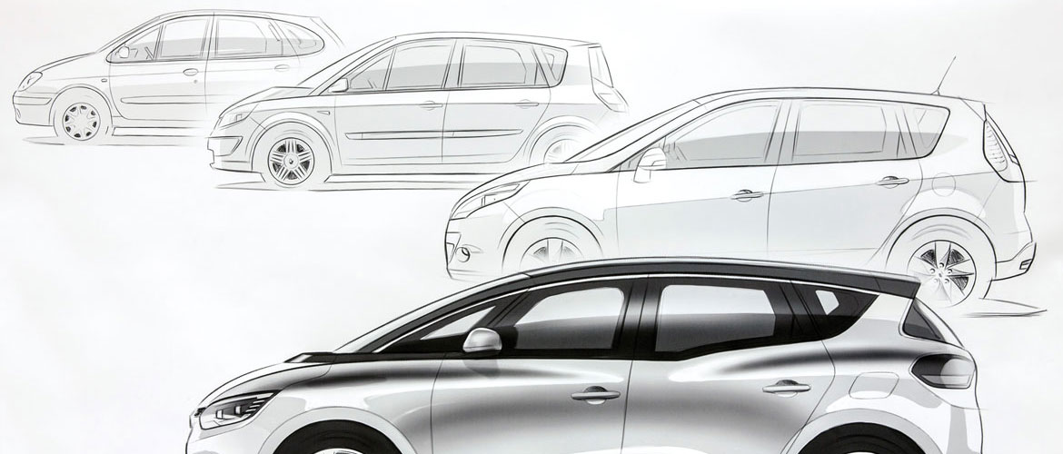
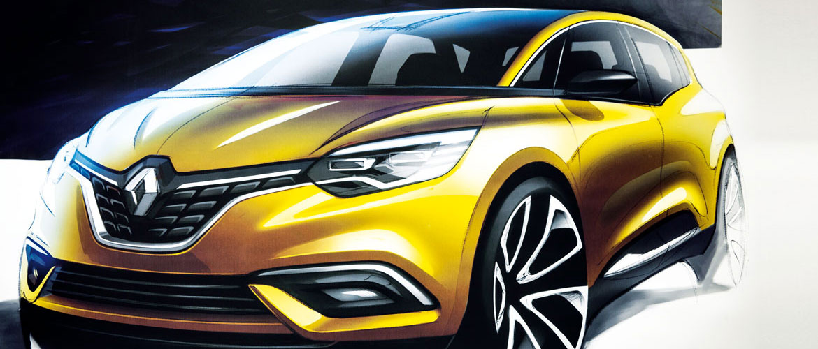
The windscreen is further forward, and the height of the body has been lowered slightly to achieve a single tense arc; but then the car has been given a more robust look, with both strong shoulders worthy of an SUV and 20 inch wheels (designed by Stefano Bolis, who was also responsible for the light clusters) so in fact the car has a dominant height.
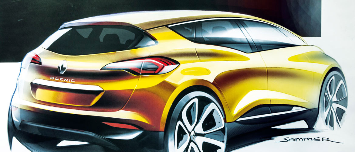
“It had to be a truly innovative car,” remembers Jérémie Sommer, who designed the exterior: “This was the reason for the large but narrow tyres, which made it unique but also introduced an all-new architecture. From that moment on, it was a matter of optimising everything, and of improving the proportions. Then the R-Space concept car presented at Geneva in 2011 focalised our work. At that point our task was basically to put a concept car on the road. “It was the R-Space”, Van den Acker confirms, “that revealed the right formula. Someone who drove the first Scénic felt modern and progressive, a feeling that was lost over the years, and one which we now intend to recover.”
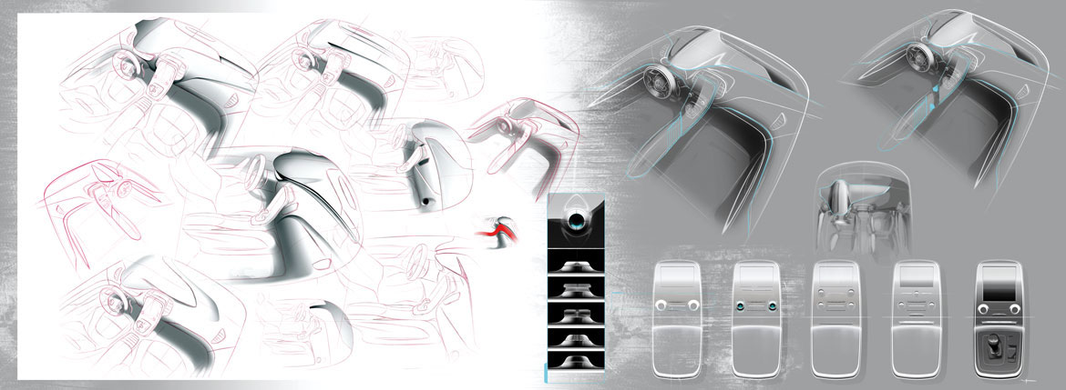
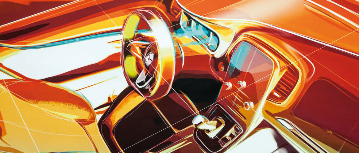
It is not a crossover, but it resembles one. “Intentionally,” Sommer cuts in. “We knew that the large wheels would make the car taller. A crossover feeling, if you wish. And we went along with it. We wanted to express robustness but also sensuality and warmth, with solid shoulders to give it a hint of sportiness, in other words a car you would buy not only for the family but for yourself too.” Then there is the interior, which has always been foremost in Van den Acker’s mind. It was designed by Maxime Pinol, who talks about “slightly sporty styling, and above the instrumentation, which is turned towards the driver, is a wing-like element that extends towards the passenger, a sort of fusion between sportiness and involvement.” It remains a compact family MPV, but with some elements of an SUV, which help to “make it more sensual and exciting”.
Full article in Auto&Design no. 217


