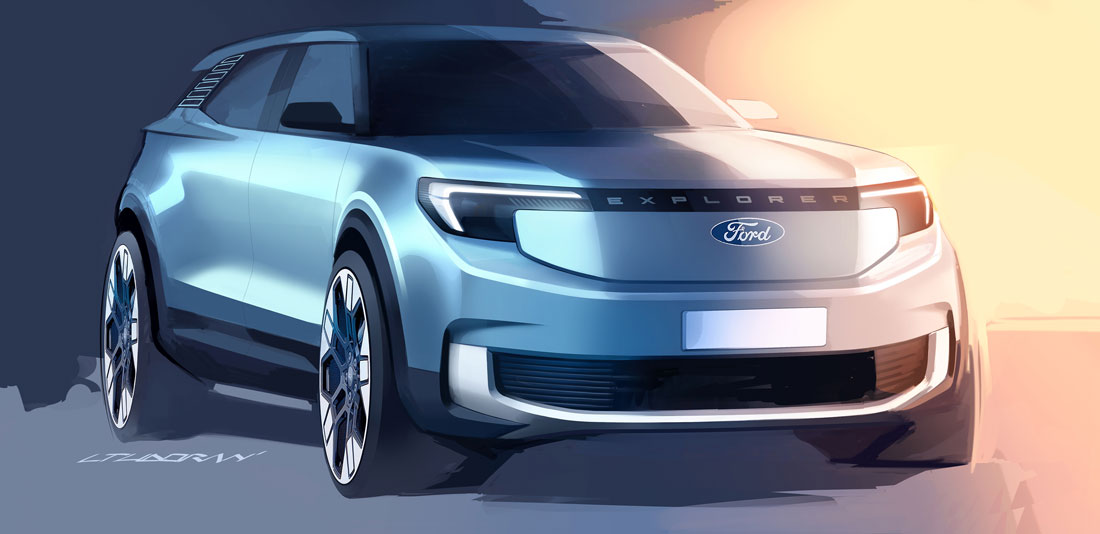
Reconciling the pressing need for EVs while reassuring users who don’t like features that are over the top? Ford design seems to have found the solution to this conundrum with the new Explorer which has a nose panel that is deliberately devoid of a grille, but which has borrowed lines from the tradition of certain US off-roaders. It is no coincidence that the name, initially missing in press releases, appeared appropriate as soon as the car was unveiled: “Explorer, as a symbol of our story. A choice that conditioned the styling from very early on”, explains Liviu Tudoran, exterior designer.
No more family feeling
The result is a surprise: very neat, regular shapes, no sign of the nastiness that dresses the Mustang Mach-E with ribbing, no Suv-coupé silhouette. The rational, square elements, combined with the well-chosen Artic Blue launch colour, generate almost the same effect as some early 2000s prototypes, enlivened by a purity that is anything but disagreeable.
“For the future, Ford aims to break free from the logic of an overly constrictive family feeling: each model will have its own character. That is why here we have enjoyed a certain freedom and made the most of the new platform, the first fully electric one for the European market”, continues Tudoran.
Between aerodynamics and offroad
Defining this specific personality is first and foremost “the new closed grille that has become a ‘shield’ and is dominated by the restyled logo, i.e. flat instead of convex, in dark blue and white instead of chrome”. Further down, the aluminium-coloured profile evokes an underbody plate and, above all, engages with the corners of the bumper by opening two slits that reduce turbulence in the wheel arches. “Aerodynamics was a key objective, but in this way we also displayed our off-road origins. Without overdoing it, as we were aiming for a road vehicle in any case”.
A graphic replacement for the pillar
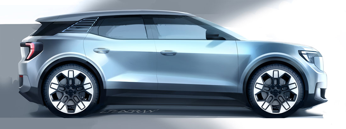
Moderation is also confirmed by the absence of any “rustic” accessories, as well as a ground clearance in line with that of saloons: perhaps the project’s authentic contemporary feature, capable of completely distancing it from the proportions of the SUVs of yesteryear.
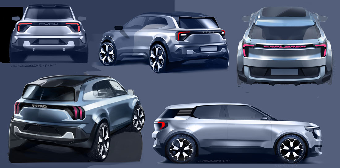
The treatment of the third side light is decidedly intriguing, decorated with a sticker never before used by Ford and conceived as a graphic replacement for the pillar “with a high degree of transparency from the inside, so as not to affect visibility”.
Super compact indicators
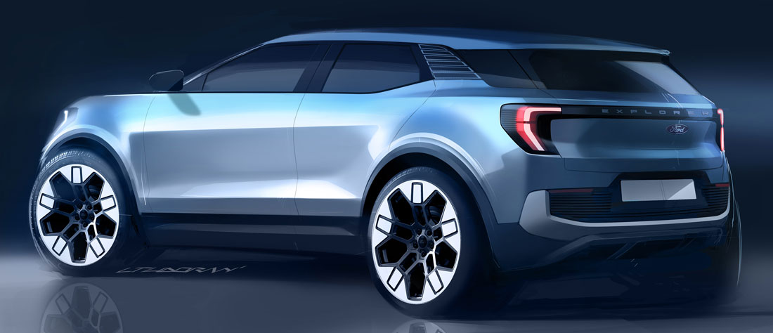
The rear, by contrast, plays on symmetries with the front through two full-width inserts (the aluminium lower profile mentioned above and the black moulding with the car’s name), structuring itself strongly around the two small lights that do not encroach on the tailgate. “All the light indicators are as compact as the law allows”, concludes the designer. In this way, the tail mirror is surprisingly loaded with identity, even more so than the front, borrowing the full feel of the original Explorer. At 4.46 metres long, however, the dimensions fit into the European C-segment, offering a replacement for the popular Kuga.
Flattened steering wheel
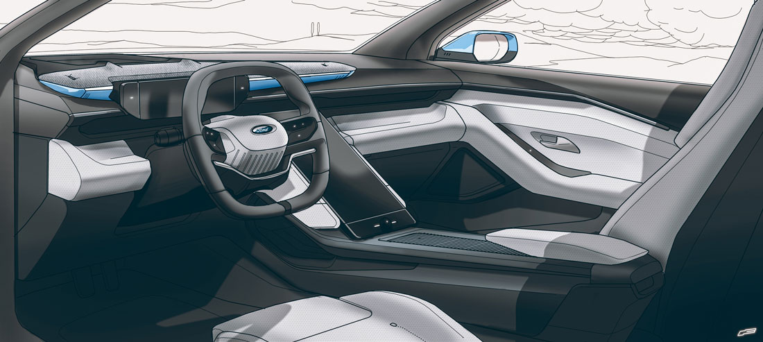
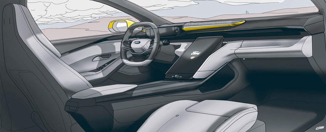
That’s why everyday usability appears to be very well catered for: in addition to the roomy volumes typical of battery-powered cars, the enormous storage compartment fitted between the front seats, the additional concealed compartment under the infotainment screen, which tilts to free up access, and the oblong sound bar grafted onto the dashboard like an eyelid, are all striking. Solutions in part taken, this time, from the very Mach-E that the exterior refrains from citing. With the addition of a steering wheel with a flattened circumference both below and above (to favour space and visibility respectively) and Sensico vegan leather, composing a rich framework of innovations devoted to rationality. Capable, at least in designer intentions, of bringing electric cars closer to the needs of families: a further homage to the traditional nuances of the Ford spirit.
(Full article in A&D no. 260)

