Now in its tenth generation, the E-Class remains the symbol of Mercedes. “It embodies the very idea of the company”, says Gorden Wagener, Head of Design for the Daimler Group: “It is the core of our brand, the backbone of the company”. So it would have been unthinkable for the car to turn its back on the German company’s design philosophy, which focuses on a concept of modern luxury obtained by applying sensual purity, the combination of emotion and intelligence, beauty and technology that has been the hallmark of the cars from Sindelfingen for several years now. “
The new E-Class completes the programme to revamp our three basic models. After the S-Class three years ago and the C-Class a year later, it conveys the same family feeling, but this homogeneity has not excluded a new approach, a refinement, replacing the ‘dropping line’ of the other two models with a more elegant ‘catwalk line’.”
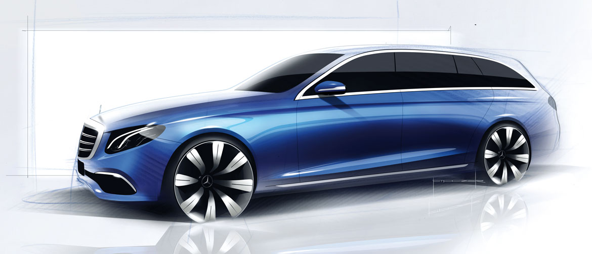
“It embodies the best proportions that a saloon could have,” comments Robert Lesnik, who is responsible for the exterior. Then his eyes light up as he talks about the station wagon version: “It has a sportier, less boxy, look than the previous model. It is also smaller, but still the most generous in its segment.” “A quality leap,” Wagener confirms: “It is a sleek, sexy, elegant, functional station wagon that looks more like a shooting brake. Seen from behind, with its strong shoulders, it looks so broad and low slung that you could mistake it for a sports car.”
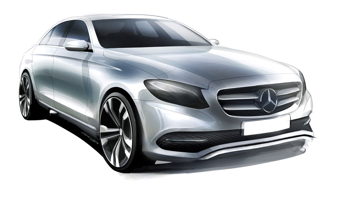
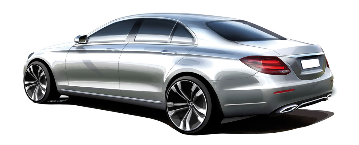
The saloon is 43 mm longer than the previous model, with a 65 mm longer wheelbase (and an elongated version has also been presented for the Chinese market, with an even more generous wheelbase and a third side window). A sleek profile evolves out of the longer bonnet and follows the line of the roof, like a coupé, blending finally into the tail whose broad shoulders the designers define as “sensual”. Short overhangs, a long wheel base, large wheels and sleek sides rewrite the line that defines the car’s sinuous profile – the so-called “catwalk” line, which Wagener describes as “the most successful chosen for the three saloons”. The tail, with muscular shoulders on the rear wheelarches, conveys a strong personality, like the light clusters which are designed with Mercedes’ customary painstaking attention to detail, while the rear lights adopt the new “stardust” effect.
“We concentrated above all on the volumes and the treatment of the surfaces”, Lesnik underlines: “We take our inspiration increasingly from the line of the CLS, and from the next generation, the treatment of the surfaces will play an even more important role.” Begun in 2012, the E-Class project started from a sketch by Thomas Sälzle which was chosen over ideas put forward – as usual – by all the Mercedes design facilities. After eight 1:4 scale models, four 1:1 models were developed, until the design was frozen three years ago. “In terms of sensual purity,” Lesnik states, “this is the most intelligent executive car.” In fact the car is fitted with driver assistance systems which make it a car that practically drives itself.
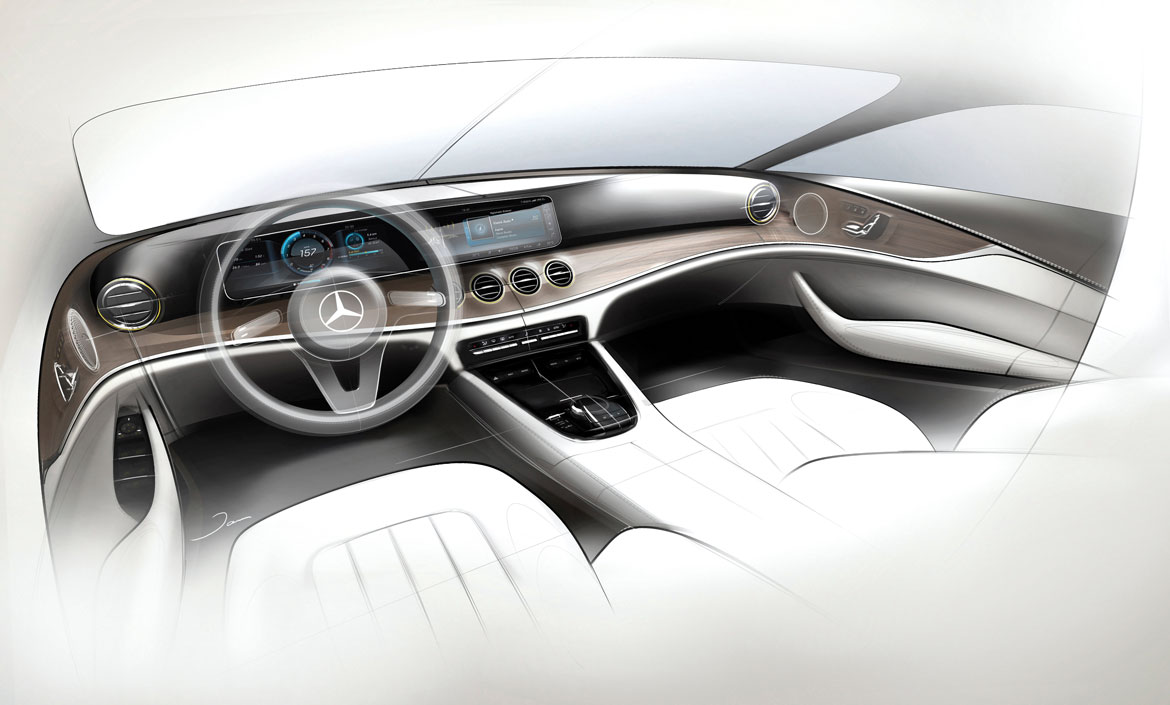
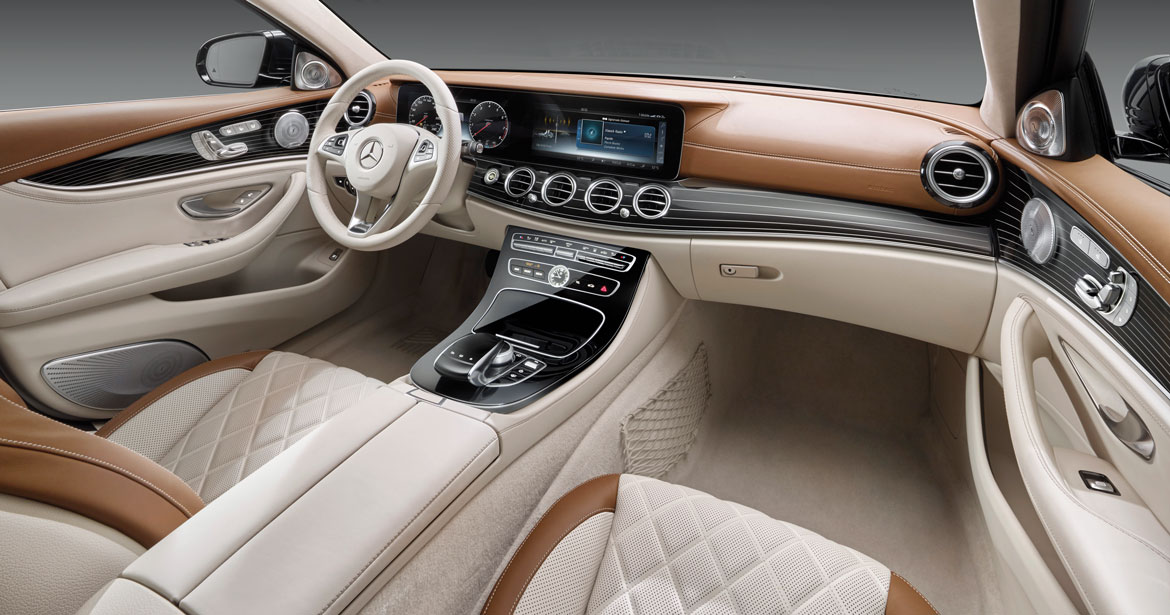
Then there is the interior. “This is possibly even more successful than the exterior,” Wagener underlines: “First on the S, then on the C and now on the E, we have created an interior that is more luxurious than ever before, but also very high-tech”. Together with quality materials and top level ergonomics, digital equipment plays an increasingly important role. This is now in the hands of Klaus Frenzel, Director of Digital Graphic and Corporate Design. “We strove to achieve graphic perfection,” states Frenzel: “Even the infotainment must reflect our philosophy and our design language, the bipolarity between emotion and intelligence; in other words on one hand the sensuality that comes from the use of lights, pictures and animation, and on the other, the intelligence that consists in reducing the number of elements to make everything more instinctive. In the graphics we must respect every pixel”.
Born from an idea of Jan Kaul, it was initially in competition with another idea studied at the Como facility, and then developed by Hans-Peter Wunderlich, under the supervision of Hartmut Sinkwitz, the Director of Interior Design, the E-Class passenger compartment is “elegant, but sportier than the S”, Sinkwitz says. “We wanted the same icons: the digital cluster, the four large air vents, the fluid shapes, the dashboard that flows seamlessly into the doors and the extremely comfortable seats. Classic, sophisticated solutions, with an extra touch of sportiness.” But always from the perspective of sensual purity, which is “hot and cool”. “These contradictions create harmony, between high tech elements
and other, more organic elements like the seats, which are extremely creative, and soft to touch, and the wonderful colour combinations devised by Claudia Braun, responsible for Colour & Trim, which are a blend of elegance and modernity. Take, for example, the use of black with brown, or two shades of brown, or woven metal as an alternative to aluminium, or different combinations of wood.”
Full article in Auto&Design no. 220


