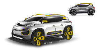
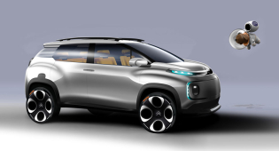
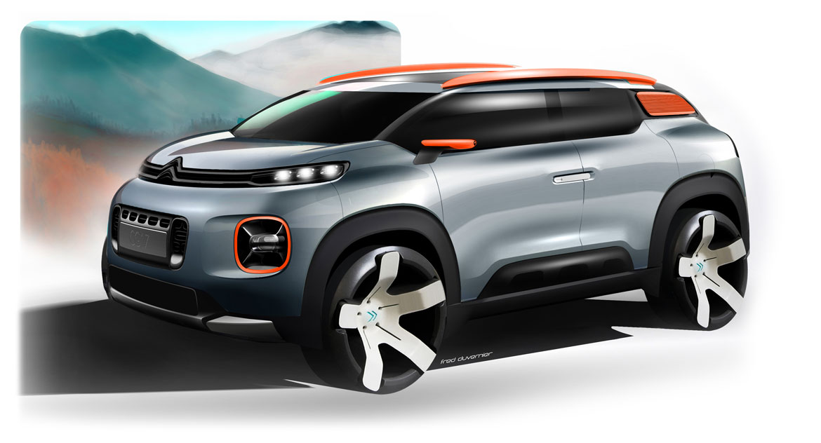
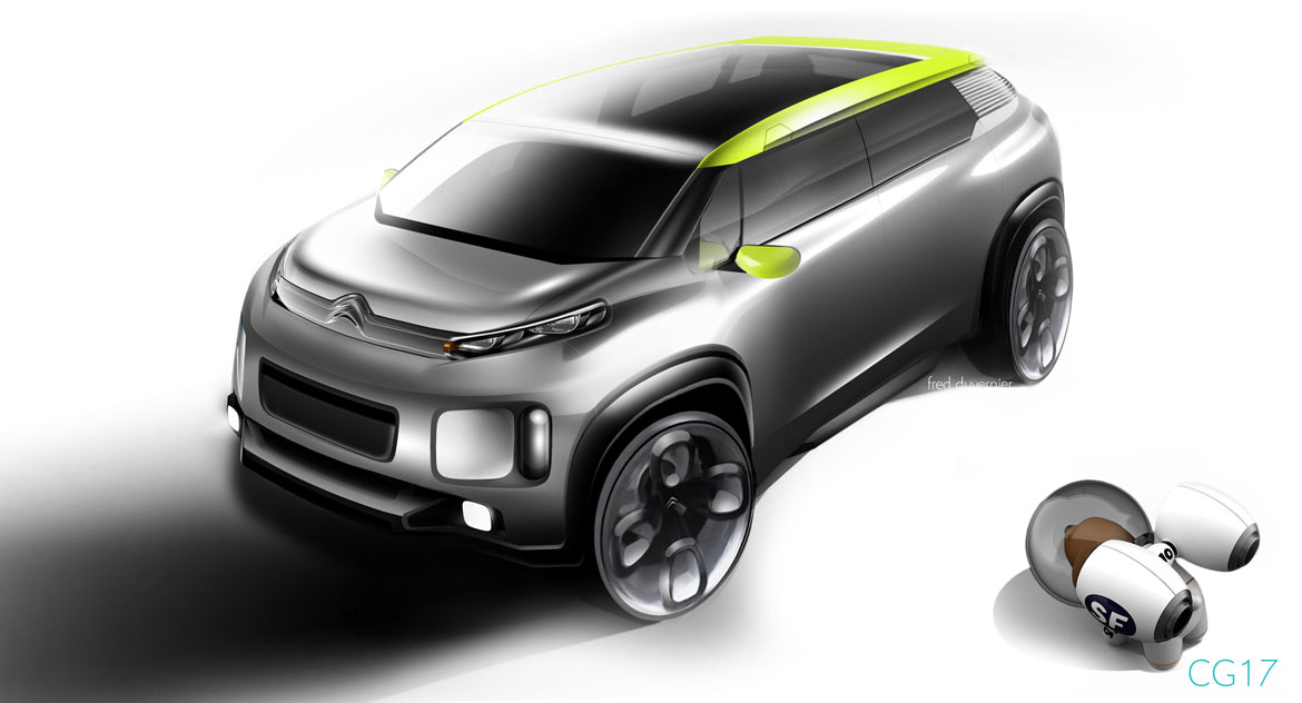
Pop and catchy, but not playful. When Alexandre Malval, director of Citroën design, talks about the creative path of the Double Chevron’s Geneva proposal, he’s keen to emphasise it: “I don’t think it’s right to call it “funky”, because that would convey the idea of an object that was designed with frivolity, much too disengaged. However, we were aiming for a fun-looking car that was also substantial and reassuring.
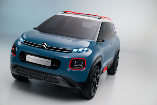
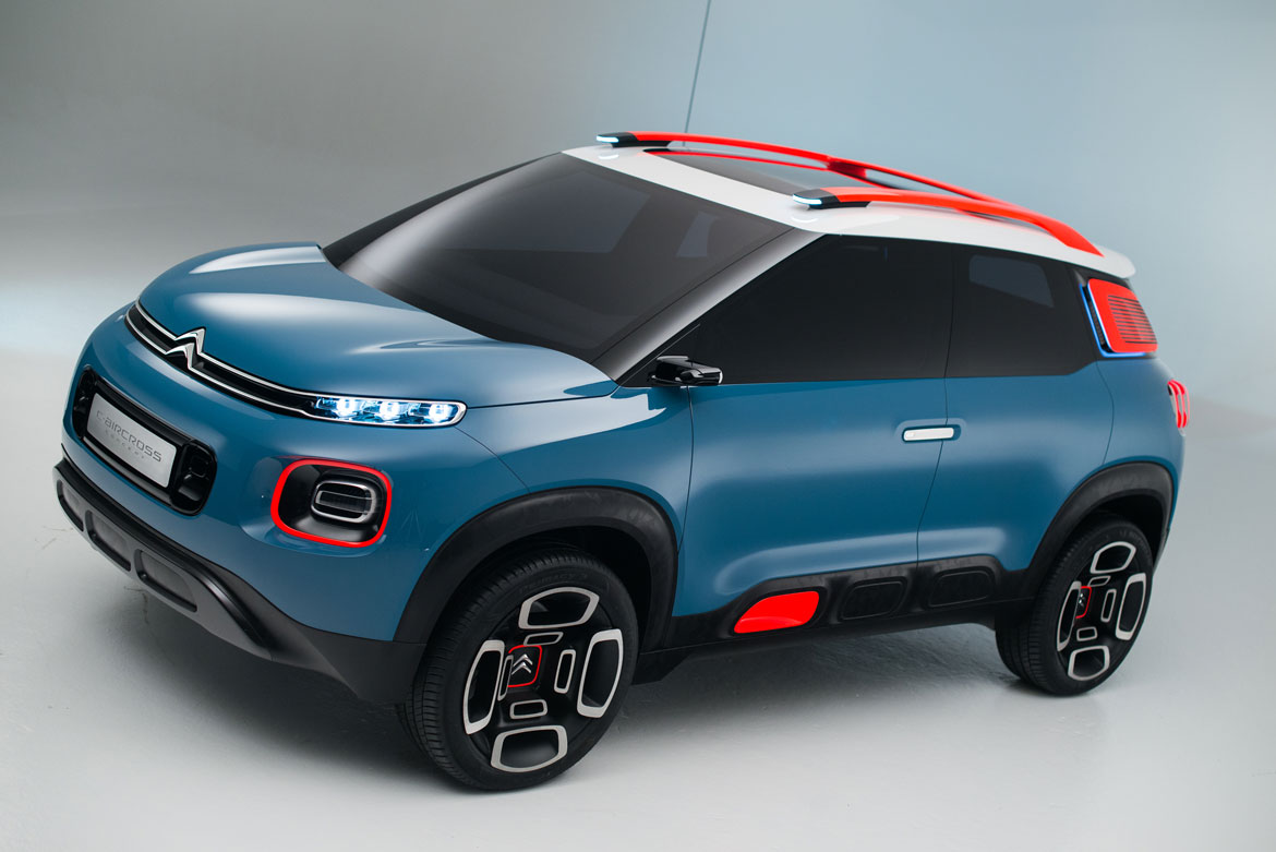
A car that’s cool and adult at the same time.” To soften the spunky effect we worked hard on details and volumes, even the smallest ones: its striking beltline, for example, seems perfectly horizontal, yet in correspondence with the rear wheel arch it barely makes a ripple, going so far as to suggest a hint of muscle without betraying the uniformity of the sides. “The surface modelling and related bulge shapes are just one aspect to which we have devoted a lot of attention,” confirms Frédéric Duvernier, in charge of the Concept car.
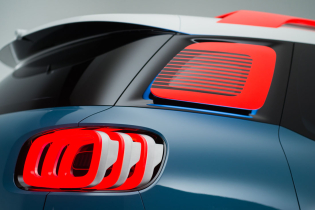
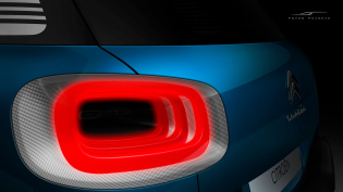
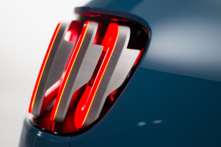
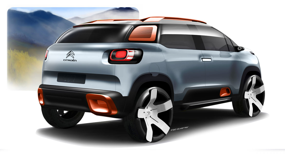
“It was not easy to make a car that proves sufficiently “perky” while preserving the dimensional limits of the B segment. We had to get a greater muscular impact in an overall width very similar to that of the C3.” The method used? Taking advantage of the details and the relationships between recesses and frames. This is demonstrated by the contours of the tail lights or the exchange between the sheet metal and plastic profiles along the wheel arches: thin shadowy zones that give the impression of volume created in both areas.
Above this smart plastic bodywork, the C-pillars offer a curious two-way mirror effect (now you see it/now you don’t) thanks to the original application of a slatted element which recalls, with extreme discretion and a pinch of irreverence, the handling of the historical DS models. “This solution has a very precise styling reason” explains Malval. “We wanted to cover the third side light in order to avoid having the car look like a small station wagon.
The elimination of glass in favour of steel, however, would have proven too cumbersome, so we opted for a compromise outside the box, a kind of louvered shutter.” That, however, doesn’t dampen the brightness of the passenger compartment, proving to be an original and functional ensemble. In the true Citroën spirit.
Making the C-Aircross solid, but also decidedly likeable, a pleasurable visual feeling of “air suspension” is generated by the alloy wheels, which appear to consist of a group of graphic symbols, resting simply one on top of the other, and by the bars on the raised roof, which return an echo of the clearance between the chassis and the road. Even the paint job, applied with a special water process, shines with special depth and fluidity, light and soothing.
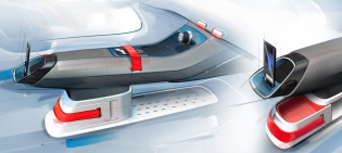
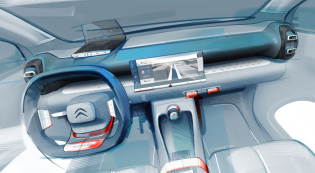
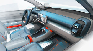
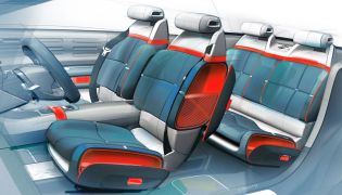
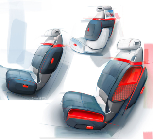
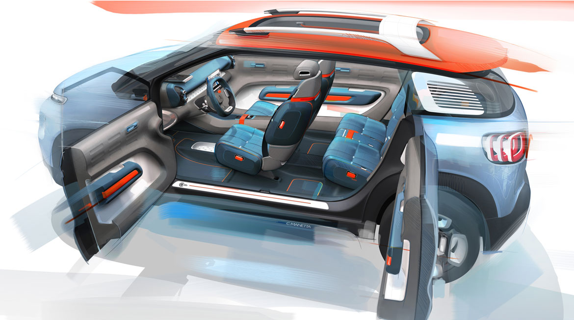
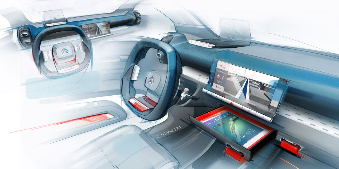
In the cabin (only virtual for the moment), next to the minimalist, sculptural dashboard, storage spaces materialise, glorified as protagonists and able to colonise the seats. Ideal for completing the functional structure and in a disenchanted vein refer back to themes of travel and comfort. Typical of Citroën’s continuing solidity.
Full article in Auto&Design no. 224
